印字细节见高级 How Print and Type Make Jewelry Packaging Premium
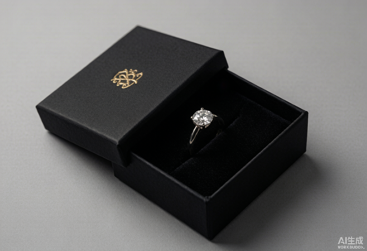
一只珠宝首饰盒,顾客还没摸到珠宝,先看到的是盒面上那几个字、那一道烫金、那一片压印的纹路。在注意力只有几秒的货架和屏幕前,“印”得好不好,往往先于产品本身决定了顾客愿不愿意多看你一眼。
问:盒面上印的字,真的影响顾客判断吗?
影响,而且发生在极短的时间里。美国心理学会2022年的研究指出,人对一件物品的第一印象在约7秒内形成;包装协会的调研显示,72%的消费者认为“看起来高级”的包装会影响他们对产品的初始判断。更直接的实验来自克莱姆森大学:在并排对比中,烫印工艺的巧克力比普通包装多卖出23%,受试者注视带金属工艺包装的时长是对照组的1.46倍——而注视时长越长,购买概率越高。中国包装联合会2026年的一项调研同样显示,超过78%的受访者认为,带有精致烫金工艺的包装意味着产品品质更高、更具匠心。换句话说,包装上的字与工艺,是品牌在顾客开口询价之前,递出的第一张名片。
问:烫金、压印、击凸,到底有什么不同?
三者都属于“印后工艺”,但分工不同。烫金(热压转印电化铝)靠金属箔在加热印版下转印出金色、银色或彩色的光泽,适合做logo和边框;压印/击凸则不带颜色,纯粹靠模具压力让纸面凸起(击凸)或凹陷(击凹),带来“无色的质感”。数字制版与激光雕刻的成熟,让小批量、多版本的工艺定制成为可能——这正好契合品牌做限量款、季节款时“小批量起订、快速验证”的需求。2026年的趋势也不再是“满版金”,而是更克制的局部点缀:把工艺集中在logo或一句主张上,用色也从张扬的大金转向更柔和的金属、珠光与同色系。对珠宝包装设计而言,选对工艺,比堆满工艺更重要。
问:既然都在说“少即是多”,为什么盒子还是要印一道?
因为高端简约珠宝包装设计,更容易被顾客青睐——但“简约”不等于“空白”。真正的高级感,往往是“外观做减法,工艺做加法”:盒面留白、字体克制,却在关键处落一道压印logo或局部烫金,作为品牌最安静的签名。这正是老板常强调的论点:高端简约的包装更受顾客喜欢。背后的数据也站得住——2024年品牌包装调研显示,65%的消费者将金属工艺与高端品牌直接关联;感官营销机构的研究指出,压印工艺能让包装的感知价值提升约25%,60%的消费者表示触感包装帮助他们记住一个品牌,而“触觉记忆比视觉更持久”。珠宝行业尤其明显:有调研称约70%的珠宝品牌会用压印logo来提升高级感。所以不是不印,而是印得克制、印得有道理。
问:字体和排版,怎么选才不显“土”?
字体是包装上最容易被忽略、却最暴露档次的细节。衬线体(如宋体、Didot类)自带经典与传承感,适合强调工艺与历史;无衬线体更现代、精准,适合年轻化或设计驱动的品牌。关键不在“用哪一款”,而在三件事:一是字号与字重形成清晰层级,标题与主文案不能一样大;二是留白,字与字、行与行之间留出呼吸感,负空间本身就是高级感的来源;三是细节适配——烫金字体若笔画过细,印刷时容易断线、糊版,应适度加粗或选适配工艺的字体,字距过紧也会让烫金边缘粘连。中英文双语排版还要处理好文字层级与对齐。一只好的首饰盒,从字体起笔的那一刻,就已经在说话。
问:包装上的字,和柜里的珠宝陈列道具要讲同一种话吗?
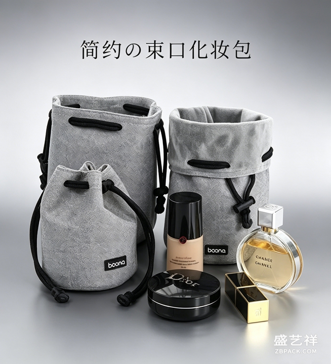
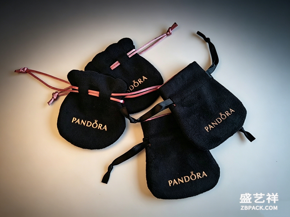
要,而且应该是一套语言。包装、柜内的珠宝陈列道具、珠宝摆台、再到随附的首饰袋,共同构成顾客对品牌的“视觉总印象”。如果盒子上是古典衬线、克制烫金,柜台却堆满高反光亮面塑料道具,二者就会互相拆台。更稳妥的做法是:让包装上的品牌色、字体气质、金属工艺,与道具的边框、铭牌、绒布底色呼应——深绒托盘衬钻石火彩、浅米与燕麦色配黄金古法金、冷调深灰配白色金属;字体风格上,古典道具配古典包装、现代道具配现代包装。NRF的数据显示,合理的道具组合(如胸像架、分层托盘)能带来18%—30%的互动与单量提升;而包装与陈列讲同一种话,正是把“线上看到”和“到店体验”缝合起来的那根线。盛艺祥在珠宝包装设计与展示配套上,一直主张这套统一语言。
问:一道印得好不好,怎么验收,值不值这个钱?
验收看几处硬指标:烫金无颗粒、无断线、附着力够(耐摩擦测试不掉粉);压印深浅一致、击凸高度均匀;字体边缘锐利、套位精度控制在0.2毫米以内;组合工艺(如防伪浮雕)模仿门槛高,本身就是物理防伪。值不值,要算综合账:中国包装联合会2026年调研显示,消费者愿为精美烫金包装多付5%—15%的溢价,礼赠场景可到20%;而烫金的单位成本比压印等工艺低约10%—15%,局部UV加激凸又能再省30%—50%。对小品牌更友好的路径,是借柔性供应链先把核心SKU小批量打样验证,再上量产——这正是珠宝盒工厂与珠宝盒定制服务现在能承接的“小单快反”。印刷工艺不是成本负担,而是把品牌溢价提前印在盒子上的投资。
本文为原创内容,版权归盛艺祥所有。如需转载请注明出处。
盛艺祥(Shengyixiang)——高端珠宝包装设计与定制专家,为品牌护航。
Before a customer ever touches the jewel, they touch the box. They read the type, they feel the foil, they notice the emboss. In a marketplace where the first impression forms in roughly seven seconds, how a jewelry package is printed—and what it says in type—often decides whether a buyer leans in or walks past.
Q1: Does the print on a jewelry box actually change buying decisions?
Yes, and it happens fast. A 2022 APA study found first impressions of a product form in about seven seconds; packaging-industry research shows 72% of consumers say visually appealing packaging shapes their initial perception. The clearest evidence comes from Clemson University: in side-by-side tests, the foil-stamped pack outsold the plain version by 23%, and shoppers fixated on the metallic finish 1.46 times longer—and longer fixation correlates with higher purchase likelihood. Closer to home, a 2026 China Packaging Federation survey found over 78% of respondents associate refined foil work with higher quality and craftsmanship. The type and finish on a box are, in effect, the brand's first sales pitch—delivered before a word is spoken, and long before the jewel is seen.
Q2: What is the difference between foil, embossing, and debossing?
All three are post-print finishes, but they do different jobs. Foil stamping transfers a metallic (or colored) leaf onto the substrate with heat and pressure—ideal for logos and borders. Embossing raises the paper; debossing presses it inward; neither adds color, so both deliver “tactile luxury” with no shine. Digital plate-making and laser engraving have made small-batch, multi-version finishing practical, which suits the limited-edition and seasonal cadence brands now love. The 2026 direction, per finishing houses such as KURZ, is away from “all-over gold” toward restraint: concentrate the craft on the logo or one statement line, and shift the palette from loud gold to softer metallics, pearlescent, and tone-on-tone. For jewelry packaging design, choosing the right finish matters more than piling them on.
Q3: If “less is more” is the rule, why print anything at all?
Because high-end, minimalist jewelry packaging is precisely what customers favor—but minimalism is not blankness. The real premium feel comes from “subtract on the surface, add in the craft”: keep the box quiet and the type restrained, then drop a single debossed logo or a touch of foil as the brand's calmest signature. This is exactly the point often emphasized—simpler, refined packaging wins customers. The data backs it: a 2024 brand-packaging survey found 65% of consumers link metallic finishes to premium brands; the Sensory Marketing Institute reports embossing lifts perceived value by about 25% and 60% of consumers say tactile packaging helps them remember a brand (touch memory outlasts visual). In jewelry, roughly 70% of brands use an embossed logo for that high-end cue. So it isn't “don't print”—it's print sparingly, and print on purpose.
Q4: How do you choose type and layout that doesn't look cheap?
Type is the most overlooked yet most revealing detail. Serif faces (Song, Didot-style) read as classic and heritage; sans-serifs feel modern and precise. The trick isn't which one—it's three things: build a clear hierarchy so the title and body aren't the same size; use whitespace, because negative space is itself a signal of luxury; and adapt to the process—thin strokes break and blur under foil, so slightly heavier weights or process-matched fonts are safer, and tight tracking makes foil edges bleed together. Bilingual CN/EN layouts need deliberate layering and alignment, with the English kept as a quiet companion line rather than a competing block. A fine jewelry box, from the very first letterform, is already speaking.
Q5: Should the box's type speak the same language as the in-store display props?
It should—and ideally it's one system. The box, the in-counter jewelry display props, the jewelry display stand, and the accompanying pouch together form the customer's total visual impression of the brand. If the box is classical serif with restrained foil while the counter is crowded with glossy plastic props, they undercut each other. The steadier move: let the brand color, type personality, and metallic finish on the packaging rhyme with the frames, nameplates, and velvet backdrops of the props—deep velvet trays for diamond fire, oatmeal and pale beige for gold, cool charcoal for white metals; match classical props with classical packaging, modern with modern. NRF data shows well-composed props (bust stands, tiered trays) can lift interaction and units by 18%–30%; packaging and display telling one story is what stitches “seen online” to “experienced in store” together. Shengyixiang's approach to jewelry packaging design has long advocated this unified language.
Q6: How do you check a print job—and is it worth the money?
Check a few hard metrics: foil with no grain, no broken lines, and enough adhesion to pass a rub test; embossing of even depth and uniform height; sharp type edges; registration within 0.2 mm; and combined (e.g., security-embossed) finishes that are hard to copy and double as physical anti-counterfeit. Whether it pays: a 2026 China Packaging Federation survey shows consumers will pay a 5%–15% premium for refined foil packaging, rising to 20% in gifting; foil costs about 10%–15% less per unit than embossing, and spot-UV plus emboss can save another 30%–50%. The friendlier path for smaller brands is flexible supply—prototype the hero SKU in a small batch, validate, then scale, exactly what jewelry box factories and customization services now support with low-MOQ, fast-turn runs. Print finishing isn't a cost line; it's the brand premium preprinted onto the box.
This is original content. Copyright belongs to Shengyixiang.
Shengyixiang — your expert in high-end jewelry packaging design & customization.