
品牌视觉识别:盒子就是移动广告位 Brand Visual Identity: The Box Is a Moving Billboard
两家店卖同款戒指,为什么一家让人记住、一家转眼就忘?差别常常不在戒指,而在包装传递出的品牌识别。视觉识别(VI)落到首饰盒上,是门被低估的学问。多数中小珠宝品牌把 VI 只用在 Logo 和店铺,却忘了客人最后带走的盒子才是曝光最久的广告位。
一、包装是品牌 VI 的"最后一块屏"
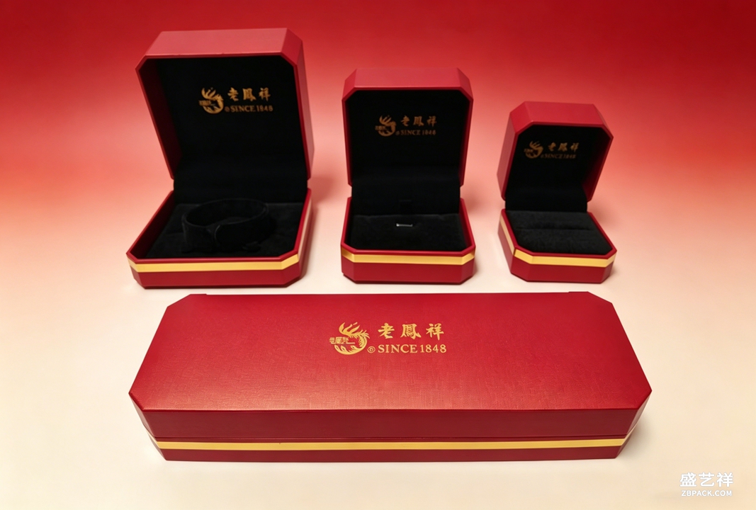
广告、店铺、官网都在讲品牌,但客人带走的、长期摆放的,是那只盒子。它365天在顾客抽屉里当"品牌广告位"。所以珠宝盒定制必须和 LOGO、主色、字体一脉相承——盒子的颜色就是品牌的颜色。盛艺祥见过太多品牌:线上视觉精致,盒子却随便找通版,结果"开箱即掉价",前面营销全白费。
二、三个最容易被忽略的识别要素
第一,专属色:别用通用金,调一支只属于你的潘通色,闭眼摸到盒子就知道是你家。第二,字体与排版:盒面品牌名的字距、大小、位置,决定"高级感"还是"地摊感"。第三,开合仪式感:磁吸的"咔哒"声、内衬的第一眼,都是识别的一部分。盛艺祥常帮客户把这些写进珠宝包装设计规范,保证线上线下一致。识别不是贴个 Logo 就完事,而是一整套可感知的细节系统。
三、识别统一,但别"撞脸"
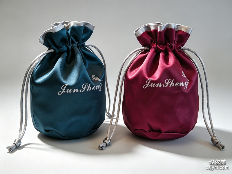
统一不等于千篇一律。同一品牌下,婚戒盒、项链盒、首饰袋可以用"同色不同型"区分产品线,既成系列又不混淆。对做珠宝袋加工的客户,袋面印品牌色+极简LOGO,比满版印花更有记忆点。一个常见错误是每条产品线各自找供应商,结果盒子颜色差出两三个色号——盛艺祥建议品牌锁定"主色卡+辅助色",所有供应商按卡出货。
四、小品牌如何低成本建立识别
不需要大预算。一支专属色+一个克制的LOGO压印+一致的纸感,三件套就能立住调性。盛艺祥建议:先定"品牌色卡"和"盒面规范"两页纸,再开模,避免后期反复改版烧钱。识别不是装饰,是资产——它让客人下次在货架前,凭盒子就认出你。哪怕预算只够做 300 个盒子,只要颜色、字体、触感统一,照样能建立清晰识别。
五、识别的延续:从盒子到全触点
真正成熟的品牌,识别会从盒子延伸到卡片、封套、电商运输箱,甚至售后养护布。客人收到货的那一刻,所有触点颜色字体一致,信任感才完整。盛艺祥在服务珠宝盒定制客户时,会输出一份"包装 VI 延展清单",把盒子、袋子、卡片、外箱的统一规则写清楚,让老板拿去给任何供应商都能执行。识别一旦系统化,品牌就不再是"卖货的",而是"被记住的"。
六、识别翻车案例:三个真实教训
盛艺祥见过三种典型翻车:一是主色没锁,三家供应商出的盒子差出三个色号,客人以为是假货;二是字体侵权,用了未授权商用字体被索赔;三是工艺过度,盒子比戒指还贵,喧宾夺主。避坑清单:① 出“品牌色卡+字体授权书”给所有供应商;② 盒子造价控制在货品 3%-8%;③ 先做 100 个市测再放大。识别的价值不在贵,而在“一致且可被记住”。还有一个常被忽视的翻车点:包装上的品牌名与官网不一致(繁简混用、英文名拼写漂移),客人搜不到你,识别就断了。盛艺祥建议把“品牌中英文名+标准字体+标准色”做成一页 VI 卡,所有包装、详情页、名片统一照此执行,别让任何环节自由发挥。
本文为原创内容,版权归盛艺祥所有。如需转载请注明出处。
盛艺祥(Shengyixiang)——高端珠宝包装设计与定制专家,为品牌护航。
Two stores sell the same ring — why does one stay in memory while the other is forgotten by evening? The gap is often not the ring but the brand recognition carried by the packaging. Visual identity (VI) on a jewelry box is an underrated discipline. Most small and mid jewelry brands apply VI only to the logo and store, forgetting that the box the client keeps is the longest-exposed ad space.
1. Packaging is the "last screen" of brand VI
Ads, stores and websites all tell the brand story, but what the client keeps and displays for years is the box — a 365-day ad slot in their drawer. So jewelry box customization must share the logo, primary color and typography: the box color is the brand color. Shengyixiang has seen too many brands with polished online visuals yet random generic boxes — the unboxing "drops the value" and wastes all prior marketing.
2. Three overlooked identity elements
First, signature color: skip generic gold; mix a Pantone that is yours alone, so the box is recognized by touch. Second, type and layout: the spacing, size and placement of the brand name decide "premium" versus "bargain." Third, unboxing ritual: the magnetic "click" and the first glimpse of lining are part of identity. Shengyixiang often helps clients codify these into a jewelry packaging design spec for online-offline consistency. Identity is not "stick a logo and done" but a perceivable system of details.
3. Unified, but not "same face"
Unity is not uniformity. Under one brand, engagement boxes, necklace boxes and pouches can use "same color, different shape" to separate lines without confusion. For pouch processing clients, a brand color plus minimal logo beats all-over printing for recall. A common mistake is each product line sourcing its own supplier, ending with boxes off by two or three shades — Shengyixiang advises locking a "primary + secondary color card" all suppliers must match.
4. How small brands build identity cheaply
No big budget needed. One signature color + one restrained embossed logo + consistent paper feel — a three-piece kit stands up the tone. Shengyixiang advises: lock a "brand color card" and a "box-face spec" (two pages) before cutting dies, avoiding costly late revisions. Identity is not decoration; it is an asset that lets clients recognize you by the box alone. Even with a budget for only 300 boxes, unified color, type and touch still build clear recognition.
5. Extending identity: from box to every touchpoint
Mature brands extend identity from the box to cards, sleeves, e-commerce shippers and even after-sales care cloths. The moment the client receives the parcel, every touchpoint sharing color and type completes the trust. Serving jewelry box customization clients, Shengyixiang delivers a "packaging VI extension list" spelling out unified rules for box, bag, card and outer carton, so the owner can hand it to any supplier. Once systematized, the brand is no longer "one that sells" but "one that is remembered."
6. Identity failure cases: three real lessons
Shengyixiang has seen three typical failures: one, no locked primary color, three suppliers delivered boxes in three shades and clients thought they were fakes; two, font infringement, using an unlicensed commercial typeface triggered a claim; three, over-finishing, the box cost more than the ring and upstaged it. Avoidance checklist: issue a brand color card and font license to all suppliers; keep box cost at 3%-8% of the goods; pilot 100 units before scaling. Identity's value is not in being pricey but in being consistent and memorable.
One overlooked failure: the brand name on the box diverges from the website, mixing simplified and traditional Chinese or drifting English spelling, so clients cannot search and find you, breaking the identity chain. Shengyixiang advises a one-page VI card with the standard Chinese name, English name, typeface and primary color, executed uniformly across packaging, product pages and business cards, leaving no step to improvise. Another trap is trend-chasing: a logo redesigned every season erases recognition faster than any supplier error. Pick a system and keep it for years; consistency compounds, while constant redesign resets your memory in the client's mind to zero. The cheapest identity work is simply not changing what already works.
This is original content. Copyright belongs to Shengyixiang.
Shengyixiang — your expert in high-end jewelry packaging design & customization.