男士珠宝悄然崛起 Men's Jewelry Quietly Takes Over
2026年的珠宝市场,增长最快的板块之一并不在传统的女性客群,而在男士。从秀场到街头,印章戒指、粗链条项链、极简手环正大规模走进男士的日常衣橱;胸针更是完成了从“爷爷辈遗物”到“西装点睛之笔”的逆袭。多家行业媒体把男士珠宝列为今年最值得关注的增量市场——对珠宝品牌与零售商而言,这不只是多了一类商品,而是多了一整套需要重新思考的陈列与包装逻辑。
一、男士买珠宝,买的是“身份感”而非“装饰感”。观察今年的热销品类会发现:印章戒指承载家族与个性符号,古币吊坠讲述历史故事,哑光质感的钛金属手环强调工艺与克制。男士消费者更在意材质的真实与设计的克制,浮夸的镶嵌反而劝退。这决定了面向男士的产品叙事要少谈“闪耀”,多谈材质、工艺与传承。
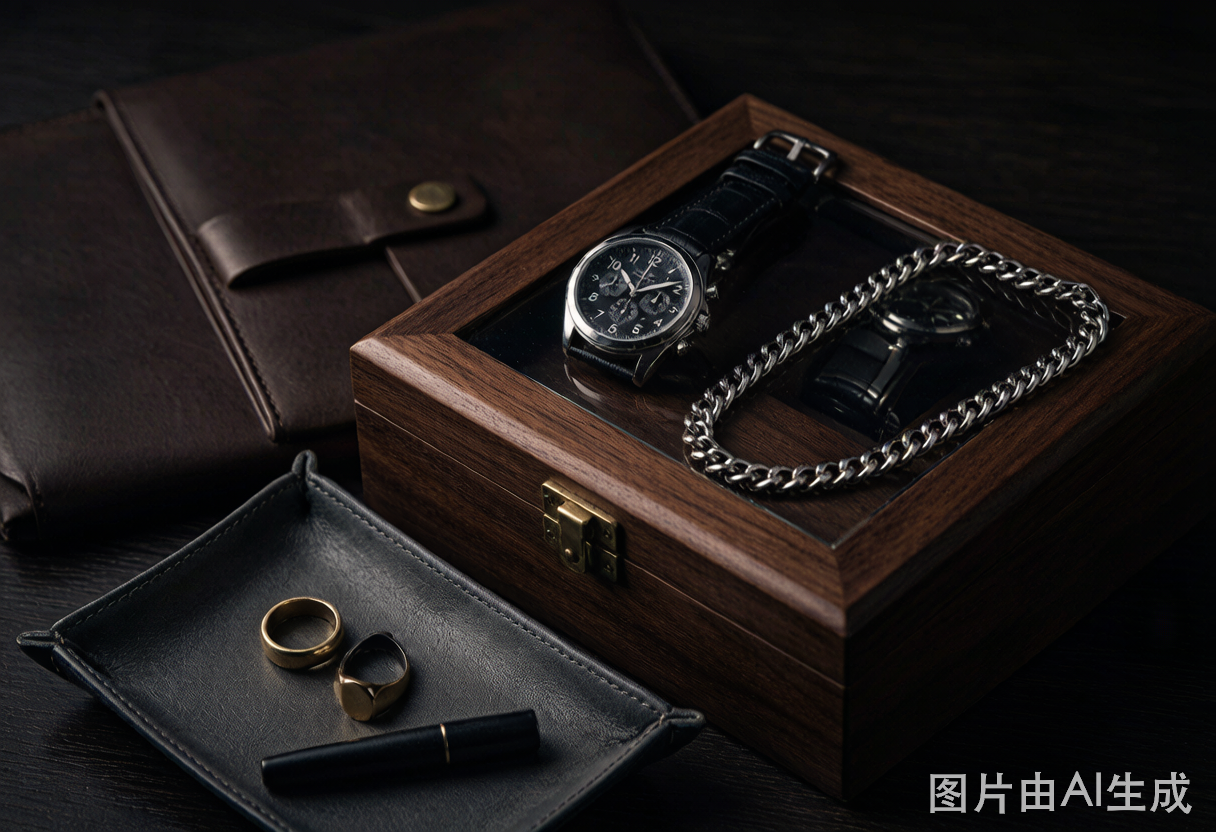
二、陈列语言必须“换频道”。粉色绒布与亮面镜台对男士客群几乎无效。男士珠宝区正在流行深色系陈列:炭灰、深棕、墨绿的皮革与哑光木质,搭配更低的陈列密度和更硬朗的几何线条。珠宝陈列道具也随之更新——加宽的戒指槽位适配男士戒圈、更稳重的立式项链架适配粗链条,一块好的深色皮革珠宝摆台,能让同一枚戒指瞬间“贵”出一个档次。
三、包装向“表盒逻辑”靠拢。男士对包装的期待更接近腕表而非首饰:结构扎实、开合有阻尼感、内衬深色沉稳。因此越来越多品牌把男士首饰的包装直接做成缩小版手表盒——木质或皮革外壳、金属铰链、可长期收纳的枕芯结构。一只能同时安放戒指、手环与腕表的组合收纳盒,正在成为男士高端线的标配赠品;差旅场景下,硬壳便携盒与卷式收纳的需求也在快速上升。
四、给品牌方的三点建议。其一,男士线包装选材优先考虑哑光皮纹、实木与金属件,避免高光与暖粉色系;其二,为印章戒指、袖扣等小件配置独立深色内衬格,突出“工具感”与秩序感;其三,零售端可将男士珠宝与腕表区相邻陈列,共享表盒式的包装语言,降低男士客群的进店心理门槛。
作为深耕珠宝包装多年的盛艺祥,我们看到:男士珠宝的崛起,本质是包装与陈列语言的一次“再翻译”。谁先读懂男士客群的审美语法,谁就能在这个快速扩张的市场里占住先手。
本文为原创内容,版权归盛艺祥所有。如需转载请注明出处。
One of the fastest-growing segments of the 2026 jewelry market is not the traditional female customer base — it is men. From runways to city streets, signet rings, chunky chains, and minimal bracelets have marched into men's everyday wardrobes, while the brooch has completed its comeback from grandfather's relic to the finishing touch on a tailored suit. Industry media now rank men's jewelry among the year's most promising growth markets. For brands and retailers, this is not simply a new product category — it demands a rethink of the entire display and packaging language.
Men buy identity, not decoration. Look at this year's bestsellers: signet rings carry family and personal symbols, coin pendants tell historical stories, and matte titanium cuffs emphasize craft and restraint. Male customers care about honest materials and disciplined design; flashy stone-setting tends to push them away. Product storytelling for men should talk less about sparkle and more about material, workmanship, and heritage.
Display language must switch channels. Pink velvet and glossy mirrored counters barely register with male shoppers. Men's jewelry zones are shifting to deep palettes — charcoal, dark brown, and forest green in leather and matte wood — with lower display density and stronger geometric lines. Display props are evolving too: wider ring slots for men's sizes, sturdier necklace stands for heavy chains. A well-made dark leather display riser can make the same ring look a full tier more expensive.
Packaging is borrowing the watch-box logic. Men expect packaging closer to a timepiece than a trinket: solid structure, a damped hinge action, and calm dark linings. More brands are building men's jewelry packaging as a scaled-down watch box — wooden or leather shells, metal hinges, and cushion inserts designed for long-term storage. Combination cases that hold a ring, a bracelet, and a watch together are becoming the standard gift for premium men's lines, while hard-shell travel cases and roll organizers are rising fast for business trips.
Three practical tips for brands. First, choose matte leather textures, solid wood, and metal hardware for men's lines, avoiding high gloss and warm pink tones. Second, give small pieces like signet rings and cufflinks their own dark-lined compartments to convey a sense of order and toolcraft. Third, place men's jewelry next to the watch counter in-store and share the watch-box packaging language — it lowers the psychological barrier for male customers to walk in.
At Shengyixiang, after years of dedication to jewelry packaging, we see it clearly: the rise of men's jewelry is, at its core, a retranslation of packaging and display language. The brand that first learns to speak this new grammar will take the lead in a rapidly expanding market.
This is original content. Copyright belongs to Shengyixiang.