首饰盒色彩搭配,这几招最实用 Practical Color Pairing for Jewelry Boxes
很多人挑首饰盒只看器型,却忽略了颜色——盒子本身的色彩,往往在顾客拆封前就定下了"贵不贵"的第一印象。下面几组配色思路,能让圆角珠宝盒从货架上跳出来,又不显廉价。
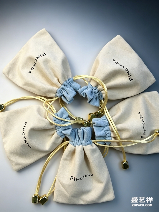
一、中性底色最稳妥。黑、白、灰、米是永远的安全牌。深灰绒布衬钻石显冷艳,米白盒身托彩宝更干净。珠宝盒配色第一法则,是让盒子当配角、珠宝当主角。除非做主题系列,否则少碰高饱和大色块。
二、同色系叠搭出层次。不想太素,就用同色系做深浅渐变——浅灰到深灰、米白到驼色,靠明度差拉出空间感,不靠撞色抢戏。这种思路最不容易出错,也最显贵。
三、小面积撞色做焦点。想制造记忆点,可用小面积对比:墨绿盒配金饰、酒红衬钻、藏蓝托珍珠。记住"九分稳一分跳",撞色面积控制在十分之一以内。彩盒一旦满屏撞色,反而显乱。
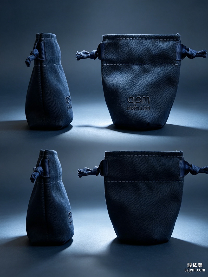
四、跟着节令换主题色。春用嫩绿、夏用冰蓝、秋用琥珀、冬用酒红,节令珠宝包装设计能制造"正当季"的暗示。主题色建议只换盒身与内衬,器型结构不动,成本低、新鲜感足。
五、金属与盒身要呼应。黄金配暖调(驼、棕),白金配冷调(灰、蓝),玫瑰金配藕粉或裸米。金属与首饰盒色彩顺色,整体才"顺眼";逆着搭,再贵的货也显乱。
六、避开两个误区。一是荧光色与珠宝天生相克,显廉价;二是系列混陈时色系必须统一,否则像地摊。定一个珠宝盒主色长期复用,顾客才会形成视觉记忆。
七、留白让色彩呼吸。再高级的配色,塞满也显乱。盒与盒之间、盒与珠宝之间留出呼吸距离,让单只成为视觉焦点。留白不是空,而是用空间替色彩说话——这往往是区分"好盒子"与"堆货"的最后一寸。电商主图尤其如此,一只盒子配一缕留白,比九宫格堆叠更显贵气。
色彩是包装里最便宜的杠杆,也最容易被滥用。守住"中性打底、同色出层次、撞色只点睛、顺色呼应品牌、留白给呼吸"这五条,盒子就能从喧闹变安静、从安静变高级。
本文为原创内容,版权归骏依美所有,如需转载请注明出处。
骏依美——21年专做珠宝包装,让每一件珠宝都被更好地呈现、收纳与珍藏。
Many choose a jewelry box by shape alone, overlooking color — yet the box's own hue often decides the "is it premium" first impression before the customer even opens it. The following pairing ideas help a rounded jewelry box stand out on the shelf without looking cheap.
1. Neutral base is safest. Black, white, grey and beige are forever safe. Deep-grey velvet makes diamonds look cool and sharp; off-white body keeps colored stones clean. The first rule of jewelry box color is to let the box play support and the jewelry play lead. Unless it is a themed series, avoid high-saturation blocks.
2. Monochrome layers build depth. If you want more than plain, use one hue in light-to-dark gradation — light grey to charcoal, off-white to camel — pulling space through value contrast, not clashing colors. This approach rarely goes wrong and always looks expensive.
3. Small-area contrast for focus. To create a memory hook, use small-area contrast: emerald box with gold, wine red under diamonds, navy under pearls. Remember "nine parts calm, one part pop" — keep contrast under a tenth of the area. Once a colored box clashes across the board, it reads messy.
4. Shift theme color with the season. Tender green in spring, ice blue in summer, amber in autumn, wine red in winter — seasonal jewelry packaging design hints "in season right now". Change only body and lining, keep the shape structure, and you get freshness at low cost.
5. Metal and body must rhyme. Yellow gold with warm tones (camel, brown), white gold with cool tones (grey, blue), rose gold with blush or nude beige. When metal and jewelry box color sit in the same family, the whole reads "right"; against the grain, even expensive goods look messy.
6. Avoid two traps. First, neon colors and jewelry are born enemies — they look cheap. Second, when mixing a series, the color system must unify or it reads like a flea market. Set one jewelry box base color and reuse it, so customers form a visual memory.
7. Negative space lets color breathe. Even the finest palette looks messy when crammed. Leave breathing room between boxes and between box and jewel, so each piece becomes a focal point. Negative space is not emptiness — it lets the gap speak for color, and is often the last inch that separates "a good box" from "a pile". This holds especially for e-commerce shots: one box with a sliver of space reads more premium than a nine-grid pile.
Color is the cheapest lever in packaging, and the easiest to misuse. Hold to "neutral ground, monochrome depth, contrast only as accent, metal rhyming with brand, negative space to breathe" and the box moves from noisy to quiet, from quiet to premium.
This is original content. Copyright belongs to Junyimei.
Junyimei — present every jewel at its best.