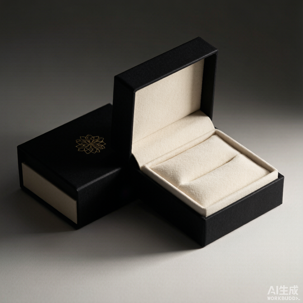
包装出海的本地化 How to Localize Jewelry Packaging for Global Markets
把珠宝卖到海外,盒子不是换个语言那么简单。同一套包装,在纽约和迪拜可能收获两种完全不同的反应——差别往往就藏在颜色、符号与尺寸里。
Q1:出海包装和国内到底差在哪?
最大的变量是文化语义。同一抹红,在中国是喜庆与好运,到了北欧常被解读为警示与激进;白色在西方是纯洁高端,在东亚许多市场却是丧仪之色。除此之外还有三道硬门槛:尺寸与重量(跨境按体积重计费,盒越大运费越贵)、文字与法规标识(金属含量、产地、回收标识强制标注)、以及当地审美偏好(北欧爱极简、东南亚爱浓色繁复)。国际包装协会 2025 年研究指出,78% 的全球消费者会在 90 秒内凭颜色判断一份礼物的价值,所以"看起来对不对"直接决定成交。这也是为什么有品牌宁愿多花一点预算做市场调研,也不愿凭国内经验拍板上色——一次文化误读带来的退货与差评,远比前期调研昂贵。珠宝包装出海,第一步是把"文化适配"列进产品定义,而不是等货到了海外再补救。
Q2:颜色语义最容易踩哪些坑?
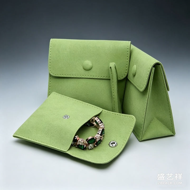 几个高频雷区值得记牢。中东与伊斯兰文化里绿色神圣、象征丰饶与和平,是当地最安全的正向色,而"全黑礼盒"常与哀悼相连、需谨慎;拉美(尤其巴西)紫色代表哀悼,与欧美的"皇室奢华紫"完全相反;南非忌用"红+白"组合,因为近似急救标识。红牛进入中国把银蓝罐换成金红罐并调整配方,正是颜色本地化的典型案例;雀巢 KitKat 在日本用"抹茶绿+奶白"礼盒比竞品多卖 42%,SK-II 用"樱粉+雾白"让 62% 东南亚消费者联想到纯净。反过来,把纽约卖得好的纯白极简盒直接搬去上海,常因白色=丧而表现大跌。结论很直接:出海前先列一张"目标市场色彩红黑榜",比事后改包装便宜得多。
Q3:高端简约为何更受青睐?
老板常强调,高端简约的珠宝首饰品包装设计,更容易被顾客青睐——放到出海场景这条更成立。简约等于更低的跨文化误读风险:一个克制的中性色主盒,比满版民族纹样更难踩雷;Pantone 2025 报告显示"海蓝绿+沙米色"这类低饱和中性组合的识别度比传统红白高 67%。全球统一的主盒语言(同一结构、同一品牌色、同一触感)让分散在多国的门店与电商共用一套资产,省下为每国单独开模的成本;需要本地化时,只在可替换的腰封、卡片、丝带上做文章即可。换言之,外观做减法,反而是最稳的全球化策略。盛艺祥在给海外客户打样时,常先用一套哑光中性主盒验证结构与手感,确认无误再叠加本地化视觉,避免反复重印造成的材料与时间浪费。
Q4:文字与标识怎么不出错?
三件事最容易翻车。其一,金属含量强制标注:销往欧美须在包装标明 925、750、AU750 等成色与"sterling silver"字样,漏标会被清关扣留或罚款;其二,多语文案与阅读方向:中东市场需阿拉伯语且从右往左排版(RTL),欧盟常要求多语并列,机翻错字会被当地消费者当成"山寨";其三,合规与溯源标识:FSC、回收标志、防伪二维码应按目标市场要求印放。建议把"成分+产地+金属含量"做成一个全球通用内页,本地化只叠加语言层,并由珠宝盒定制工厂把字体与套位写进验收单,避免烫金断线、套位偏移这类低级事故。
Q5:尺寸重量与物流也要本地化吗?
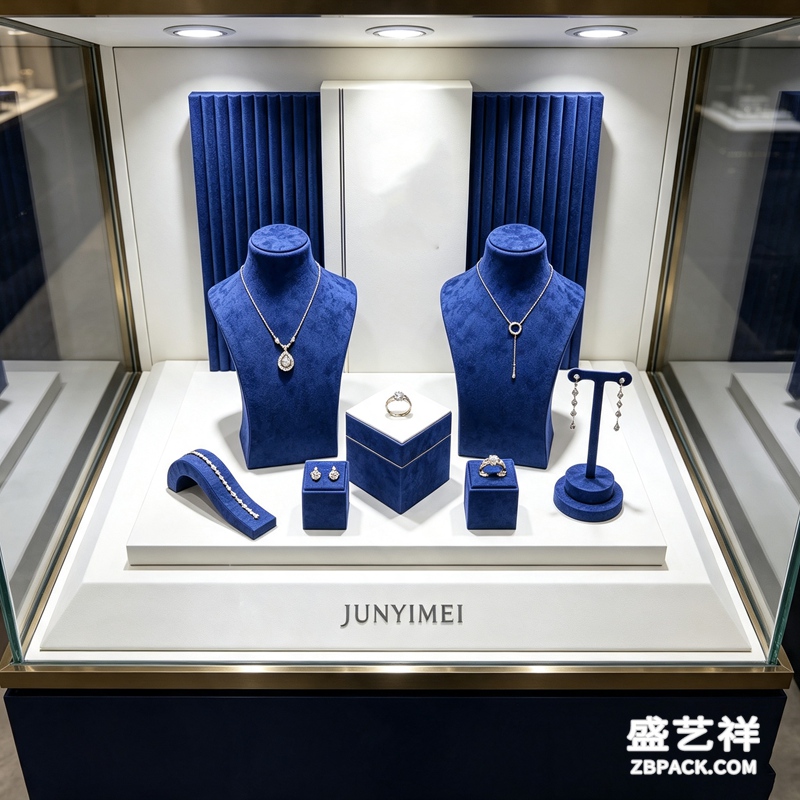 要,而且很值钱。跨境普遍按"体积重"计费,盒内空隙率每高一点,运费就多付一点——许多卖家的运费因过度包装被推高两到三成。欧美消费者偏好略大的"仪式感"礼盒,亚洲市场则更接受紧凑轻巧;此外还要按目的国气候配防潮与防磁:海运到热带高湿地区需加干燥剂与抗硫化片,腕表类更要防磁袋。right-sizing(按真实尺寸定做首饰盒)能把空隙率压到 40% 以下,既降运费又减少运输途中二次碰撞导致的划痕。盛艺祥给出口客户做方案时,常把"盒型常年通用、尺寸按目的国微调"作为第一原则,让包装与珠宝陈列道具、珠宝摆台从一开始就讲同一种视觉语言。对中小出口商来说,先把首饰盒做成"通用尺寸+可调内衬",比每个市场单独开模更划算,也能更快响应零散订单。
Q6:怎样平衡"全球统一"与"本地适配"?
七三开最稳:70% 预算投在能被全球共认的部分——主盒结构、内衬手感、开合阻尼、品牌色与触感语言;30% 留给本地化外挂件(腰封、节日卡、符号贴纸、可换内衬)。先定一条"全球红线"(不可逾越的合规与品牌底线),再在其上做本地层,避免各市场各自为政、最后失去品牌识别。落地时给珠宝盒工厂一份"本地化验收清单":目标市场色彩禁忌、强制标识、语言方向、气候防护,逐项打钩入合同附件。包装、珠宝陈列道具与珠宝摆台本就该说同一套话,而出海之后这套话术还要多带一张"文化翻译表",才能让同一个品牌在每一片市场都显得既地道又统一。
本文为原创内容,版权归盛艺祥所有。如需转载请注明出处。
盛艺祥(Shengyixiang)——高端珠宝包装设计与定制专家,为品牌护航。
Exporting jewelry means rethinking the box, not just the label. The same package can land very differently in New York and Dubai—and the gap is usually in color, symbol and proportion.
Q1: What actually changes when packaging goes abroad?
The biggest variable is cultural semantics. The same red reads as luck and celebration in China but as warning and aggression in parts of Northern Europe; white signals purity and premium in the West yet funeral in much of East Asia. On top of that sit three hard gates: dimensions and volumetric weight (cross-border freight is charged by size, so a bigger box costs more), labeling and compliance (metal content, origin and recycling marks are mandatory), and local aesthetic taste (Scandinavia loves minimalism, Southeast Asia leans to rich color and ornament). The International Packaging Institute's 2025 study found 78% of global consumers judge a gift's value by its color within 90 seconds—so "looking right" decides the sale. Localizing jewelry packaging starts at product definition, not after the goods reach overseas shelves.
Q2: Where do color meanings trip brands up?
A few hotspots recur. Across the Middle East and Islamic cultures green is sacred and the safest positive color, while an all-black box reads close to mourning and needs care; in Latin America, especially Brazil, purple means mourning—the opposite of the Western "royal luxury purple"; South Africa avoids red-and-white because it resembles emergency signage. Red Bull swapped its silver-blue can for gold-red in China and tweaked the formula—a textbook case of color localization; Nestlé's KitKat in "matcha green + milk white" outsold rivals by 42% in Japan, and SK-II's "sakura pink + matte white" made 62% of Southeast Asian consumers think "purity." Reverse it and a minimalist white box that wins in New York underperforms in Shanghai precisely because white equals mourning there. The fix is mundane: build a per-market color red/black list before tooling.
Q3: Why does minimalism win abroad?
The boss often says high-end, simple jewelry packaging design is more favored by customers—and across borders that holds even more. Minimalism means lower cross-cultural misreading risk: a restrained neutral box is far harder to offend than one crowded with local motifs. Pantone's 2025 report found neutral palettes like "ocean teal + sand beige" score 67% higher recognition than traditional red/white. One global master box—same structure, same brand color, same tactile feel—lets stores and e-commerce in many countries share a single asset, saving per-market tooling; localization lives only in swappable belly bands, cards and ribbons. Subtraction on the surface is the safest globalization strategy. Shengyixiang, when prototyping for overseas clients, often validates structure and feel with one matte neutral master box first, then layers the local visuals only after confirmation—avoiding the material and time waste of repeated reprints.
Q4: How do text and markings stay correct?
Three failure points. Metal content must be declared: 925, 750, AU750 and marks like "sterling silver" for the US and EU, or customs holds or fines follow. Multilingual and reading direction matter: the Middle East needs Arabic set right-to-left, the EU often requires parallel languages, and a machine-translation typo reads as "counterfeit" to local buyers. Compliance and traceability marks—FSC, recycling, anti-fake QR—must follow each market's rules. Make a global universal inner page (composition + origin + metal content) and add only a language layer locally; have the custom jewelry box factory put font and registration into the acceptance sheet to avoid broken foil or misregistration.
Q5: Do size, weight and logistics need localization?
Yes, and it pays. Cross-border freight is charged by volumetric weight; every point of void rate raises the bill—many sellers push freight up 20–30% through over-packaging. Western buyers like a slightly larger "ritual" box; Asian markets accept compact and light. Climate also calls for tweaks: desiccant and anti-tarnish tabs for tropical, humid sea freight, magnetic-shield bags for watches. Right-sizing—boxing to the true product size—cuts void rate below 40%, lowering freight and transit scuffing. Shengyixiang advises export clients on "one master box type, dimensions tuned per destination," so the package and the display props and showcase speak one visual language from the start. For smaller exporters, a "universal size + adjustable insert" box beats per-market tooling on both cost and speed to fulfill scattered orders.
Q6: How to balance global uniformity with local fit?
The 70/30 split is safest: 70% into parts recognized everywhere—master structure, lining feel, closure damping, brand color and tactile language; 30% into local add-ons (belly band, festive card, symbol sticker, swap lining). Set a "global red line" (non-negotiable compliance and brand baseline), then build the local layer on top, so markets don't drift apart and lose identity. Hand the factory a localization acceptance list: target-market color taboos, mandatory marks, language direction, climate protection—checked into the contract. Packaging, display props and showcase should speak one language; abroad that playbook just needs a "cultural translation table" so the same brand feels both local and unified in every market.
This is original content. Copyright belongs to Shengyixiang.
Shengyixiang — your expert in high-end jewelry packaging design & customization.