国潮不是贴花纹:珠宝包装的年轻化表达盛艺祥 · 行业资讯
国潮不是贴花纹:珠宝包装的年轻化表达 Guochao Beyond Patterns: A Youthful Take on Jewelry Packaging
当国潮成为年轻人消费的关键词,珠宝包装也迎来了一次表达升级。但不少品牌把国潮理解成在盒子上印个云纹、回字纹就完事,结果图案堆砌、质感掉队。真正的国潮包装,是把文化符号内化为结构与气质,让年轻人愿意为懂我的设计买单。
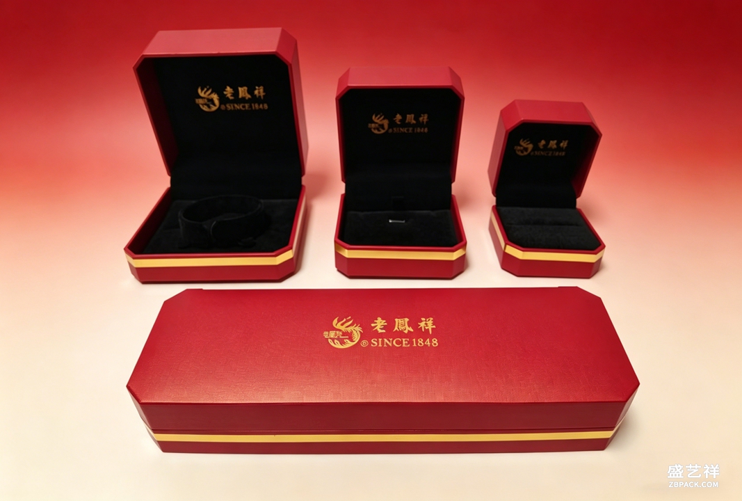 年轻化的第一步,是克制的符号运用。与其满版印花,不如提取一个核心意象,比如一枚印章式卡扣、一道书法笔触的烫金线、一方留白的窗格。符号少而准,反而更显高级,也更容易被社交平台上的开箱镜头记住。过度装饰只会让首饰盒看起来像旅游纪念品。
材质与工艺是国潮落地的硬支撑。植绒内衬配哑光纸盒,能压住纹样的轻飘;局部烫金、击凸、镂空,让传统纹样有了触感层次。对新中式首饰盒来说,纸的肌理、盒的器型往往比图案本身更决定第一印象,选对纸样比多加一层印花更划算。
年轻化的第一步,是克制的符号运用。与其满版印花,不如提取一个核心意象,比如一枚印章式卡扣、一道书法笔触的烫金线、一方留白的窗格。符号少而准,反而更显高级,也更容易被社交平台上的开箱镜头记住。过度装饰只会让首饰盒看起来像旅游纪念品。
材质与工艺是国潮落地的硬支撑。植绒内衬配哑光纸盒,能压住纹样的轻飘;局部烫金、击凸、镂空,让传统纹样有了触感层次。对新中式首饰盒来说,纸的肌理、盒的器型往往比图案本身更决定第一印象,选对纸样比多加一层印花更划算。
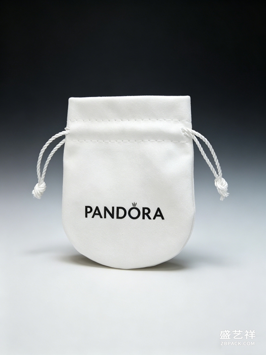 色彩上,年轻化国潮未必非红即金。黛蓝、松绿、月白、黛紫这些低饱和传统色,正在取代高饱和大红大金,成为更耐看的选择。它们既保留东方韵味,又不显老气,配银饰、珍珠或玉饰都显得清爽。色彩做减法,是让国潮包装走向日常的关键一步。
珠宝袋也可以成为国潮表达的轻量入口。抽绳绒布袋上做一小块扎染或刺绣标识,成本可控又能传递态度;随盒附一张可收藏的书法书签或小卡,则把一次购买延伸成一段文化体验。对中小品牌而言,从珠宝袋与随附小物切入,比重做整套盒型更现实。
最后要守住一条线:国潮是手段,不是目的。包装最终要服务于产品与品牌,而非让符号盖过珠宝本身。建议先做小批量打样,把目标客群的审美偏好摸准,再决定纹样、器型与色彩的配比。让国潮真正长在品牌里,珠宝包装才能既年轻、又经得起时间。
本文为原创内容,版权归骏依美所有。如需转载请注明出处。
盛艺祥珠宝包装专注首饰盒与珠宝袋定制,用年轻化设计讲好品牌故事。
This article is original content, copyrighted by Junyimei. Please credit the source for any reprint.
Shengyixiang: jewelry boxes and pouches crafted with youthful, story-driven design.
As guochao becomes a keyword in young consumers' spending, jewelry packaging is also getting an expressive upgrade. Yet many brands reduce guochao to printing a cloud or key-fret pattern on the box, ending up with cluttered graphics and dated texture. Real guochao packaging internalizes cultural symbols into structure and temperament, so young buyers pay for a design that gets them.
The first step to youthfulness is restrained use of symbols. Rather than full-bleed prints, extract one core image — a seal-style clasp, a gilded stroke of calligraphy, a window grid left blank. Few and precise symbols read more premium and are easier to remember on unboxing videos. Over-decoration only makes a jewelry box look like a tourist souvenir.
Material and craft are the hard support for guochao. Flocked lining under a matte paper shell steadies a floating pattern; partial foil, embossing and laser cut give traditional motifs a tactile layer. For new-Chinese-style boxes, the paper's texture and the box's form often decide the first impression more than the print itself — choosing the right paper pays off more than adding another layer of pattern.
In color, youthful guochao need not be red or gold. Low-saturation traditional tones — indigo blue, pine green, moon white, violet — are replacing saturated red and gold as the more enduring choice. They keep an eastern flavor without looking old, and pair cleanly with silver, pearls or jade. Subtracting color is the key step that brings guochao packaging into everyday life.
The jewelry pouch can be a light entry point for guochao. A small tie-dye or embroidered mark on a drawstring velvet pouch controls cost while signaling attitude; a collectible calligraphy bookmark or card inside extends one purchase into a cultural moment. For smaller brands, starting from pouches and enclosures is more realistic than reworking the whole box.
Finally, hold one line: guochao is a means, not an end. Packaging must serve the product and brand, not let symbols overshadow the jewelry. Make small pilot batches first, learn the target audience's taste, then decide the ratio of motif, form and color. Let guochao grow inside the brand, and jewelry packaging stays both young and timeless.
This article is original content, copyrighted by Junyimei. Please credit the source for any reprint.
Shengyixiang: jewelry boxes and pouches crafted with youthful, story-driven design.
色彩上,年轻化国潮未必非红即金。黛蓝、松绿、月白、黛紫这些低饱和传统色,正在取代高饱和大红大金,成为更耐看的选择。它们既保留东方韵味,又不显老气,配银饰、珍珠或玉饰都显得清爽。色彩做减法,是让国潮包装走向日常的关键一步。
珠宝袋也可以成为国潮表达的轻量入口。抽绳绒布袋上做一小块扎染或刺绣标识,成本可控又能传递态度;随盒附一张可收藏的书法书签或小卡,则把一次购买延伸成一段文化体验。对中小品牌而言,从珠宝袋与随附小物切入,比重做整套盒型更现实。
最后要守住一条线:国潮是手段,不是目的。包装最终要服务于产品与品牌,而非让符号盖过珠宝本身。建议先做小批量打样,把目标客群的审美偏好摸准,再决定纹样、器型与色彩的配比。让国潮真正长在品牌里,珠宝包装才能既年轻、又经得起时间。
本文为原创内容,版权归骏依美所有。如需转载请注明出处。
盛艺祥珠宝包装专注首饰盒与珠宝袋定制,用年轻化设计讲好品牌故事。
This article is original content, copyrighted by Junyimei. Please credit the source for any reprint.
Shengyixiang: jewelry boxes and pouches crafted with youthful, story-driven design.
As guochao becomes a keyword in young consumers' spending, jewelry packaging is also getting an expressive upgrade. Yet many brands reduce guochao to printing a cloud or key-fret pattern on the box, ending up with cluttered graphics and dated texture. Real guochao packaging internalizes cultural symbols into structure and temperament, so young buyers pay for a design that gets them.
The first step to youthfulness is restrained use of symbols. Rather than full-bleed prints, extract one core image — a seal-style clasp, a gilded stroke of calligraphy, a window grid left blank. Few and precise symbols read more premium and are easier to remember on unboxing videos. Over-decoration only makes a jewelry box look like a tourist souvenir.
Material and craft are the hard support for guochao. Flocked lining under a matte paper shell steadies a floating pattern; partial foil, embossing and laser cut give traditional motifs a tactile layer. For new-Chinese-style boxes, the paper's texture and the box's form often decide the first impression more than the print itself — choosing the right paper pays off more than adding another layer of pattern.
In color, youthful guochao need not be red or gold. Low-saturation traditional tones — indigo blue, pine green, moon white, violet — are replacing saturated red and gold as the more enduring choice. They keep an eastern flavor without looking old, and pair cleanly with silver, pearls or jade. Subtracting color is the key step that brings guochao packaging into everyday life.
The jewelry pouch can be a light entry point for guochao. A small tie-dye or embroidered mark on a drawstring velvet pouch controls cost while signaling attitude; a collectible calligraphy bookmark or card inside extends one purchase into a cultural moment. For smaller brands, starting from pouches and enclosures is more realistic than reworking the whole box.
Finally, hold one line: guochao is a means, not an end. Packaging must serve the product and brand, not let symbols overshadow the jewelry. Make small pilot batches first, learn the target audience's taste, then decide the ratio of motif, form and color. Let guochao grow inside the brand, and jewelry packaging stays both young and timeless.
This article is original content, copyrighted by Junyimei. Please credit the source for any reprint.
Shengyixiang: jewelry boxes and pouches crafted with youthful, story-driven design.
返回资讯列表
Back To News List
年轻化的第一步,是克制的符号运用。与其满版印花,不如提取一个核心意象,比如一枚印章式卡扣、一道书法笔触的烫金线、一方留白的窗格。符号少而准,反而更显高级,也更容易被社交平台上的开箱镜头记住。过度装饰只会让首饰盒看起来像旅游纪念品。
材质与工艺是国潮落地的硬支撑。植绒内衬配哑光纸盒,能压住纹样的轻飘;局部烫金、击凸、镂空,让传统纹样有了触感层次。对新中式首饰盒来说,纸的肌理、盒的器型往往比图案本身更决定第一印象,选对纸样比多加一层印花更划算。
色彩上,年轻化国潮未必非红即金。黛蓝、松绿、月白、黛紫这些低饱和传统色,正在取代高饱和大红大金,成为更耐看的选择。它们既保留东方韵味,又不显老气,配银饰、珍珠或玉饰都显得清爽。色彩做减法,是让国潮包装走向日常的关键一步。
珠宝袋也可以成为国潮表达的轻量入口。抽绳绒布袋上做一小块扎染或刺绣标识,成本可控又能传递态度;随盒附一张可收藏的书法书签或小卡,则把一次购买延伸成一段文化体验。对中小品牌而言,从珠宝袋与随附小物切入,比重做整套盒型更现实。
最后要守住一条线:国潮是手段,不是目的。包装最终要服务于产品与品牌,而非让符号盖过珠宝本身。建议先做小批量打样,把目标客群的审美偏好摸准,再决定纹样、器型与色彩的配比。让国潮真正长在品牌里,珠宝包装才能既年轻、又经得起时间。
本文为原创内容,版权归骏依美所有。如需转载请注明出处。
盛艺祥珠宝包装专注首饰盒与珠宝袋定制,用年轻化设计讲好品牌故事。
This article is original content, copyrighted by Junyimei. Please credit the source for any reprint.
Shengyixiang: jewelry boxes and pouches crafted with youthful, story-driven design.
As guochao becomes a keyword in young consumers' spending, jewelry packaging is also getting an expressive upgrade. Yet many brands reduce guochao to printing a cloud or key-fret pattern on the box, ending up with cluttered graphics and dated texture. Real guochao packaging internalizes cultural symbols into structure and temperament, so young buyers pay for a design that gets them.
The first step to youthfulness is restrained use of symbols. Rather than full-bleed prints, extract one core image — a seal-style clasp, a gilded stroke of calligraphy, a window grid left blank. Few and precise symbols read more premium and are easier to remember on unboxing videos. Over-decoration only makes a jewelry box look like a tourist souvenir.
Material and craft are the hard support for guochao. Flocked lining under a matte paper shell steadies a floating pattern; partial foil, embossing and laser cut give traditional motifs a tactile layer. For new-Chinese-style boxes, the paper's texture and the box's form often decide the first impression more than the print itself — choosing the right paper pays off more than adding another layer of pattern.
In color, youthful guochao need not be red or gold. Low-saturation traditional tones — indigo blue, pine green, moon white, violet — are replacing saturated red and gold as the more enduring choice. They keep an eastern flavor without looking old, and pair cleanly with silver, pearls or jade. Subtracting color is the key step that brings guochao packaging into everyday life.
The jewelry pouch can be a light entry point for guochao. A small tie-dye or embroidered mark on a drawstring velvet pouch controls cost while signaling attitude; a collectible calligraphy bookmark or card inside extends one purchase into a cultural moment. For smaller brands, starting from pouches and enclosures is more realistic than reworking the whole box.
Finally, hold one line: guochao is a means, not an end. Packaging must serve the product and brand, not let symbols overshadow the jewelry. Make small pilot batches first, learn the target audience's taste, then decide the ratio of motif, form and color. Let guochao grow inside the brand, and jewelry packaging stays both young and timeless.
This article is original content, copyrighted by Junyimei. Please credit the source for any reprint.
Shengyixiang: jewelry boxes and pouches crafted with youthful, story-driven design.