用一抹主色串起整条产品线:珠宝包装的视觉一致性盛艺祥 · 行业资讯
用一抹主色串起整条产品线:珠宝包装的视觉一致性 One Key Color Across the Line: Visual Consistency in Jewelry Packaging
一个珠宝品牌给人"整齐、靠谱"的第一印象,往往不是靠某一只盒子多华丽,而是整条产品线的包装看起来像"一家人"。把品牌主色贯穿到首饰盒、珠宝袋和礼盒上,就是最朴素的视觉一致性做法,也是成本最低的品牌识别投资。
很多品牌起步时随手选色:这款用酒红、那款用墨绿、再过季又换米金,结果柜台上一排盒子各说各话,顾客记不住你是谁。珠宝包装视觉一致性要做的,是先定一两个主色,让它们出现在每一只盒子的烫金、内衬滚边或封套上,形成稳定的视觉锤。
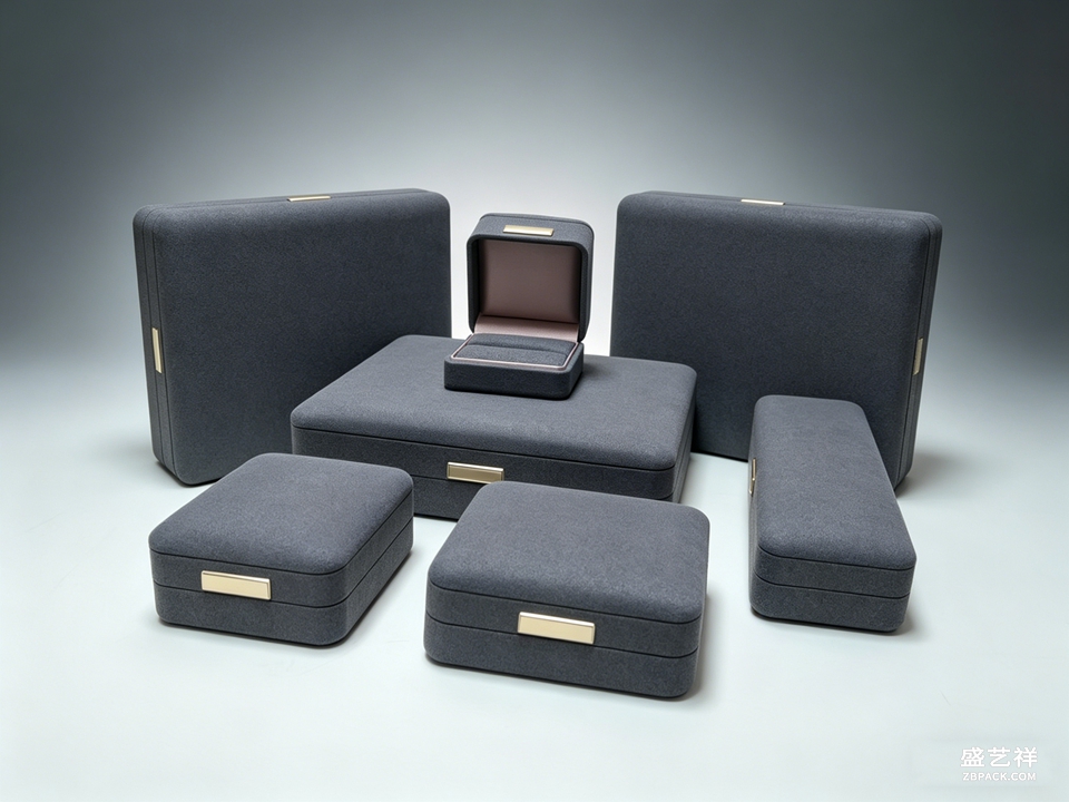 主色不一定是大面积铺满。小批量定制时,更稳妥的做法是"留白加一点主色":盒子主体走中性色,只在品牌标识、内衬面料或丝带位置点一抹主色。这样既控制了印刷与工艺成本,又让首饰盒主色成为可识别的记忆点,不影响珠宝本身当主角。
跨品类也要守住同一套色。首饰盒、珠宝袋、礼盒虽然器型不同,但只要共用那组主色和同一种烫金质感,顾客拿到任意一件都能认出品牌。包装品牌识别不靠大声喊,而靠每一次拆封都在重复同一句话。
主色不一定是大面积铺满。小批量定制时,更稳妥的做法是"留白加一点主色":盒子主体走中性色,只在品牌标识、内衬面料或丝带位置点一抹主色。这样既控制了印刷与工艺成本,又让首饰盒主色成为可识别的记忆点,不影响珠宝本身当主角。
跨品类也要守住同一套色。首饰盒、珠宝袋、礼盒虽然器型不同,但只要共用那组主色和同一种烫金质感,顾客拿到任意一件都能认出品牌。包装品牌识别不靠大声喊,而靠每一次拆封都在重复同一句话。
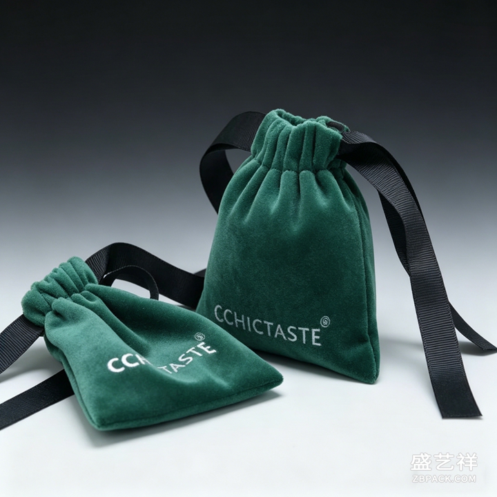 落地时建议先做一套色彩规范:主色、辅助色、禁用色各列清楚,交给打样厂时一并附上色号。这样无论哪批货、哪个季节,出来的盒子都不会偏色跑调。用一抹主色把产品线串起来,品牌感就立住了,而代价只是一份写清楚的规范。
主色也讲究"新旧呼应"。老顾客认得的那一抹色,不要因为追流行就丢掉;新系列可以在不改变主色的前提下,用辅助色做小变化,既新鲜又不陌生。打样阶段就要校色,屏幕上的红和印刷出来的红常差一截,务必拿实物色卡对着看,确认烫金和纸面的结合效果,避免大货出来才发现有偏差。
别忘了包装之外的触点。手提袋、保修卡、封口贴都沿用同一主色,拆箱体验才连贯;顾客带出去的每一个细节,都是一次无声的品牌曝光。小品牌更该守色,预算有限时,统一的色彩反而是最省钱的"高级感"来源,因为它不需要昂贵材质,只靠纪律就能让产品看起来成体系。
本文为原创内容,版权归骏依美所有。如需转载请注明出处。
盛艺祥珠宝包装,专注首饰盒与珠宝袋定制,以工厂实力为品牌守住每一份体面。
A jewelry brand's first impression of being "tidy and trustworthy" rarely comes from one gorgeous box—it comes from the whole product line looking like one family. Carrying the brand key color across jewelry boxes, pouches and gift cases is the simplest move toward visual consistency, and the cheapest investment in brand recognition.
Many brands pick colors on a whim at the start: this style in wine red, that one in forest green, next season in cream gold—so a row of boxes on the counter each says something different and the customer can't remember who you are. Visual consistency in jewelry packaging means first fixing one or two key colors, then letting them appear on the foil, the lining trim or the sleeve of every box, building a steady visual hammer.
The key color need not be a big area. For small-batch custom work, the safer play is "neutral base plus a touch of key color": keep the box body neutral and drop the key color only on the logo, the lining fabric or the ribbon. This controls print and finish cost while making the box's key color a recognizable memory point, without stealing the spotlight from the jewelry.
Hold the same palette across categories. Boxes, pouches and gift cases differ in form, but sharing that key-color set and the same foil texture lets a customer recognize the brand from any single piece. Brand recognition in packaging doesn't shout—it repeats the same sentence at every unboxing.
In production, start with a color spec: list key, secondary and banned colors with codes, and hand the Pantone numbers to the sampling factory. Then no batch, no season, drifts in hue. String the line together with one key color and the brand feel stands—at the cost of a clear written spec.
This article is original; copyright belongs to JunyiMei. Reproduction requires attribution.
Shengyixiang packages jewelry with custom boxes and pouches—factory-grade quality that protects your brand.
落地时建议先做一套色彩规范:主色、辅助色、禁用色各列清楚,交给打样厂时一并附上色号。这样无论哪批货、哪个季节,出来的盒子都不会偏色跑调。用一抹主色把产品线串起来,品牌感就立住了,而代价只是一份写清楚的规范。
主色也讲究"新旧呼应"。老顾客认得的那一抹色,不要因为追流行就丢掉;新系列可以在不改变主色的前提下,用辅助色做小变化,既新鲜又不陌生。打样阶段就要校色,屏幕上的红和印刷出来的红常差一截,务必拿实物色卡对着看,确认烫金和纸面的结合效果,避免大货出来才发现有偏差。
别忘了包装之外的触点。手提袋、保修卡、封口贴都沿用同一主色,拆箱体验才连贯;顾客带出去的每一个细节,都是一次无声的品牌曝光。小品牌更该守色,预算有限时,统一的色彩反而是最省钱的"高级感"来源,因为它不需要昂贵材质,只靠纪律就能让产品看起来成体系。
本文为原创内容,版权归骏依美所有。如需转载请注明出处。
盛艺祥珠宝包装,专注首饰盒与珠宝袋定制,以工厂实力为品牌守住每一份体面。
A jewelry brand's first impression of being "tidy and trustworthy" rarely comes from one gorgeous box—it comes from the whole product line looking like one family. Carrying the brand key color across jewelry boxes, pouches and gift cases is the simplest move toward visual consistency, and the cheapest investment in brand recognition.
Many brands pick colors on a whim at the start: this style in wine red, that one in forest green, next season in cream gold—so a row of boxes on the counter each says something different and the customer can't remember who you are. Visual consistency in jewelry packaging means first fixing one or two key colors, then letting them appear on the foil, the lining trim or the sleeve of every box, building a steady visual hammer.
The key color need not be a big area. For small-batch custom work, the safer play is "neutral base plus a touch of key color": keep the box body neutral and drop the key color only on the logo, the lining fabric or the ribbon. This controls print and finish cost while making the box's key color a recognizable memory point, without stealing the spotlight from the jewelry.
Hold the same palette across categories. Boxes, pouches and gift cases differ in form, but sharing that key-color set and the same foil texture lets a customer recognize the brand from any single piece. Brand recognition in packaging doesn't shout—it repeats the same sentence at every unboxing.
In production, start with a color spec: list key, secondary and banned colors with codes, and hand the Pantone numbers to the sampling factory. Then no batch, no season, drifts in hue. String the line together with one key color and the brand feel stands—at the cost of a clear written spec.
This article is original; copyright belongs to JunyiMei. Reproduction requires attribution.
Shengyixiang packages jewelry with custom boxes and pouches—factory-grade quality that protects your brand.
返回资讯列表
Back To News List
主色不一定是大面积铺满。小批量定制时,更稳妥的做法是"留白加一点主色":盒子主体走中性色,只在品牌标识、内衬面料或丝带位置点一抹主色。这样既控制了印刷与工艺成本,又让首饰盒主色成为可识别的记忆点,不影响珠宝本身当主角。
跨品类也要守住同一套色。首饰盒、珠宝袋、礼盒虽然器型不同,但只要共用那组主色和同一种烫金质感,顾客拿到任意一件都能认出品牌。包装品牌识别不靠大声喊,而靠每一次拆封都在重复同一句话。
落地时建议先做一套色彩规范:主色、辅助色、禁用色各列清楚,交给打样厂时一并附上色号。这样无论哪批货、哪个季节,出来的盒子都不会偏色跑调。用一抹主色把产品线串起来,品牌感就立住了,而代价只是一份写清楚的规范。
主色也讲究"新旧呼应"。老顾客认得的那一抹色,不要因为追流行就丢掉;新系列可以在不改变主色的前提下,用辅助色做小变化,既新鲜又不陌生。打样阶段就要校色,屏幕上的红和印刷出来的红常差一截,务必拿实物色卡对着看,确认烫金和纸面的结合效果,避免大货出来才发现有偏差。
别忘了包装之外的触点。手提袋、保修卡、封口贴都沿用同一主色,拆箱体验才连贯;顾客带出去的每一个细节,都是一次无声的品牌曝光。小品牌更该守色,预算有限时,统一的色彩反而是最省钱的"高级感"来源,因为它不需要昂贵材质,只靠纪律就能让产品看起来成体系。
本文为原创内容,版权归骏依美所有。如需转载请注明出处。
盛艺祥珠宝包装,专注首饰盒与珠宝袋定制,以工厂实力为品牌守住每一份体面。
A jewelry brand's first impression of being "tidy and trustworthy" rarely comes from one gorgeous box—it comes from the whole product line looking like one family. Carrying the brand key color across jewelry boxes, pouches and gift cases is the simplest move toward visual consistency, and the cheapest investment in brand recognition.
Many brands pick colors on a whim at the start: this style in wine red, that one in forest green, next season in cream gold—so a row of boxes on the counter each says something different and the customer can't remember who you are. Visual consistency in jewelry packaging means first fixing one or two key colors, then letting them appear on the foil, the lining trim or the sleeve of every box, building a steady visual hammer.
The key color need not be a big area. For small-batch custom work, the safer play is "neutral base plus a touch of key color": keep the box body neutral and drop the key color only on the logo, the lining fabric or the ribbon. This controls print and finish cost while making the box's key color a recognizable memory point, without stealing the spotlight from the jewelry.
Hold the same palette across categories. Boxes, pouches and gift cases differ in form, but sharing that key-color set and the same foil texture lets a customer recognize the brand from any single piece. Brand recognition in packaging doesn't shout—it repeats the same sentence at every unboxing.
In production, start with a color spec: list key, secondary and banned colors with codes, and hand the Pantone numbers to the sampling factory. Then no batch, no season, drifts in hue. String the line together with one key color and the brand feel stands—at the cost of a clear written spec.
This article is original; copyright belongs to JunyiMei. Reproduction requires attribution.
Shengyixiang packages jewelry with custom boxes and pouches—factory-grade quality that protects your brand.