色彩触感藏价值 How Color and Texture Shape Perceived Jewelry Value
在珠宝门店里,顾客往往在打开盒子之前,就已经对这件首饰的"身价"下了判断。这个判断,七成以上来自包装的颜色与触感——而不是价格标签。
一、包装颜色真的会影响顾客掏钱吗?
会,而且影响比多数品牌想象的更大。Adobe 2025 年品牌色彩调研显示,50% 的消费者仅因为配色方案就选择过一个品牌,42% 的冲动购买直接由货架上的色彩线索触发;德国 POSpulse 2025 购物者研究进一步指出,68% 的德国消费者确认包装色彩显著左右购买决策。UGW《2025 POS 营销报告》则给出更直接的商业结论:协调的卖场色彩方案平均可提升 38% 的购买意愿。Anandakumar 等 2025 年的对照实验也印证了这点:相同产品换上更讨喜的包装时,77.5% 的受试者会稳定地选"包装更好看"的那一款,即便它并非更优选项。色彩,是珠宝成交前最廉价的心理杠杆。
二、为什么高端珠宝盒偏爱黑、金、酒红这些"克制色"?
因为每一种颜色都在替品牌说一句话。HAW Hamburg 2025 的研究里,48% 的受访者把黑色包装与"奢华、 exclusivity"直接挂钩;金/银色天然指向贵重与匠心,深蓝传递信任(与蓝宝石、坦桑石品类高度契合),酒红与勃艮第则象征热情与典藏。白与象牙是婚嫁与极简品牌的底色,而近年崛起的森绿、牛皮棕则在讲"可持续"的故事。Tiffany 的知更鸟蓝、Cartier 的深红,都是把单一颜色做成品牌资产的例子。对珠宝包装设计而言,选色不是审美偏好,而是给顾客预设一个情绪入口。
三、触感(植绒、皮革、纸纹)对"贵"的感觉有多大?
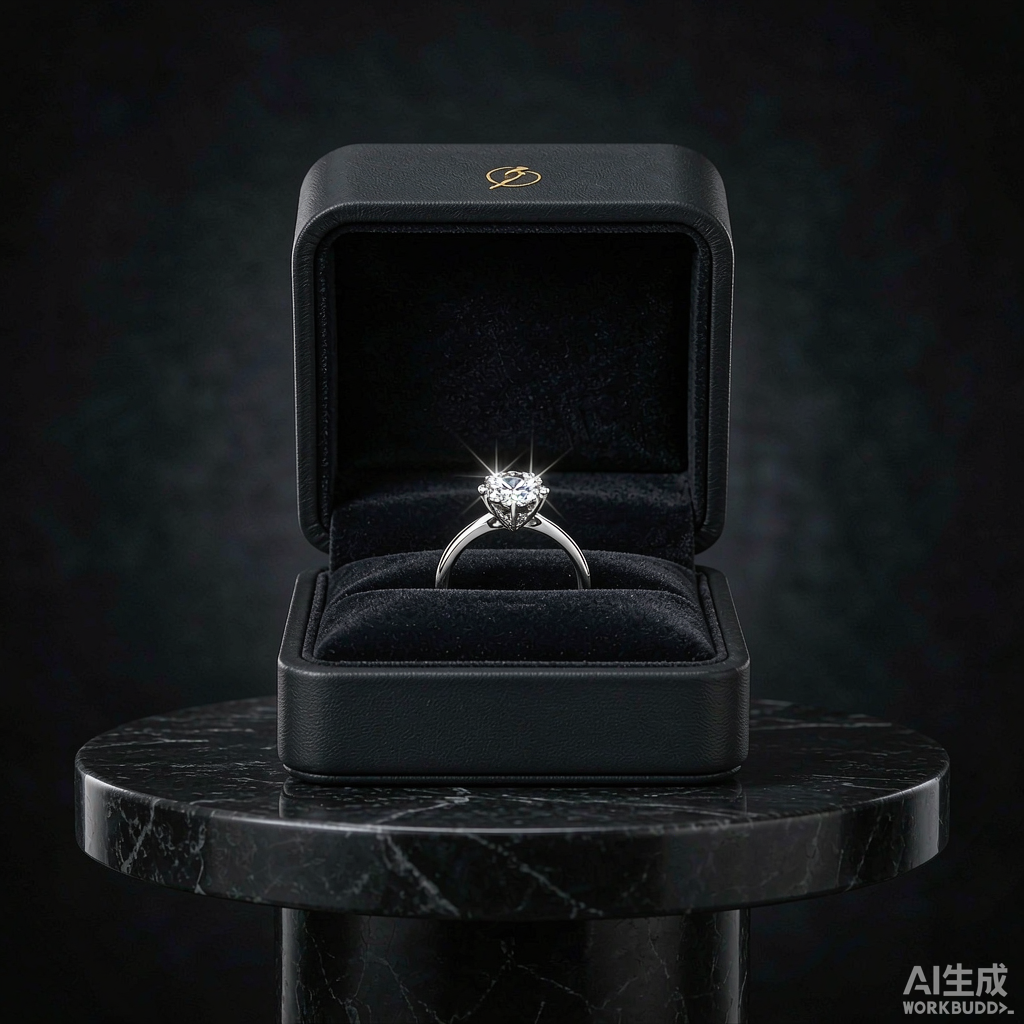
触感可能是所有感官里最被低估的一项。牛津大学 Crossmodal 实验室 2023 年的研究指出,在奢侈品评估中,触觉是比视觉、听觉、嗅觉更具影响力的单一感官输入;同一件产品放进织物包覆的包装,被评定的"高级感"比硬纸板包装高出 27%。Bain《2025 全球奢侈品报告》也印证了这股转向:自 2022 年以来,68% 的奢侈品牌已在产品线中引入或扩大了织物包覆包装。Luxury Institute 2024 的包装感知调研更具体:植绒首饰盒在"产品价值感"上比普通软触膜高出 34%、在"赠礼意愿"上高出 41%。Peck 与 Childers 在《消费者研究杂志》的结论也一致——人一旦触摸到带纹理的表面,会对产品产生更强的情感依附与评估信心。一枚戒指躺在植绒首饰盒里,手先替大脑做了"值得"的判断。
四、哑光还是亮面,哪种更显高级?
哑光(soft-touch)正在成为高端的默认语言。神经消费研究表明,圆润、柔软、哑光的表面会让人联想到"温和、高级、有机"(即所谓的 Bouba-Kiki 效应),而冷硬、高光的塑料感则偏向"廉价、工业"。Chanel、Tom Ford 的许多礼盒都用哑光底+局部金箔,靠"暗与亮""柔与金属"的对比制造视觉张力。成本上软触膜仅比普通膜贵约 0.08–0.20 美元,烫金约 0.25–0.70 美元,是小预算撬动大质感的高性价比杠杆。关键是"克制":一个主色加一个点缀,远比堆砌更显贵。
五、颜色与触感,怎么配合品牌定位与门店?
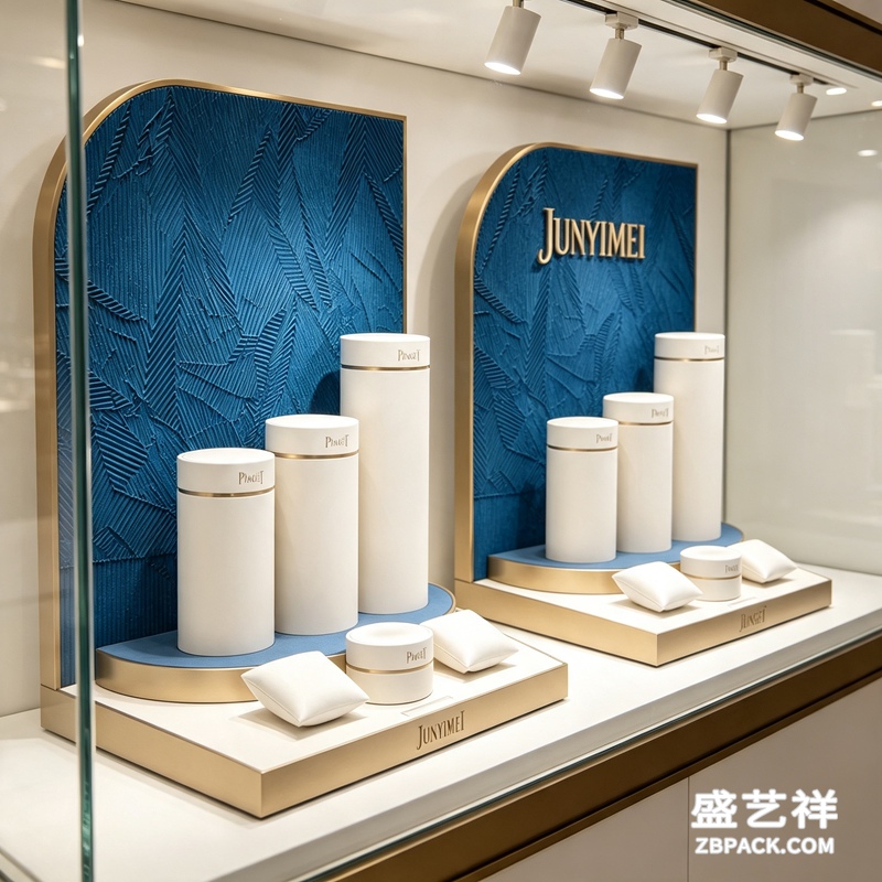
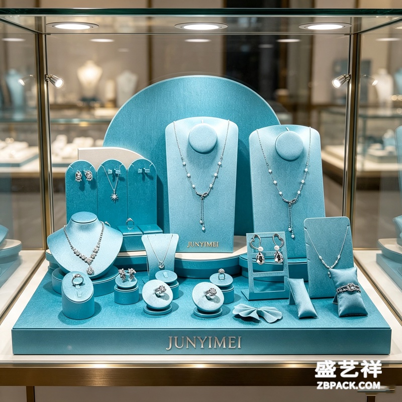
包装的逻辑要延续到卖场。珠宝摆台与珠宝陈列道具同样遵循色彩心理学:深底衬让金属与宝石更出彩,暖白光让红蓝宝更鲜艳,而克制的灰金陈列语言会把"少即是多"的调性从盒子延伸到整条交付动线。这也是盛艺祥在珠宝盒定制与整店陈列方案里坚持的做法——让包装、陈列、空间讲同一个故事。对中小品牌,预算有限时把力气花在"一件对的硬盒、一处烫金 logo、一套统一色系"上,用一致性换识别度更稳妥。
六、颜色与触感用错,会翻车吗?
会,而且很常见。Yiklee Packaging 的奢侈品牌指南提醒:奢侈靠"少",一个包装最好只保留一到两个主色,叠色过多反而稀释高级感。跨文化也要小心——红在亚洲是喜庆、在西方是激情,白在欧洲是纯洁、在东亚部分地区却关联丧仪。印刷上,潘通色差会让同一只盒子显得"廉价"。最稳妥的做法是做小范围 A/B 测试与焦点小组再定型。盛艺祥在对接品牌时,通常先用打样确认触感与色差,再放量,避免上线即翻车。
本文为原创内容,版权归盛艺祥所有。如需转载请注明出处。
盛艺祥(Shengyixiang)——高端珠宝包装设计与定制专家,为品牌护航。
Before a customer ever touches the jewel, they have already judged its worth — and that judgment is made, more than half the time, by the color and texture of the box it comes in.
1. Does packaging color really change what people buy?
Yes, and by more than most brands expect. Adobe's 2025 color survey found that 50% of consumers had chosen a brand purely because of its color scheme, and 42% of impulse purchases were triggered by color cues on the shelf. The POSpulse Shopper Study 2025 (Germany) reports that 68% of shoppers confirm packaging color significantly shapes their buying decision; blue, separately, instils a sense of trust in 56% of consumers. The UGW POS Marketing Report 2025 adds a hard business number: well-coordinated point-of-sale color schemes lift purchase intent by an average of 38%. Anandakumar et al. (2025) showed in a controlled experiment that when an identical product was placed in more appealing packaging, 77.5% of respondents consistently picked the better-wrapped version, even though it was not the superior option. Color is the cheapest psychological lever a jewelry brand owns.
2. Why do luxury jewelry boxes favor black, gold and deep red?
Because every hue is a sentence the brand speaks before a word is said. In HAW Hamburg's 2025 work, 48% of respondents linked black packaging to luxury and exclusivity; gold and silver signal preciousness and craft; deep blue builds trust (and pairs naturally with sapphire or tanzanite categories); burgundy and wine-red suggest passion and collectability. White and ivory are the canvas of bridal and minimalist lines, while the rising earthy greens and kraft browns tell a sustainability story. Tiffany's robin-egg blue and Cartier's deep red are textbook cases of turning a single color into brand equity. In jewelry packaging design, color choice is not taste — it is the emotional doorway you set for the customer.
3. How much does touch (velvet, leather, paper grain) add to perceived value?
Touch may be the most underrated sense in the room. Oxford's Crossmodal Research Laboratory (2023) found that in luxury assessment, touch is the single most influential sensory input — ahead of sight, sound or smell — and that the same product in fabric-wrapped packaging was rated 27% more premium than in rigid paperboard. The mechanism is what psychologists call haptic transfer: when a hand meets a soft, quality surface, the brain attributes that quality to the product inside. Bain's Global Luxury Report 2025 confirms the shift: since 2022, 68% of luxury brands have introduced or expanded textile-wrapped packaging. The Luxury Institute's 2024 packaging perception survey is even more specific — a velvet jewelry box scored +34% on perceived product value and +41% on giftworthiness versus a standard soft-touch laminate. Peck and Childers (Journal of Consumer Research) reach the same conclusion: once a hand meets a textured surface, it forms stronger emotional attachment and greater confidence in evaluating the product. A ring resting in a velvet jewelry box lets the hand decide "worth it" before the eyes do.
4. Matte or glossy — which reads as more premium?
Matte (soft-touch) has become the default language of high-end. Neuromarketing studies describe the Bouba-Kiki effect: rounded, soft, matte surfaces are associated with "gentle, premium, organic," while cold, glossy plastic reads as cheap and industrial. Chanel and Tom Ford lean on a matte base with spot gold foil, creating tension between dull and metallic. On cost, a soft-touch laminate adds only about $0.08-0.20 per unit over standard film and foil stamping $0.25-0.70 — a high-leverage, low-budget upgrade. The rule is restraint: one primary color plus one accent beats clutter every time.
5. How should color and texture align with brand and store?
The logic of the box must carry into the shop floor. Jewelry display props and the jewelry display stand follow the same color psychology: dark liners make metal and stones pop, warm-white light makes rubies and sapphires glow, and a restrained grey-gold display language extends the "less is more" tone from the box to the entire delivery journey. The same principle applies to weight — a denser, rigid box reads as investment, while a light, hollow one signals disposable. This is exactly the discipline Shengyixiang applies across custom jewelry box programs and full-store display schemes — packaging, props and space tell one story. For smaller brands on a tight budget, spend on one right structural box from a reliable jewelry box factory, one foiled logo and one consistent color system; consistency buys recognition more reliably than chasing trends.
6. Can color and texture backfire?
They can, and often do. Yiklee Packaging's luxury guide warns that luxury lives on restraint — keep one or two key tones, because piling on colors dilutes prestige. Culture matters too: red means celebration in Asia but passion in the West; white means purity in Europe yet mourning in parts of East Asia. In printing, a Pantone mismatch can make the same box look cheap. The safe move is small A/B tests and focus groups before locking a design. When Shengyixiang onboards a brand, it typically proofs the texture and color first, then scales — avoiding an expensive launch-day misfire.
This is original content. Copyright belongs to Shengyixiang.
Shengyixiang — your expert in high-end jewelry packaging design & customization.