留白给盒子:中性色首饰盒与珠宝袋的打底法盛艺祥 · 行业资讯
留白给盒子:中性色首饰盒与珠宝袋的打底法 Let the Box Breathe: Neutral Tones for Jewelry Boxes and Pouches
包装的第一眼,往往决定顾客对品牌档次的下意识判断。在琳琅满目的珠宝包装里,最不容易出错、也最容易显高级的,其实是中性色——黑、白、灰,以及米、驼、裸色这类低饱和的安静色。它们不像高饱和色那样抢戏,却能让盒子里的珠宝自己成为主角。
中性色打底的核心逻辑是退后一步。当首饰盒的外壳与内衬都采用低饱和的中性调,视觉重心会自然落到珠宝本身的光泽与造型上。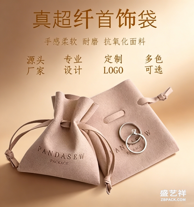 一只裸色的绒布珠宝袋,配一枚金戒,金色的贵气反而被衬得更干净;反之若袋子用了大红大绿,注意力就被包装抢走了。中性色不是没有性格,而是把性格让给了内容物。
在材质搭配上,中性色给了设计师更大的自由度。同一只米白天地盖盒,可以配哑光皮革、配缎面内衬,也可以配细纹特种纸,质感走向完全不同却都稳妥。
一只裸色的绒布珠宝袋,配一枚金戒,金色的贵气反而被衬得更干净;反之若袋子用了大红大绿,注意力就被包装抢走了。中性色不是没有性格,而是把性格让给了内容物。
在材质搭配上,中性色给了设计师更大的自由度。同一只米白天地盖盒,可以配哑光皮革、配缎面内衬,也可以配细纹特种纸,质感走向完全不同却都稳妥。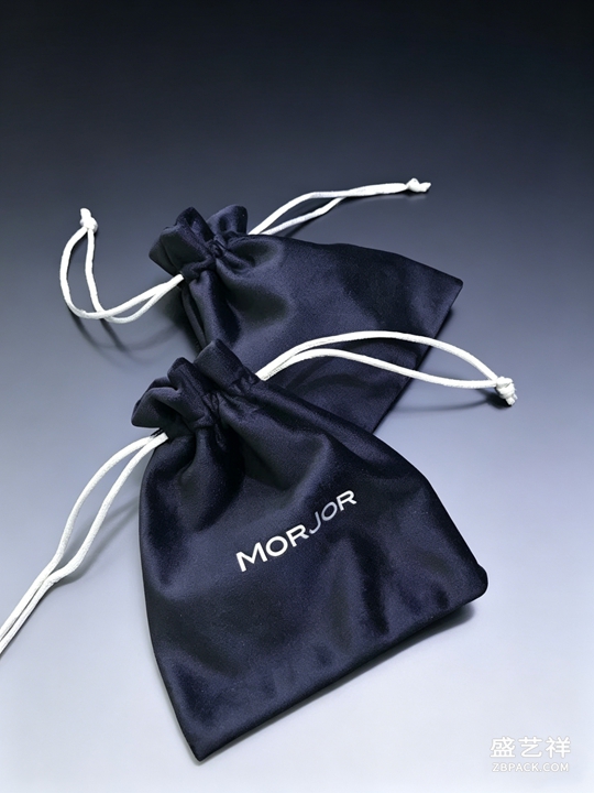 这种百搭特性,让品牌在做系列延伸时不必每次重写色彩体系,只要守住中性基底,再点缀一抹品牌主色,就能既统一又有识别度。
当然中性色也有讲究。太冷太硬的纯灰容易显廉价,适当加入一点暖调(如米、驼)会更亲和;大面积纯黑需要靠材质纹理避免沉闷。真正考究的中性色包装,赢在比例的克制与材质的克制——少一笔杂乱,多一分体面。对于走轻奢与日常通勤定位的品牌,中性色几乎是稳妥又不失格调的默认答案。
中性色的另一个好处是季节适应力强。高饱和的流行色往往一季就过时,而米、灰、驼这类基底色常年站得住脚,品牌只需在节庆时换一抹点缀色,就能既应景又不破坏整体调性。对中小品牌尤其友好:一套中性基底的包装体系,可以服务多条产品线,降低打样与备货的复杂度。把克制做成体系,比追逐每一个潮流更长久,也更能沉淀出属于自己的安静高级感。
从开箱体验看,中性色也更经得起镜头与手感的双重检验。顾客拆开盒子时,低饱和的外壳不会在第一眼就制造刺激,反而把期待留给里面的珠宝;指尖触到哑光或缎面的内衬,体感的温润又悄悄补足了视觉的安静。这种由外到内的从容,正是轻奢定位想传递的情绪价值。若品牌还想加点记忆点,不妨在盒内烫印一枚极小的标识,于不喧哗处留下身份,让中性色的体面不止于好看,更能被记住。
本文为原创内容,版权归骏依美所有。如需转载请注明出处。
骏依美珠宝盒与首饰袋,以精致工艺与克制设计守护每份礼赠的体面与温度。
The first glance at packaging quietly decides how a customer grades a brand. Among the noisy world of jewelry packaging, the safest and most reliably premium choice is often the neutral palette — black, white, grey, plus low-saturation quiet tones like beige, camel and nude. Unlike high-saturation colors, they don't fight for the spotlight; they let the jewel inside become the hero.
The core logic of neutral backing is to step back. When both the shell and the lining of a jewelry box take low-saturation neutrals, the visual weight naturally shifts to the jewel's shine and form. A nude velvet pouch with a gold ring makes the gold's richness read cleaner; switch the pouch to loud red or green and attention hijacks the packaging. Neutral is not without character — it simply hands the character to its contents.
In material pairing, neutrals give designers far more freedom. The same ivory two-piece box can carry matte leather, satin lining or finely textured specialty paper, each reading completely different yet always safe. This goes-with-everything quality means a brand can extend a series without rewriting its color system every time; hold the neutral base, then dot in one brand key color, and you get both unity and recognition.
Neutrals, of course, have their own craft. A cold, hard pure grey easily looks cheap; a touch of warmth (beige, camel) feels kinder. Large areas of pure black need material texture to avoid flatness. Truly refined neutral packaging wins on restraint of proportion and restraint of material — one less mess, one more dignity. For brands positioned in light luxury and everyday wear, neutral is almost the default answer: safe, and still tasteful.
本文为原创内容,版权归骏依美所有。如需转载请注明出处。
Choose Junyimei jewelry boxes and pouches, where refined craft and restrained design protect the dignity and warmth of every gift you give.
这种百搭特性,让品牌在做系列延伸时不必每次重写色彩体系,只要守住中性基底,再点缀一抹品牌主色,就能既统一又有识别度。
当然中性色也有讲究。太冷太硬的纯灰容易显廉价,适当加入一点暖调(如米、驼)会更亲和;大面积纯黑需要靠材质纹理避免沉闷。真正考究的中性色包装,赢在比例的克制与材质的克制——少一笔杂乱,多一分体面。对于走轻奢与日常通勤定位的品牌,中性色几乎是稳妥又不失格调的默认答案。
中性色的另一个好处是季节适应力强。高饱和的流行色往往一季就过时,而米、灰、驼这类基底色常年站得住脚,品牌只需在节庆时换一抹点缀色,就能既应景又不破坏整体调性。对中小品牌尤其友好:一套中性基底的包装体系,可以服务多条产品线,降低打样与备货的复杂度。把克制做成体系,比追逐每一个潮流更长久,也更能沉淀出属于自己的安静高级感。
从开箱体验看,中性色也更经得起镜头与手感的双重检验。顾客拆开盒子时,低饱和的外壳不会在第一眼就制造刺激,反而把期待留给里面的珠宝;指尖触到哑光或缎面的内衬,体感的温润又悄悄补足了视觉的安静。这种由外到内的从容,正是轻奢定位想传递的情绪价值。若品牌还想加点记忆点,不妨在盒内烫印一枚极小的标识,于不喧哗处留下身份,让中性色的体面不止于好看,更能被记住。
本文为原创内容,版权归骏依美所有。如需转载请注明出处。
骏依美珠宝盒与首饰袋,以精致工艺与克制设计守护每份礼赠的体面与温度。
The first glance at packaging quietly decides how a customer grades a brand. Among the noisy world of jewelry packaging, the safest and most reliably premium choice is often the neutral palette — black, white, grey, plus low-saturation quiet tones like beige, camel and nude. Unlike high-saturation colors, they don't fight for the spotlight; they let the jewel inside become the hero.
The core logic of neutral backing is to step back. When both the shell and the lining of a jewelry box take low-saturation neutrals, the visual weight naturally shifts to the jewel's shine and form. A nude velvet pouch with a gold ring makes the gold's richness read cleaner; switch the pouch to loud red or green and attention hijacks the packaging. Neutral is not without character — it simply hands the character to its contents.
In material pairing, neutrals give designers far more freedom. The same ivory two-piece box can carry matte leather, satin lining or finely textured specialty paper, each reading completely different yet always safe. This goes-with-everything quality means a brand can extend a series without rewriting its color system every time; hold the neutral base, then dot in one brand key color, and you get both unity and recognition.
Neutrals, of course, have their own craft. A cold, hard pure grey easily looks cheap; a touch of warmth (beige, camel) feels kinder. Large areas of pure black need material texture to avoid flatness. Truly refined neutral packaging wins on restraint of proportion and restraint of material — one less mess, one more dignity. For brands positioned in light luxury and everyday wear, neutral is almost the default answer: safe, and still tasteful.
本文为原创内容,版权归骏依美所有。如需转载请注明出处。
Choose Junyimei jewelry boxes and pouches, where refined craft and restrained design protect the dignity and warmth of every gift you give.
返回资讯列表
Back To News List
一只裸色的绒布珠宝袋,配一枚金戒,金色的贵气反而被衬得更干净;反之若袋子用了大红大绿,注意力就被包装抢走了。中性色不是没有性格,而是把性格让给了内容物。
在材质搭配上,中性色给了设计师更大的自由度。同一只米白天地盖盒,可以配哑光皮革、配缎面内衬,也可以配细纹特种纸,质感走向完全不同却都稳妥。这种百搭特性,让品牌在做系列延伸时不必每次重写色彩体系,只要守住中性基底,再点缀一抹品牌主色,就能既统一又有识别度。
当然中性色也有讲究。太冷太硬的纯灰容易显廉价,适当加入一点暖调(如米、驼)会更亲和;大面积纯黑需要靠材质纹理避免沉闷。真正考究的中性色包装,赢在比例的克制与材质的克制——少一笔杂乱,多一分体面。对于走轻奢与日常通勤定位的品牌,中性色几乎是稳妥又不失格调的默认答案。
中性色的另一个好处是季节适应力强。高饱和的流行色往往一季就过时,而米、灰、驼这类基底色常年站得住脚,品牌只需在节庆时换一抹点缀色,就能既应景又不破坏整体调性。对中小品牌尤其友好:一套中性基底的包装体系,可以服务多条产品线,降低打样与备货的复杂度。把克制做成体系,比追逐每一个潮流更长久,也更能沉淀出属于自己的安静高级感。
从开箱体验看,中性色也更经得起镜头与手感的双重检验。顾客拆开盒子时,低饱和的外壳不会在第一眼就制造刺激,反而把期待留给里面的珠宝;指尖触到哑光或缎面的内衬,体感的温润又悄悄补足了视觉的安静。这种由外到内的从容,正是轻奢定位想传递的情绪价值。若品牌还想加点记忆点,不妨在盒内烫印一枚极小的标识,于不喧哗处留下身份,让中性色的体面不止于好看,更能被记住。
本文为原创内容,版权归骏依美所有。如需转载请注明出处。
骏依美珠宝盒与首饰袋,以精致工艺与克制设计守护每份礼赠的体面与温度。
The first glance at packaging quietly decides how a customer grades a brand. Among the noisy world of jewelry packaging, the safest and most reliably premium choice is often the neutral palette — black, white, grey, plus low-saturation quiet tones like beige, camel and nude. Unlike high-saturation colors, they don't fight for the spotlight; they let the jewel inside become the hero.
The core logic of neutral backing is to step back. When both the shell and the lining of a jewelry box take low-saturation neutrals, the visual weight naturally shifts to the jewel's shine and form. A nude velvet pouch with a gold ring makes the gold's richness read cleaner; switch the pouch to loud red or green and attention hijacks the packaging. Neutral is not without character — it simply hands the character to its contents.
In material pairing, neutrals give designers far more freedom. The same ivory two-piece box can carry matte leather, satin lining or finely textured specialty paper, each reading completely different yet always safe. This goes-with-everything quality means a brand can extend a series without rewriting its color system every time; hold the neutral base, then dot in one brand key color, and you get both unity and recognition.
Neutrals, of course, have their own craft. A cold, hard pure grey easily looks cheap; a touch of warmth (beige, camel) feels kinder. Large areas of pure black need material texture to avoid flatness. Truly refined neutral packaging wins on restraint of proportion and restraint of material — one less mess, one more dignity. For brands positioned in light luxury and everyday wear, neutral is almost the default answer: safe, and still tasteful.
本文为原创内容,版权归骏依美所有。如需转载请注明出处。
Choose Junyimei jewelry boxes and pouches, where refined craft and restrained design protect the dignity and warmth of every gift you give.