盒子上的字也得体:珠宝包装的字体与版面分寸盛艺祥 · 行业资讯
盒子上的字也得体:珠宝包装的字体与版面分寸 The Words on the Box Matter Too: Typography and Layout in Jewelry Packaging
谈珠宝包装,大家先想的往往是盒型、内衬、烫金和材质,很少有人第一反应去管“印在盒子上的字”。但顾客拿到礼盒,视线落定的第一秒,除了盒子本身,就是那几行字:品牌名、系列名、一句 slogan、也许还有产地或材质说明。字排得讲究,盒子立刻多了份高级;字挤、乱、糊,再贵的纸也显得将就。包装上的字体与版面,是离顾客最近、却最容易被省掉的一道工序。
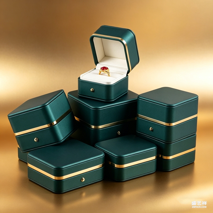 字体是包装性格的第一步。珠宝包装常见两条路:一条是衬线体(宋体、明体或西文 serif),笔画有收尾、有呼吸,天然带典雅和仪式感,适合婚嫁、高珠、经典系列;另一条是无衬线体(黑体、西文 sans),干净利落、现代感强,适合轻奢、年轻线、国潮。选字先问“这条线和谁说话”:送长辈的礼盒用衬线更稳,送给年轻人的用无衬线更俏。同一品牌也建议定一款“主字体”贯穿全系,别今天宋体明天黑体,视觉就散了。
字号是版面的骨架。一条合格的印面至少有三级:品牌名最大最显,系列名或产品词次之,说明性小字(材质、产地、条码旁文案)最小。比例上常见“主比次比注 ≈ 3比2比1”或更大跨度,关键是别让三级挤成一个大小,那样读起来像一团。烫金或压印时,主字可适当加粗加高,让光打上去有立体阴影;注释小字则要留出足够字间距,印小了容易糊、扫不进条码也麻烦。
字放在盒面哪里,比字本身还考验功力。常见做法:品牌名居中靠上、系列名居中靠下,整体压在盒盖正脸的“视觉中心”;侧边或内盖可放小字说明,避免正脸太满。留白是高级感的放大器——字四周多留点空,比塞满更显贵。注意烫金字和盒面底色要够对比:深盒浅金、浅盒深字,别让字“溶”进背景里。翻盖盒还要预判开盖后字的正反方向,别一打开字是倒的。
字体是包装性格的第一步。珠宝包装常见两条路:一条是衬线体(宋体、明体或西文 serif),笔画有收尾、有呼吸,天然带典雅和仪式感,适合婚嫁、高珠、经典系列;另一条是无衬线体(黑体、西文 sans),干净利落、现代感强,适合轻奢、年轻线、国潮。选字先问“这条线和谁说话”:送长辈的礼盒用衬线更稳,送给年轻人的用无衬线更俏。同一品牌也建议定一款“主字体”贯穿全系,别今天宋体明天黑体,视觉就散了。
字号是版面的骨架。一条合格的印面至少有三级:品牌名最大最显,系列名或产品词次之,说明性小字(材质、产地、条码旁文案)最小。比例上常见“主比次比注 ≈ 3比2比1”或更大跨度,关键是别让三级挤成一个大小,那样读起来像一团。烫金或压印时,主字可适当加粗加高,让光打上去有立体阴影;注释小字则要留出足够字间距,印小了容易糊、扫不进条码也麻烦。
字放在盒面哪里,比字本身还考验功力。常见做法:品牌名居中靠上、系列名居中靠下,整体压在盒盖正脸的“视觉中心”;侧边或内盖可放小字说明,避免正脸太满。留白是高级感的放大器——字四周多留点空,比塞满更显贵。注意烫金字和盒面底色要够对比:深盒浅金、浅盒深字,别让字“溶”进背景里。翻盖盒还要预判开盖后字的正反方向,别一打开字是倒的。
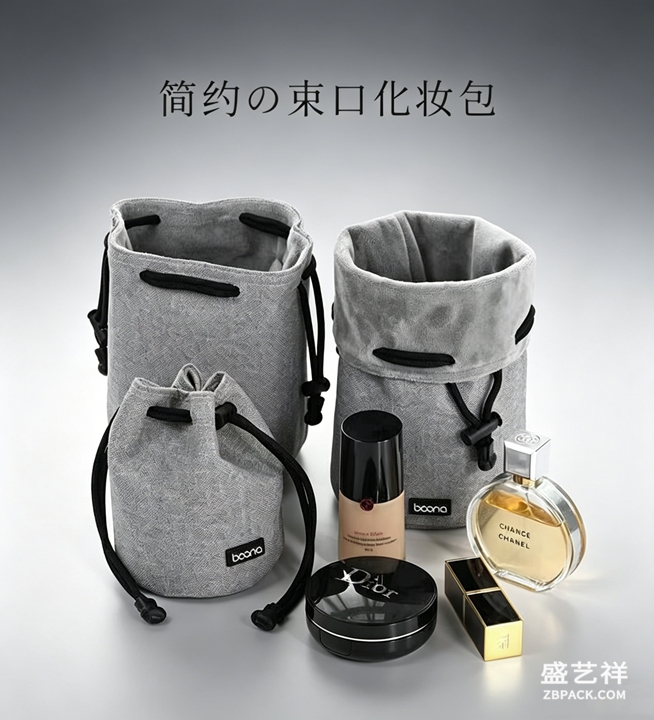 做出口或国际站的包装,常常中英文并列。这里最忌“英文只是中文的翻译件、字号一样大也挤一起”。更得体的做法是:主市场语言做主字、另一语言做辅助小字,或上下分行错开,让视线有明确先后。西文字母的字形、字距和中文不同,排在一起要单独调字间距,别直接照搬中文排版参数,否则西文会显得忽松忽紧。
字体版面一定要打样看实物,屏幕上的效果和烫金压印在纸上的质感差很多。打样时重点查三件事:主字在不同光线下是否清晰、小字是否糊、字与盒面是否对齐不偏。定稿后把字体文件、字号、字距、位置做成一份“印面规范”存档,下次翻单、换工厂都能直接复用,避免同一品牌不同批次盒子字体忽变。把字管好了,包装的体面才算真正闭环。
本文为原创内容,版权归骏依美所有。如需转载请注明出处。
盛艺祥珠宝包装专注首饰盒与珠宝袋定制生产,让品牌每一面都经得起细看与长久使用的考验。
Shengyixiang jewelry packaging makes boxes and pouches whose every side holds up to a closer look and to daily use.
When people talk about jewelry packaging, the first things that come to mind are usually the box shape, the lining, the foil stamping and the material—rarely the "words printed on the box." But the moment a customer receives a gift box, after the box itself the eye lands on those few lines: brand name, collection name, a slogan, maybe origin or material notes. Typeset with care, the box gains a layer of premium; cramped, messy or blurry, even expensive paper looks makeshift. The typography and layout on packaging are the closest thing to the customer, yet the easiest step to skip.
Typeface is the first step in a package's character. Jewelry packaging usually walks two roads: one is serif (Song, Ming, or Western serif), with finished, breathing strokes that carry elegance and ritual—suited to bridal, high jewelry and classic lines; the other is sans-serif (Hei, or Western sans), clean and modern—suited to light-luxury, youthful and guochao lines. Ask "who is this line speaking to" before choosing: a gift box for elders feels steadier in serif, one for young buyers feels sharper in sans. A brand should also fix one "primary typeface" across the whole line; don't switch from Song to Hei day to day or the visual scatters.
Type size is the skeleton of layout. A qualified print face has at least three levels: brand name largest and most prominent, collection or product word next, and small notes (material, origin, barcode copy) smallest. A common ratio is "primary : secondary : note ≈ 3 : 2 : 1" or wider; the key is never to crush all three into one size, which reads as a blob. For foil or emboss, the primary word can be bolder and taller so light casts a dimensional shadow; note text needs enough letter spacing, or it blurs when small and the barcode won't scan.
Where the words sit on the box tests more skill than the words themselves. Common practice: brand name centered upper, collection name centered lower, together pressing the "visual center" of the lid face; side or inner-lid holds small notes to keep the face from feeling full. Negative space amplifies premium—more empty room around the text looks richer than filling it. Keep enough contrast between foil and box: dark box with light gold, light box with dark text; don't let the words "melt" into the background. For hinged boxes, predict the text orientation after opening so it isn't upside down.
For export or international lines, Chinese and English often sit side by side. The worst habit is treating English as merely a translation of the Chinese, set at the same size and crammed together. The more decent approach: let the primary-market language be the hero word and the other a supporting note, or split them onto separate lines with a clear order for the eye. Western letterforms, spacing and rhythm differ from Chinese; adjust letter spacing separately when setting them together, or the English will look unevenly tight and loose.
Always proof the typography on a physical sample—the screen effect differs greatly from foil or emboss pressed into paper. At proofing, check three things: is the primary word clear under different lights, does the small text blur, and is the text aligned and not offset on the box. Once finalized, archive a "print-face spec" with font file, sizes, spacing and position, so the next reorder or factory change can reuse it directly and avoid the brand's boxes shifting fonts between batches. Manage the words well, and the package's dignity truly closes the loop.
This article is original content, copyright JunyiMei. Please credit the source if reprinted.
Shengyixiang jewelry packaging makes boxes and pouches whose every side holds up to a closer look and to daily use.
We craft jewelry boxes and bags that carry your brand's detail, consistently, from the first impression to the long run.
做出口或国际站的包装,常常中英文并列。这里最忌“英文只是中文的翻译件、字号一样大也挤一起”。更得体的做法是:主市场语言做主字、另一语言做辅助小字,或上下分行错开,让视线有明确先后。西文字母的字形、字距和中文不同,排在一起要单独调字间距,别直接照搬中文排版参数,否则西文会显得忽松忽紧。
字体版面一定要打样看实物,屏幕上的效果和烫金压印在纸上的质感差很多。打样时重点查三件事:主字在不同光线下是否清晰、小字是否糊、字与盒面是否对齐不偏。定稿后把字体文件、字号、字距、位置做成一份“印面规范”存档,下次翻单、换工厂都能直接复用,避免同一品牌不同批次盒子字体忽变。把字管好了,包装的体面才算真正闭环。
本文为原创内容,版权归骏依美所有。如需转载请注明出处。
盛艺祥珠宝包装专注首饰盒与珠宝袋定制生产,让品牌每一面都经得起细看与长久使用的考验。
Shengyixiang jewelry packaging makes boxes and pouches whose every side holds up to a closer look and to daily use.
When people talk about jewelry packaging, the first things that come to mind are usually the box shape, the lining, the foil stamping and the material—rarely the "words printed on the box." But the moment a customer receives a gift box, after the box itself the eye lands on those few lines: brand name, collection name, a slogan, maybe origin or material notes. Typeset with care, the box gains a layer of premium; cramped, messy or blurry, even expensive paper looks makeshift. The typography and layout on packaging are the closest thing to the customer, yet the easiest step to skip.
Typeface is the first step in a package's character. Jewelry packaging usually walks two roads: one is serif (Song, Ming, or Western serif), with finished, breathing strokes that carry elegance and ritual—suited to bridal, high jewelry and classic lines; the other is sans-serif (Hei, or Western sans), clean and modern—suited to light-luxury, youthful and guochao lines. Ask "who is this line speaking to" before choosing: a gift box for elders feels steadier in serif, one for young buyers feels sharper in sans. A brand should also fix one "primary typeface" across the whole line; don't switch from Song to Hei day to day or the visual scatters.
Type size is the skeleton of layout. A qualified print face has at least three levels: brand name largest and most prominent, collection or product word next, and small notes (material, origin, barcode copy) smallest. A common ratio is "primary : secondary : note ≈ 3 : 2 : 1" or wider; the key is never to crush all three into one size, which reads as a blob. For foil or emboss, the primary word can be bolder and taller so light casts a dimensional shadow; note text needs enough letter spacing, or it blurs when small and the barcode won't scan.
Where the words sit on the box tests more skill than the words themselves. Common practice: brand name centered upper, collection name centered lower, together pressing the "visual center" of the lid face; side or inner-lid holds small notes to keep the face from feeling full. Negative space amplifies premium—more empty room around the text looks richer than filling it. Keep enough contrast between foil and box: dark box with light gold, light box with dark text; don't let the words "melt" into the background. For hinged boxes, predict the text orientation after opening so it isn't upside down.
For export or international lines, Chinese and English often sit side by side. The worst habit is treating English as merely a translation of the Chinese, set at the same size and crammed together. The more decent approach: let the primary-market language be the hero word and the other a supporting note, or split them onto separate lines with a clear order for the eye. Western letterforms, spacing and rhythm differ from Chinese; adjust letter spacing separately when setting them together, or the English will look unevenly tight and loose.
Always proof the typography on a physical sample—the screen effect differs greatly from foil or emboss pressed into paper. At proofing, check three things: is the primary word clear under different lights, does the small text blur, and is the text aligned and not offset on the box. Once finalized, archive a "print-face spec" with font file, sizes, spacing and position, so the next reorder or factory change can reuse it directly and avoid the brand's boxes shifting fonts between batches. Manage the words well, and the package's dignity truly closes the loop.
This article is original content, copyright JunyiMei. Please credit the source if reprinted.
Shengyixiang jewelry packaging makes boxes and pouches whose every side holds up to a closer look and to daily use.
We craft jewelry boxes and bags that carry your brand's detail, consistently, from the first impression to the long run.
返回资讯列表
Back To News List
字体是包装性格的第一步。珠宝包装常见两条路:一条是衬线体(宋体、明体或西文 serif),笔画有收尾、有呼吸,天然带典雅和仪式感,适合婚嫁、高珠、经典系列;另一条是无衬线体(黑体、西文 sans),干净利落、现代感强,适合轻奢、年轻线、国潮。选字先问“这条线和谁说话”:送长辈的礼盒用衬线更稳,送给年轻人的用无衬线更俏。同一品牌也建议定一款“主字体”贯穿全系,别今天宋体明天黑体,视觉就散了。
字号是版面的骨架。一条合格的印面至少有三级:品牌名最大最显,系列名或产品词次之,说明性小字(材质、产地、条码旁文案)最小。比例上常见“主比次比注 ≈ 3比2比1”或更大跨度,关键是别让三级挤成一个大小,那样读起来像一团。烫金或压印时,主字可适当加粗加高,让光打上去有立体阴影;注释小字则要留出足够字间距,印小了容易糊、扫不进条码也麻烦。
字放在盒面哪里,比字本身还考验功力。常见做法:品牌名居中靠上、系列名居中靠下,整体压在盒盖正脸的“视觉中心”;侧边或内盖可放小字说明,避免正脸太满。留白是高级感的放大器——字四周多留点空,比塞满更显贵。注意烫金字和盒面底色要够对比:深盒浅金、浅盒深字,别让字“溶”进背景里。翻盖盒还要预判开盖后字的正反方向,别一打开字是倒的。
做出口或国际站的包装,常常中英文并列。这里最忌“英文只是中文的翻译件、字号一样大也挤一起”。更得体的做法是:主市场语言做主字、另一语言做辅助小字,或上下分行错开,让视线有明确先后。西文字母的字形、字距和中文不同,排在一起要单独调字间距,别直接照搬中文排版参数,否则西文会显得忽松忽紧。
字体版面一定要打样看实物,屏幕上的效果和烫金压印在纸上的质感差很多。打样时重点查三件事:主字在不同光线下是否清晰、小字是否糊、字与盒面是否对齐不偏。定稿后把字体文件、字号、字距、位置做成一份“印面规范”存档,下次翻单、换工厂都能直接复用,避免同一品牌不同批次盒子字体忽变。把字管好了,包装的体面才算真正闭环。
本文为原创内容,版权归骏依美所有。如需转载请注明出处。
盛艺祥珠宝包装专注首饰盒与珠宝袋定制生产,让品牌每一面都经得起细看与长久使用的考验。
Shengyixiang jewelry packaging makes boxes and pouches whose every side holds up to a closer look and to daily use.
When people talk about jewelry packaging, the first things that come to mind are usually the box shape, the lining, the foil stamping and the material—rarely the "words printed on the box." But the moment a customer receives a gift box, after the box itself the eye lands on those few lines: brand name, collection name, a slogan, maybe origin or material notes. Typeset with care, the box gains a layer of premium; cramped, messy or blurry, even expensive paper looks makeshift. The typography and layout on packaging are the closest thing to the customer, yet the easiest step to skip.
Typeface is the first step in a package's character. Jewelry packaging usually walks two roads: one is serif (Song, Ming, or Western serif), with finished, breathing strokes that carry elegance and ritual—suited to bridal, high jewelry and classic lines; the other is sans-serif (Hei, or Western sans), clean and modern—suited to light-luxury, youthful and guochao lines. Ask "who is this line speaking to" before choosing: a gift box for elders feels steadier in serif, one for young buyers feels sharper in sans. A brand should also fix one "primary typeface" across the whole line; don't switch from Song to Hei day to day or the visual scatters.
Type size is the skeleton of layout. A qualified print face has at least three levels: brand name largest and most prominent, collection or product word next, and small notes (material, origin, barcode copy) smallest. A common ratio is "primary : secondary : note ≈ 3 : 2 : 1" or wider; the key is never to crush all three into one size, which reads as a blob. For foil or emboss, the primary word can be bolder and taller so light casts a dimensional shadow; note text needs enough letter spacing, or it blurs when small and the barcode won't scan.
Where the words sit on the box tests more skill than the words themselves. Common practice: brand name centered upper, collection name centered lower, together pressing the "visual center" of the lid face; side or inner-lid holds small notes to keep the face from feeling full. Negative space amplifies premium—more empty room around the text looks richer than filling it. Keep enough contrast between foil and box: dark box with light gold, light box with dark text; don't let the words "melt" into the background. For hinged boxes, predict the text orientation after opening so it isn't upside down.
For export or international lines, Chinese and English often sit side by side. The worst habit is treating English as merely a translation of the Chinese, set at the same size and crammed together. The more decent approach: let the primary-market language be the hero word and the other a supporting note, or split them onto separate lines with a clear order for the eye. Western letterforms, spacing and rhythm differ from Chinese; adjust letter spacing separately when setting them together, or the English will look unevenly tight and loose.
Always proof the typography on a physical sample—the screen effect differs greatly from foil or emboss pressed into paper. At proofing, check three things: is the primary word clear under different lights, does the small text blur, and is the text aligned and not offset on the box. Once finalized, archive a "print-face spec" with font file, sizes, spacing and position, so the next reorder or factory change can reuse it directly and avoid the brand's boxes shifting fonts between batches. Manage the words well, and the package's dignity truly closes the loop.
This article is original content, copyright JunyiMei. Please credit the source if reprinted.
Shengyixiang jewelry packaging makes boxes and pouches whose every side holds up to a closer look and to daily use.
We craft jewelry boxes and bags that carry your brand's detail, consistently, from the first impression to the long run.