盒面留白,logo往哪挪 Why Move the Logo Off the Box Face
现在不少品牌把logo从盒面正中间挪走了。早几年盒子正面必印个大标,生怕人不知道是谁家的。这两年反过来,盒面留白、把牌子藏进内衬或封口贴的越来越多。不是没标,是换了个更体面的位置。
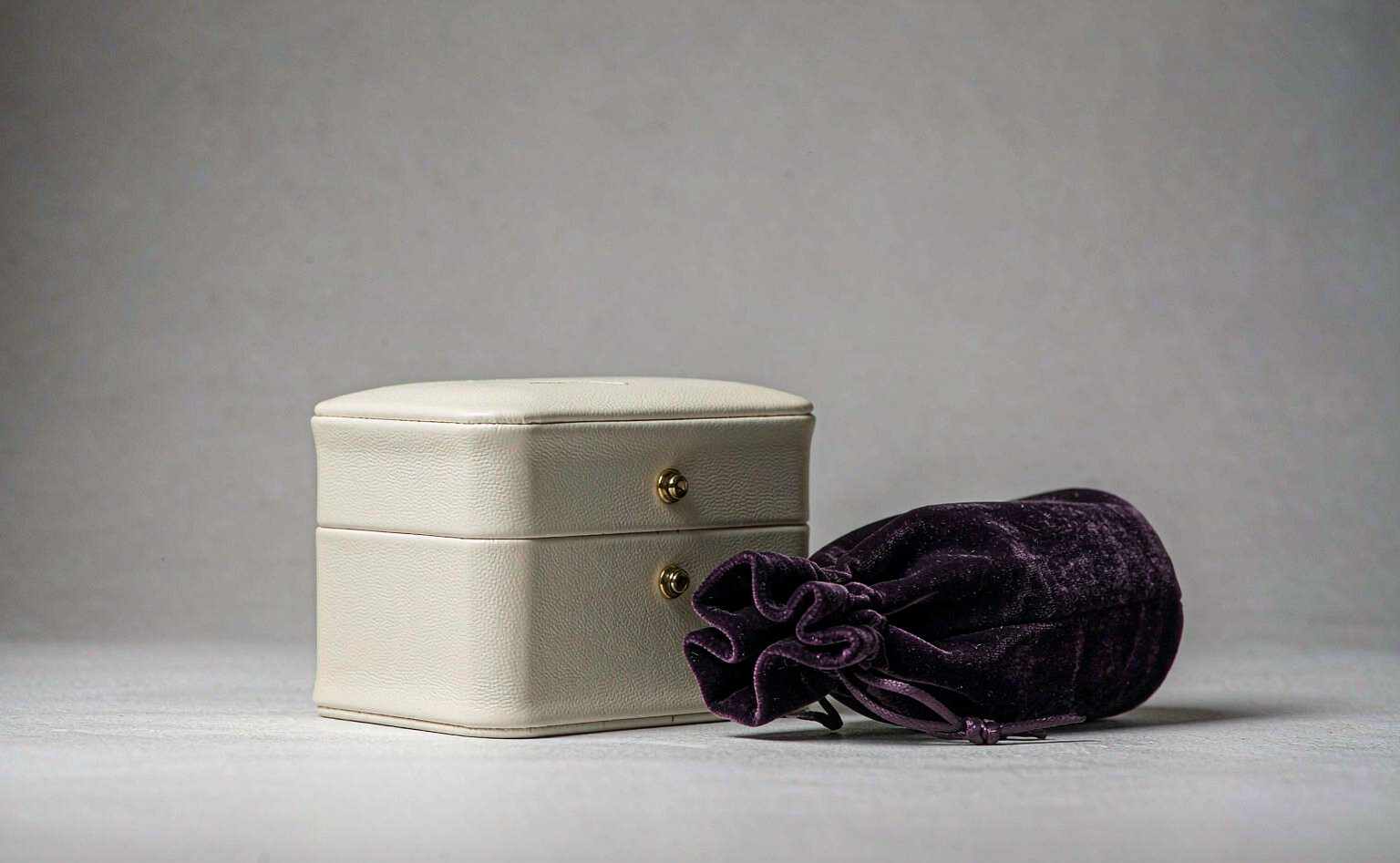
圆角珠宝盒 ZBH2 就是个例子。它外包皮革、配金属按钮,颜色和LOGO都能按需求订制。我们给走高端线的客户做这款时,常把logo从盒盖正面移到内衬——掀开盖子才看见烫印的小标,客人反而觉得用心。盒型本身圆角利落,正面干干净净,摆柜台上比满身印花耐看。
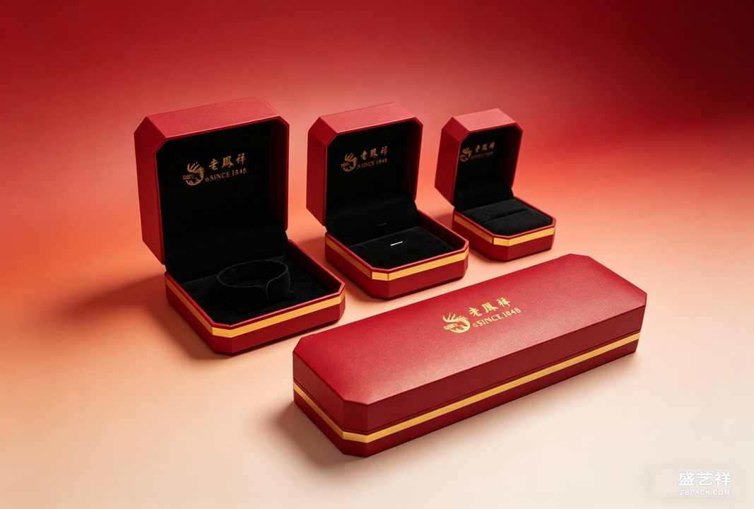 袋子的标也有讲究。礼品布袋ZBD20 是长条形绒布束口袋,绒面温润亲肤,抽绳收口。标一般缝在抽绳根部那一小截,不拉开看不见,拉开了是个小惊喜。首饰布袋ZBD18 是PINCTADA品牌那款米白高密度织物袋,挺括耐磨,标多烫在正面下角,克制地露一点,不破坏整体。
也有把品牌信息放封口贴和吊牌上的做法。盒面完全干净,封口贴印店名和 slogan,吊牌写材质和保养。客人拆的时候才读到,不打扰开盒的清爽,又能把该说的说完。
烫印这道工序本身也决定标好不好看。温度低了金粉粘不牢,蹭几次就掉;温度高了把皮面烫焦,边缘发硬。我们一般先在废皮上试三五次才上正货,金粉的厚薄也得靠手感调。
内衬烫标还要注意位置对称。盒盖内沿正中、离边两毫米,是多数客户能接受的"藏而不隐"。太靠角显随意,太靠中又回到了盒面大标那套,白忙一场。
翻车也有。有客户图省事,内衬烫标位置偏了,客人一开盖先看见歪掉的标,档次瞬间掉。还有袋面印太满,密密麻麻一行字,廉价感就来了。我的经验是:标越小、位置越藏,越显贵;标越大、越居中,越像地摊促销。
不是所有品牌都该藏。走量平价款,盒面把标印清楚反而好认,客人复购时一眼找到你。只有高端线才适合留白那一套。盛艺祥做珠宝袋加工和首饰盒批发这么多年,遇到最多的纠结就是"标放在哪",说到底还是看你的客群认不认这套克制。
本文为原创内容,版权归盛艺祥所有。如需转载请注明出处。
袋子的标也有讲究。礼品布袋ZBD20 是长条形绒布束口袋,绒面温润亲肤,抽绳收口。标一般缝在抽绳根部那一小截,不拉开看不见,拉开了是个小惊喜。首饰布袋ZBD18 是PINCTADA品牌那款米白高密度织物袋,挺括耐磨,标多烫在正面下角,克制地露一点,不破坏整体。
也有把品牌信息放封口贴和吊牌上的做法。盒面完全干净,封口贴印店名和 slogan,吊牌写材质和保养。客人拆的时候才读到,不打扰开盒的清爽,又能把该说的说完。
烫印这道工序本身也决定标好不好看。温度低了金粉粘不牢,蹭几次就掉;温度高了把皮面烫焦,边缘发硬。我们一般先在废皮上试三五次才上正货,金粉的厚薄也得靠手感调。
内衬烫标还要注意位置对称。盒盖内沿正中、离边两毫米,是多数客户能接受的"藏而不隐"。太靠角显随意,太靠中又回到了盒面大标那套,白忙一场。
翻车也有。有客户图省事,内衬烫标位置偏了,客人一开盖先看见歪掉的标,档次瞬间掉。还有袋面印太满,密密麻麻一行字,廉价感就来了。我的经验是:标越小、位置越藏,越显贵;标越大、越居中,越像地摊促销。
不是所有品牌都该藏。走量平价款,盒面把标印清楚反而好认,客人复购时一眼找到你。只有高端线才适合留白那一套。盛艺祥做珠宝袋加工和首饰盒批发这么多年,遇到最多的纠结就是"标放在哪",说到底还是看你的客群认不认这套克制。
本文为原创内容,版权归盛艺祥所有。如需转载请注明出处。
盛艺祥(Shengyixiang)——盒子留白,品牌的分寸都在里面。 A lot of brands have started moving their logo off the dead center of the box face. A few years back every lid had to carry a big mark, as if anyone might forget whose product it was. Lately the opposite is true: more and more boxes go blank on the outside and tuck the brand into the lining or the seal sticker. The mark isn't gone — it's just moved to a more dignified spot. The Rounded-Corner Jewelry Box ZBH2 is a good example. It's wrapped in leather with a metal button, and both the color and the LOGO can be customized to order. For high-end clients we often shift the logo from the lid face to the inside lining — you only see the small stamped mark when you open it, and customers read that as care rather than advertising. The box itself stays clean with its neat rounded corners, and on the counter it ages better than anything covered in prints.
Pouches have their own logic. The Gift Pouch ZBD20 is a long velvet drawstring bag with a soft, skin-friendly surface. The mark usually sits at the short strip where the drawstring gathers — hidden until you pull it open, then it's a small pleasant surprise. The PINCTADA Jewelry Pouch ZBD18 is a crisp off-white high-density fabric bag, stiff and hard-wearing, and its mark is foil-stamped at the lower front corner: revealed just a little, without breaking the whole.
Some brands put the brand info on the seal sticker and the hang tag instead. The box face stays perfectly clean, the sticker carries the name and slogan, the tag lists material and care. The customer reads it while unwrapping, never disturbed by it during the open.
There are failures too. One client, cutting corners, placed the lining mark off-center; the moment you opened the lid the crooked logo killed the grade. Another had the pouch surface printed edge to edge with a line of text, and the cheap feel arrived immediately. My rule: the smaller and more hidden the mark, the more expensive it looks; the bigger and more centered, the more it reads as a sidewalk promo.
Not every brand should hide, though. For volume entry-level lines, a clear mark on the box face actually helps — repeat customers find you at a glance. Only the premium lines earn the blank-face treatment. After years of jewelry pouch processing and jewelry box wholesale, the most common hesitation we meet is exactly "where does the mark go," and in the end it comes down to whether your customer recognizes that restraint.
This is original content. Copyright belongs to Shengyixiang.
Shengyixiang — a blank box face is the brand's quiet confidence.
返回资讯列表
Back To News List
袋子的标也有讲究。礼品布袋ZBD20 是长条形绒布束口袋,绒面温润亲肤,抽绳收口。标一般缝在抽绳根部那一小截,不拉开看不见,拉开了是个小惊喜。首饰布袋ZBD18 是PINCTADA品牌那款米白高密度织物袋,挺括耐磨,标多烫在正面下角,克制地露一点,不破坏整体。
也有把品牌信息放封口贴和吊牌上的做法。盒面完全干净,封口贴印店名和 slogan,吊牌写材质和保养。客人拆的时候才读到,不打扰开盒的清爽,又能把该说的说完。
烫印这道工序本身也决定标好不好看。温度低了金粉粘不牢,蹭几次就掉;温度高了把皮面烫焦,边缘发硬。我们一般先在废皮上试三五次才上正货,金粉的厚薄也得靠手感调。
内衬烫标还要注意位置对称。盒盖内沿正中、离边两毫米,是多数客户能接受的"藏而不隐"。太靠角显随意,太靠中又回到了盒面大标那套,白忙一场。
翻车也有。有客户图省事,内衬烫标位置偏了,客人一开盖先看见歪掉的标,档次瞬间掉。还有袋面印太满,密密麻麻一行字,廉价感就来了。我的经验是:标越小、位置越藏,越显贵;标越大、越居中,越像地摊促销。
不是所有品牌都该藏。走量平价款,盒面把标印清楚反而好认,客人复购时一眼找到你。只有高端线才适合留白那一套。盛艺祥做珠宝袋加工和首饰盒批发这么多年,遇到最多的纠结就是"标放在哪",说到底还是看你的客群认不认这套克制。
本文为原创内容,版权归盛艺祥所有。如需转载请注明出处。盛艺祥(Shengyixiang)——盒子留白,品牌的分寸都在里面。 A lot of brands have started moving their logo off the dead center of the box face. A few years back every lid had to carry a big mark, as if anyone might forget whose product it was. Lately the opposite is true: more and more boxes go blank on the outside and tuck the brand into the lining or the seal sticker. The mark isn't gone — it's just moved to a more dignified spot. The Rounded-Corner Jewelry Box ZBH2 is a good example. It's wrapped in leather with a metal button, and both the color and the LOGO can be customized to order. For high-end clients we often shift the logo from the lid face to the inside lining — you only see the small stamped mark when you open it, and customers read that as care rather than advertising. The box itself stays clean with its neat rounded corners, and on the counter it ages better than anything covered in prints.
Pouches have their own logic. The Gift Pouch ZBD20 is a long velvet drawstring bag with a soft, skin-friendly surface. The mark usually sits at the short strip where the drawstring gathers — hidden until you pull it open, then it's a small pleasant surprise. The PINCTADA Jewelry Pouch ZBD18 is a crisp off-white high-density fabric bag, stiff and hard-wearing, and its mark is foil-stamped at the lower front corner: revealed just a little, without breaking the whole.
Some brands put the brand info on the seal sticker and the hang tag instead. The box face stays perfectly clean, the sticker carries the name and slogan, the tag lists material and care. The customer reads it while unwrapping, never disturbed by it during the open.
There are failures too. One client, cutting corners, placed the lining mark off-center; the moment you opened the lid the crooked logo killed the grade. Another had the pouch surface printed edge to edge with a line of text, and the cheap feel arrived immediately. My rule: the smaller and more hidden the mark, the more expensive it looks; the bigger and more centered, the more it reads as a sidewalk promo.
Not every brand should hide, though. For volume entry-level lines, a clear mark on the box face actually helps — repeat customers find you at a glance. Only the premium lines earn the blank-face treatment. After years of jewelry pouch processing and jewelry box wholesale, the most common hesitation we meet is exactly "where does the mark go," and in the end it comes down to whether your customer recognizes that restraint.
This is original content. Copyright belongs to Shengyixiang.Shengyixiang — a blank box face is the brand's quiet confidence.