买完首饰,柜台选哪只袋装 Which Pouch to Hand Over at the Counter
客人挑好一条手链,买单的最后一刻,导购得从抽屉里抽一只袋子把东西装好递过去。这几十秒选什么袋,顾客未必说得出好坏,但手里那一下软不软、挺不挺,印象就留下了。
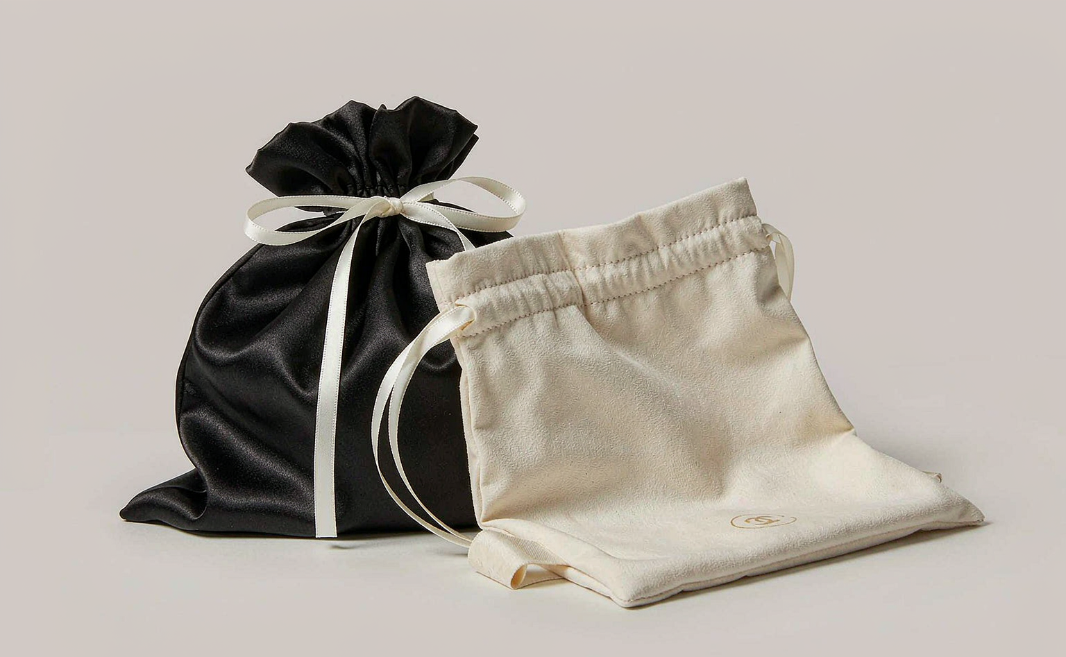
柜台常备的其实就几样。珠宝袋ZB4是黑色绸缎束口袋,抽绳是白色的,袋身印着品牌标识,摸上去滑、垂感好,装项链或手链最体面,灯光下还有一层低调的光。它轻,叠在抽屉里不占地方,起订量也低,五百只就能做,小店补货没压力。
要更挺括一点,用高档首饰袋超纤ZBD2。它是加厚超纤,米白、黑、酒红几个色,袋面能烫金压纹做LOGO,握在手里像个小盒子,不像软趴趴的布片。尺寸80×80×35毫米,戒指、吊坠、耳钉、手链都能装,适配广,起订一千只起。缺点是批次间抽绳松紧得盯,一批紧一批松,客人一拉就露馅,收货时先抽十只试手感。
绒布拉口袋ZB14走温柔路线,纯白超细纤维绒布,袋身黑色烫印,摸起来软糯,适合装耳钉、小吊坠这类轻巧件,客人拆开像收到一份小礼物。但它不挺,单只装重一点手链会塌,得配个小内托或者和盒一起给。
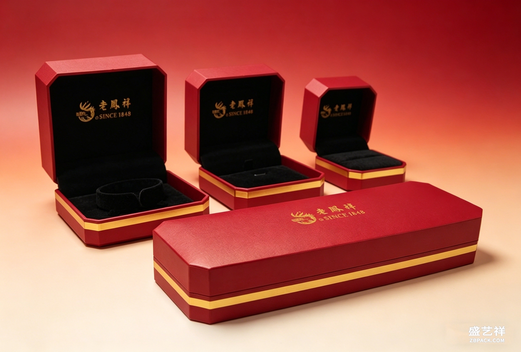 选袋有个简单法子:重的、怕压的,先入盒再套袋;轻的、日常款的,一只袋解决。节庆客人多,提前按色把袋子分好堆在顺手位,别临时翻。袋面LOGO别贪大,小一圈反而显贵。
袋子也讲周转。卖得快的色,比如黑和米白,多备;酒红、墨绿留一季的量就好,压多了占资金也占地方。每次来货先抽看烫印牢不牢,手指刮两下,掉色的当场退。
要印专属LOGO的,稿件提前定好,烫金和压纹两种工艺手感不同,烫金亮、压纹哑,按品牌调性选。来样确认时别只看正面,翻过来看抽绳根部缝得牢不牢,那是最容易开线的地方。我们也遇到过店家把袋子和盒分开找两家厂做,结果色对不上,盒是酒红、袋是玫红,摆一起就露怯,能同一家出就同一家,色卡对一遍再下单。
我们也劝过一些店,别用最便宜的薄塑料袋代替。那东西一捏就皱,拎着像外卖,前面陈列和包装做的体面,全折在最后递出去这一步。袋子是品牌最后一张脸,省这里不划算。
选袋有个简单法子:重的、怕压的,先入盒再套袋;轻的、日常款的,一只袋解决。节庆客人多,提前按色把袋子分好堆在顺手位,别临时翻。袋面LOGO别贪大,小一圈反而显贵。
袋子也讲周转。卖得快的色,比如黑和米白,多备;酒红、墨绿留一季的量就好,压多了占资金也占地方。每次来货先抽看烫印牢不牢,手指刮两下,掉色的当场退。
要印专属LOGO的,稿件提前定好,烫金和压纹两种工艺手感不同,烫金亮、压纹哑,按品牌调性选。来样确认时别只看正面,翻过来看抽绳根部缝得牢不牢,那是最容易开线的地方。我们也遇到过店家把袋子和盒分开找两家厂做,结果色对不上,盒是酒红、袋是玫红,摆一起就露怯,能同一家出就同一家,色卡对一遍再下单。
我们也劝过一些店,别用最便宜的薄塑料袋代替。那东西一捏就皱,拎着像外卖,前面陈列和包装做的体面,全折在最后递出去这一步。袋子是品牌最后一张脸,省这里不划算。
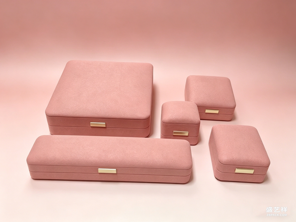 袋子还定调子。一条银手链进黑色绸缎ZB4,像一笔正经的消费;塞进皱巴巴的塑料里,像等着退货。顾客不会说破,但那点感觉被他带出了门。颜色也得配:银饰配黑绸缎显克制,配米白倒像婚庆款,按货品和季节选,柜台才显得讲究,而不是随手抓一只。
The customer picks a bracelet, pays, and in the last few seconds the associate pulls a pouch from the drawer and bags it. Those seconds decide which pouch — the customer may not name the difference, but the feel in the hand, soft or stiff, registers.
We keep a short list at the counter. The ZB4 is a black satin drawstring pouch with a white cord and a printed brand mark. It's smooth, it drapes, and it looks most formal on a necklace or bracelet, with a quiet sheen under the lights. It's light, stacks flat in the drawer, and the minimum run is only five hundred, so a small shop can restock without a second thought.
For something stiffer, the ZB2 premium microfiber pouch. It's thickened microfiber in cream, black or burgundy, and the face takes gold stamping or emboss for a logo. In the hand it feels like a little box, not a limp cloth. At 80×80×35 mm it fits a ring, pendant, stud or bracelet, so one size covers most of the line; runs start at a thousand. The one thing to watch is the drawstring tension across batches — tight one lot, loose the next, and the customer feels it the moment they pull. Test ten on arrival.
The ZB14 velvet drawstring pouch is the gentle option: pure white microfiber velvet, black print, soft to the touch. It suits light pieces like studs and small pendants, and opening it feels like a small gift. But it doesn't stand up; on its own a heavier bracelet collapses it, so give it a small insert or pair it with a box.
A simple rule: heavy or crushable pieces go in a box first, then the pouch; light everyday pieces get a pouch alone. Before a holiday rush, pre-sort the pouches by color into the nearest slot so nobody digs mid-sale. Keep the logo small; a tighter mark reads more expensive.
Pouches turn over too. Black and cream, the fast movers, stay well stocked. Burgundy or dark green, a season's worth is enough; overstock ties up cash and shelf space. On every incoming lot, scratch the print with a fingernail — flaking ones go back.
We've talked more than one shop out of the cheapest thin plastic bag. It wrinkles the instant you pinch it and reads like takeout. All the care spent on the display and the box folds at the step where you hand it over. The pouch is the brand's last face. Don't save there.
The pouch also sets the tone for what comes after. A bracelet that leaves in a satin ZB4 feels like a purchase; the same bracelet in crinkled plastic feels like a return waiting to happen. Customers don't articulate it, but they carry the feeling out the door. Color matching matters more than shops expect: a silver bracelet into black satin looks intentional, into cream looks bridal. Match the pouch to the piece and the season, and the counter looks considered rather than random.
袋子还定调子。一条银手链进黑色绸缎ZB4,像一笔正经的消费;塞进皱巴巴的塑料里,像等着退货。顾客不会说破,但那点感觉被他带出了门。颜色也得配:银饰配黑绸缎显克制,配米白倒像婚庆款,按货品和季节选,柜台才显得讲究,而不是随手抓一只。
The customer picks a bracelet, pays, and in the last few seconds the associate pulls a pouch from the drawer and bags it. Those seconds decide which pouch — the customer may not name the difference, but the feel in the hand, soft or stiff, registers.
We keep a short list at the counter. The ZB4 is a black satin drawstring pouch with a white cord and a printed brand mark. It's smooth, it drapes, and it looks most formal on a necklace or bracelet, with a quiet sheen under the lights. It's light, stacks flat in the drawer, and the minimum run is only five hundred, so a small shop can restock without a second thought.
For something stiffer, the ZB2 premium microfiber pouch. It's thickened microfiber in cream, black or burgundy, and the face takes gold stamping or emboss for a logo. In the hand it feels like a little box, not a limp cloth. At 80×80×35 mm it fits a ring, pendant, stud or bracelet, so one size covers most of the line; runs start at a thousand. The one thing to watch is the drawstring tension across batches — tight one lot, loose the next, and the customer feels it the moment they pull. Test ten on arrival.
The ZB14 velvet drawstring pouch is the gentle option: pure white microfiber velvet, black print, soft to the touch. It suits light pieces like studs and small pendants, and opening it feels like a small gift. But it doesn't stand up; on its own a heavier bracelet collapses it, so give it a small insert or pair it with a box.
A simple rule: heavy or crushable pieces go in a box first, then the pouch; light everyday pieces get a pouch alone. Before a holiday rush, pre-sort the pouches by color into the nearest slot so nobody digs mid-sale. Keep the logo small; a tighter mark reads more expensive.
Pouches turn over too. Black and cream, the fast movers, stay well stocked. Burgundy or dark green, a season's worth is enough; overstock ties up cash and shelf space. On every incoming lot, scratch the print with a fingernail — flaking ones go back.
We've talked more than one shop out of the cheapest thin plastic bag. It wrinkles the instant you pinch it and reads like takeout. All the care spent on the display and the box folds at the step where you hand it over. The pouch is the brand's last face. Don't save there.
The pouch also sets the tone for what comes after. A bracelet that leaves in a satin ZB4 feels like a purchase; the same bracelet in crinkled plastic feels like a return waiting to happen. Customers don't articulate it, but they carry the feeling out the door. Color matching matters more than shops expect: a silver bracelet into black satin looks intentional, into cream looks bridal. Match the pouch to the piece and the season, and the counter looks considered rather than random.
返回资讯列表
Back To News List
选袋有个简单法子:重的、怕压的,先入盒再套袋;轻的、日常款的,一只袋解决。节庆客人多,提前按色把袋子分好堆在顺手位,别临时翻。袋面LOGO别贪大,小一圈反而显贵。
袋子也讲周转。卖得快的色,比如黑和米白,多备;酒红、墨绿留一季的量就好,压多了占资金也占地方。每次来货先抽看烫印牢不牢,手指刮两下,掉色的当场退。
要印专属LOGO的,稿件提前定好,烫金和压纹两种工艺手感不同,烫金亮、压纹哑,按品牌调性选。来样确认时别只看正面,翻过来看抽绳根部缝得牢不牢,那是最容易开线的地方。我们也遇到过店家把袋子和盒分开找两家厂做,结果色对不上,盒是酒红、袋是玫红,摆一起就露怯,能同一家出就同一家,色卡对一遍再下单。
我们也劝过一些店,别用最便宜的薄塑料袋代替。那东西一捏就皱,拎着像外卖,前面陈列和包装做的体面,全折在最后递出去这一步。袋子是品牌最后一张脸,省这里不划算。
袋子还定调子。一条银手链进黑色绸缎ZB4,像一笔正经的消费;塞进皱巴巴的塑料里,像等着退货。顾客不会说破,但那点感觉被他带出了门。颜色也得配:银饰配黑绸缎显克制,配米白倒像婚庆款,按货品和季节选,柜台才显得讲究,而不是随手抓一只。
The customer picks a bracelet, pays, and in the last few seconds the associate pulls a pouch from the drawer and bags it. Those seconds decide which pouch — the customer may not name the difference, but the feel in the hand, soft or stiff, registers.
We keep a short list at the counter. The ZB4 is a black satin drawstring pouch with a white cord and a printed brand mark. It's smooth, it drapes, and it looks most formal on a necklace or bracelet, with a quiet sheen under the lights. It's light, stacks flat in the drawer, and the minimum run is only five hundred, so a small shop can restock without a second thought.
For something stiffer, the ZB2 premium microfiber pouch. It's thickened microfiber in cream, black or burgundy, and the face takes gold stamping or emboss for a logo. In the hand it feels like a little box, not a limp cloth. At 80×80×35 mm it fits a ring, pendant, stud or bracelet, so one size covers most of the line; runs start at a thousand. The one thing to watch is the drawstring tension across batches — tight one lot, loose the next, and the customer feels it the moment they pull. Test ten on arrival.
The ZB14 velvet drawstring pouch is the gentle option: pure white microfiber velvet, black print, soft to the touch. It suits light pieces like studs and small pendants, and opening it feels like a small gift. But it doesn't stand up; on its own a heavier bracelet collapses it, so give it a small insert or pair it with a box.
A simple rule: heavy or crushable pieces go in a box first, then the pouch; light everyday pieces get a pouch alone. Before a holiday rush, pre-sort the pouches by color into the nearest slot so nobody digs mid-sale. Keep the logo small; a tighter mark reads more expensive.
Pouches turn over too. Black and cream, the fast movers, stay well stocked. Burgundy or dark green, a season's worth is enough; overstock ties up cash and shelf space. On every incoming lot, scratch the print with a fingernail — flaking ones go back.
We've talked more than one shop out of the cheapest thin plastic bag. It wrinkles the instant you pinch it and reads like takeout. All the care spent on the display and the box folds at the step where you hand it over. The pouch is the brand's last face. Don't save there.
The pouch also sets the tone for what comes after. A bracelet that leaves in a satin ZB4 feels like a purchase; the same bracelet in crinkled plastic feels like a return waiting to happen. Customers don't articulate it, but they carry the feeling out the door. Color matching matters more than shops expect: a silver bracelet into black satin looks intentional, into cream looks bridal. Match the pouch to the piece and the season, and the counter looks considered rather than random.