彩色宝石与多巴胺配色:橱窗套装怎么搭出年轻感盛艺祥 · 行业资讯
彩色宝石与多巴胺配色:橱窗套装怎么搭出年轻感 Colored Stones and Dopamine Colors: How to Style Showcase Sets for Younger Shoppers
如果说前两年珠宝卖的是"低调",这两年风向明显变了:彩色宝石、多巴胺配色、大胆造型,一样比一样张扬。客人进了店,眼睛先被颜色勾住——红宝石的浓、祖母绿的艳、珐琅彩的明,还有各种撞色设计,年轻人尤其吃这一套。货跟上了趋势,橱窗要是还停留在黑白灰的"高级感"里,等于把好牌捂在手里。
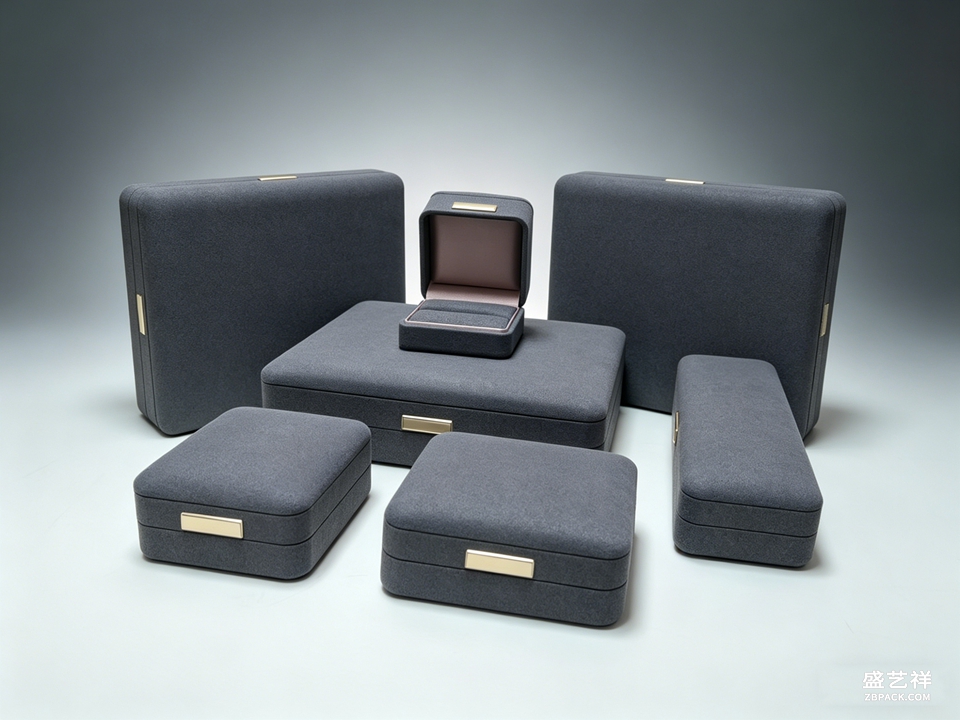
橱窗套装选色,第一原则是让货品的颜色"跳出来"。宝石本身浓艳的,背景和道具就要压得住:墨绿配金纹、藏蓝配月光白,这类深色底子把彩宝衬得又稳又贵,适合红宝石、祖母绿、碧玺这些饱和度高的货。反过来,浅色系宝石和珐琅彩,配米白、豆沙粉这类温柔底色,整体是轻盈的少女感,年轻人路过都会停下来多看一眼。
现在的彩宝客群明显分两拨。一拨是"成熟彩宝客",买红宝石、祖母绿当保值重器,要的是稳重大气,对应墨绿几何金纹(CC61)、藏蓝月亮造型(CC62)这类套装,深色丝绒衬底,灯光一打,宝石的火彩全出来了;另一拨是"多巴胺女孩",奔着颜色和拍照来的,米白烫金棕榈叶(CC60)、浅蓝金边四叶草(CC64)这类浅色套装更对胃口,摆出来清新明亮,客人在橱窗前拍照发朋友圈,等于免费引流。
 翻车经验也要讲。彩宝最怕"花上加花"——宝石艳,道具更艳,橱窗变成调色盘,客人看两秒就觉得闹眼睛。配色记住一个减法口诀:一个橱窗一种主色,道具颜色不超过两三种。还有一点,灯光色温别太高,冷白强光会把彩宝的暖调烧掉,宝石颜色发"贼";用中性光稍微压一点,宝石的浓郁感才出得来。
我们彩宝橱窗区就是这个打法:金色系宝石用墨绿金纹套装压住,越显贵气;年轻彩宝用米白、浅蓝系套装,明亮轻盈,客户反馈"路过就想进来看"。橱窗是整家店的门面,彩宝季,颜色就是销量。把套装的色系选对,让每一颗宝石都"对上镜",客人自然就进来了。
翻车经验也要讲。彩宝最怕"花上加花"——宝石艳,道具更艳,橱窗变成调色盘,客人看两秒就觉得闹眼睛。配色记住一个减法口诀:一个橱窗一种主色,道具颜色不超过两三种。还有一点,灯光色温别太高,冷白强光会把彩宝的暖调烧掉,宝石颜色发"贼";用中性光稍微压一点,宝石的浓郁感才出得来。
我们彩宝橱窗区就是这个打法:金色系宝石用墨绿金纹套装压住,越显贵气;年轻彩宝用米白、浅蓝系套装,明亮轻盈,客户反馈"路过就想进来看"。橱窗是整家店的门面,彩宝季,颜色就是销量。把套装的色系选对,让每一颗宝石都"对上镜",客人自然就进来了。
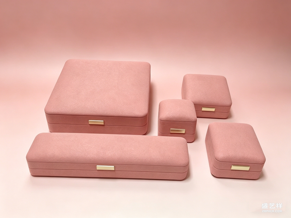 道具材质也要跟货品匹配。丝绒衬底显贵重,适合红宝石、祖母绿这类浓彩宝石;亚克力和浅色针织底色更轻盈,适合珐琅彩和浅色宝石,年轻人觉得时髦。同一套货,换一层衬底,气质能差出一截,多备几套可替换的衬垫,比买新道具省钱又见效。
橱窗套装还要跟着季节走。中秋、圣诞、新年,换主题不用换货——在套装里加一点节日元素(金色拉花、雪花摆件、红绿色系小道具),橱窗立刻有了节日气,路过的人都会多看一眼。趋势会变,颜色和节日是永恒的两张牌。
If the past two years sold "understatement", the wind has clearly turned: colored gemstones, dopamine colorways, bold silhouettes — louder every season. Customers' eyes are caught by color first: the depth of ruby, the fire of emerald, bright enamel, playful clashes. Young buyers especially love it. If stock follows the trend but the display windows still sit in grey "high-end minimalism", you're hiding your best cards.
Picking showcase-set colors has one first rule: make the goods pop. For saturated gemstones, the backdrop must hold them: deep green with gold linework, navy with moonlight white — dark grounds make rubies, emeralds and tourmalines read stable and expensive. For pale gemstones and enamel, cream, blush-pink and other soft grounds create a light, girlish feel; young shoppers stop for a second look.
Colored-stone customers split into two groups today. One is the mature buyer — rubies and emeralds as value pieces. They want weight and gravitas: dark-green geometric sets (CC61) and navy moon sets (CC62) with velvet lining; under good light the gems' fire comes alive. The other group is the "dopamine girl", here for color and photos. Cream gold-palm sets (CC60) and light-blue clover sets (CC64) land better — bright, fresh windows that people photograph and post, which is free foot traffic.
A lesson: colored stones hate "loud on loud". Jewelry is vivid, props are vivid, the window becomes a palette and customers feel dizzy in two seconds. Use a subtraction rule: one dominant color per window, no more than two or three prop colors. And watch color temperature — harsh cool light burns the warmth out of gemstones, making them look artificial; a touch of neutral light brings back their depth.
Our colored-stone windows work this way: gold-tone stones sit in green-gold sets and read richer; young pieces sit in cream and light-blue sets, bright and airy, and customers say they walk in just because the window called them. Windows are the face of the store. In the colored-stone season, color is sales. Match the set's palette, put every stone "on camera", and customers will come.
Prop materials must match the goods too. Velvet grounds read precious, right for intense colors like ruby and emerald; acrylic and light knit grounds feel modern, right for enamel and pale stones — younger shoppers call it stylish. The same stock, a different liner, and the whole temperament shifts; keeping a few swappable liners beats buying new props and works better.
Showcase sets should follow the calendar. Mid-Autumn, Christmas, New Year — refresh the theme without changing stock: a golden garland, a snowflake ornament, red-green mini props in the set, and the window suddenly speaks holiday and draws eyes. Trends change; color and festivals are the two evergreen cards.
道具材质也要跟货品匹配。丝绒衬底显贵重,适合红宝石、祖母绿这类浓彩宝石;亚克力和浅色针织底色更轻盈,适合珐琅彩和浅色宝石,年轻人觉得时髦。同一套货,换一层衬底,气质能差出一截,多备几套可替换的衬垫,比买新道具省钱又见效。
橱窗套装还要跟着季节走。中秋、圣诞、新年,换主题不用换货——在套装里加一点节日元素(金色拉花、雪花摆件、红绿色系小道具),橱窗立刻有了节日气,路过的人都会多看一眼。趋势会变,颜色和节日是永恒的两张牌。
If the past two years sold "understatement", the wind has clearly turned: colored gemstones, dopamine colorways, bold silhouettes — louder every season. Customers' eyes are caught by color first: the depth of ruby, the fire of emerald, bright enamel, playful clashes. Young buyers especially love it. If stock follows the trend but the display windows still sit in grey "high-end minimalism", you're hiding your best cards.
Picking showcase-set colors has one first rule: make the goods pop. For saturated gemstones, the backdrop must hold them: deep green with gold linework, navy with moonlight white — dark grounds make rubies, emeralds and tourmalines read stable and expensive. For pale gemstones and enamel, cream, blush-pink and other soft grounds create a light, girlish feel; young shoppers stop for a second look.
Colored-stone customers split into two groups today. One is the mature buyer — rubies and emeralds as value pieces. They want weight and gravitas: dark-green geometric sets (CC61) and navy moon sets (CC62) with velvet lining; under good light the gems' fire comes alive. The other group is the "dopamine girl", here for color and photos. Cream gold-palm sets (CC60) and light-blue clover sets (CC64) land better — bright, fresh windows that people photograph and post, which is free foot traffic.
A lesson: colored stones hate "loud on loud". Jewelry is vivid, props are vivid, the window becomes a palette and customers feel dizzy in two seconds. Use a subtraction rule: one dominant color per window, no more than two or three prop colors. And watch color temperature — harsh cool light burns the warmth out of gemstones, making them look artificial; a touch of neutral light brings back their depth.
Our colored-stone windows work this way: gold-tone stones sit in green-gold sets and read richer; young pieces sit in cream and light-blue sets, bright and airy, and customers say they walk in just because the window called them. Windows are the face of the store. In the colored-stone season, color is sales. Match the set's palette, put every stone "on camera", and customers will come.
Prop materials must match the goods too. Velvet grounds read precious, right for intense colors like ruby and emerald; acrylic and light knit grounds feel modern, right for enamel and pale stones — younger shoppers call it stylish. The same stock, a different liner, and the whole temperament shifts; keeping a few swappable liners beats buying new props and works better.
Showcase sets should follow the calendar. Mid-Autumn, Christmas, New Year — refresh the theme without changing stock: a golden garland, a snowflake ornament, red-green mini props in the set, and the window suddenly speaks holiday and draws eyes. Trends change; color and festivals are the two evergreen cards.
返回资讯列表
Back To News List
翻车经验也要讲。彩宝最怕"花上加花"——宝石艳,道具更艳,橱窗变成调色盘,客人看两秒就觉得闹眼睛。配色记住一个减法口诀:一个橱窗一种主色,道具颜色不超过两三种。还有一点,灯光色温别太高,冷白强光会把彩宝的暖调烧掉,宝石颜色发"贼";用中性光稍微压一点,宝石的浓郁感才出得来。
我们彩宝橱窗区就是这个打法:金色系宝石用墨绿金纹套装压住,越显贵气;年轻彩宝用米白、浅蓝系套装,明亮轻盈,客户反馈"路过就想进来看"。橱窗是整家店的门面,彩宝季,颜色就是销量。把套装的色系选对,让每一颗宝石都"对上镜",客人自然就进来了。
道具材质也要跟货品匹配。丝绒衬底显贵重,适合红宝石、祖母绿这类浓彩宝石;亚克力和浅色针织底色更轻盈,适合珐琅彩和浅色宝石,年轻人觉得时髦。同一套货,换一层衬底,气质能差出一截,多备几套可替换的衬垫,比买新道具省钱又见效。
橱窗套装还要跟着季节走。中秋、圣诞、新年,换主题不用换货——在套装里加一点节日元素(金色拉花、雪花摆件、红绿色系小道具),橱窗立刻有了节日气,路过的人都会多看一眼。趋势会变,颜色和节日是永恒的两张牌。
If the past two years sold "understatement", the wind has clearly turned: colored gemstones, dopamine colorways, bold silhouettes — louder every season. Customers' eyes are caught by color first: the depth of ruby, the fire of emerald, bright enamel, playful clashes. Young buyers especially love it. If stock follows the trend but the display windows still sit in grey "high-end minimalism", you're hiding your best cards.
Picking showcase-set colors has one first rule: make the goods pop. For saturated gemstones, the backdrop must hold them: deep green with gold linework, navy with moonlight white — dark grounds make rubies, emeralds and tourmalines read stable and expensive. For pale gemstones and enamel, cream, blush-pink and other soft grounds create a light, girlish feel; young shoppers stop for a second look.
Colored-stone customers split into two groups today. One is the mature buyer — rubies and emeralds as value pieces. They want weight and gravitas: dark-green geometric sets (CC61) and navy moon sets (CC62) with velvet lining; under good light the gems' fire comes alive. The other group is the "dopamine girl", here for color and photos. Cream gold-palm sets (CC60) and light-blue clover sets (CC64) land better — bright, fresh windows that people photograph and post, which is free foot traffic.
A lesson: colored stones hate "loud on loud". Jewelry is vivid, props are vivid, the window becomes a palette and customers feel dizzy in two seconds. Use a subtraction rule: one dominant color per window, no more than two or three prop colors. And watch color temperature — harsh cool light burns the warmth out of gemstones, making them look artificial; a touch of neutral light brings back their depth.
Our colored-stone windows work this way: gold-tone stones sit in green-gold sets and read richer; young pieces sit in cream and light-blue sets, bright and airy, and customers say they walk in just because the window called them. Windows are the face of the store. In the colored-stone season, color is sales. Match the set's palette, put every stone "on camera", and customers will come.
Prop materials must match the goods too. Velvet grounds read precious, right for intense colors like ruby and emerald; acrylic and light knit grounds feel modern, right for enamel and pale stones — younger shoppers call it stylish. The same stock, a different liner, and the whole temperament shifts; keeping a few swappable liners beats buying new props and works better.
Showcase sets should follow the calendar. Mid-Autumn, Christmas, New Year — refresh the theme without changing stock: a golden garland, a snowflake ornament, red-green mini props in the set, and the window suddenly speaks holiday and draws eyes. Trends change; color and festivals are the two evergreen cards.