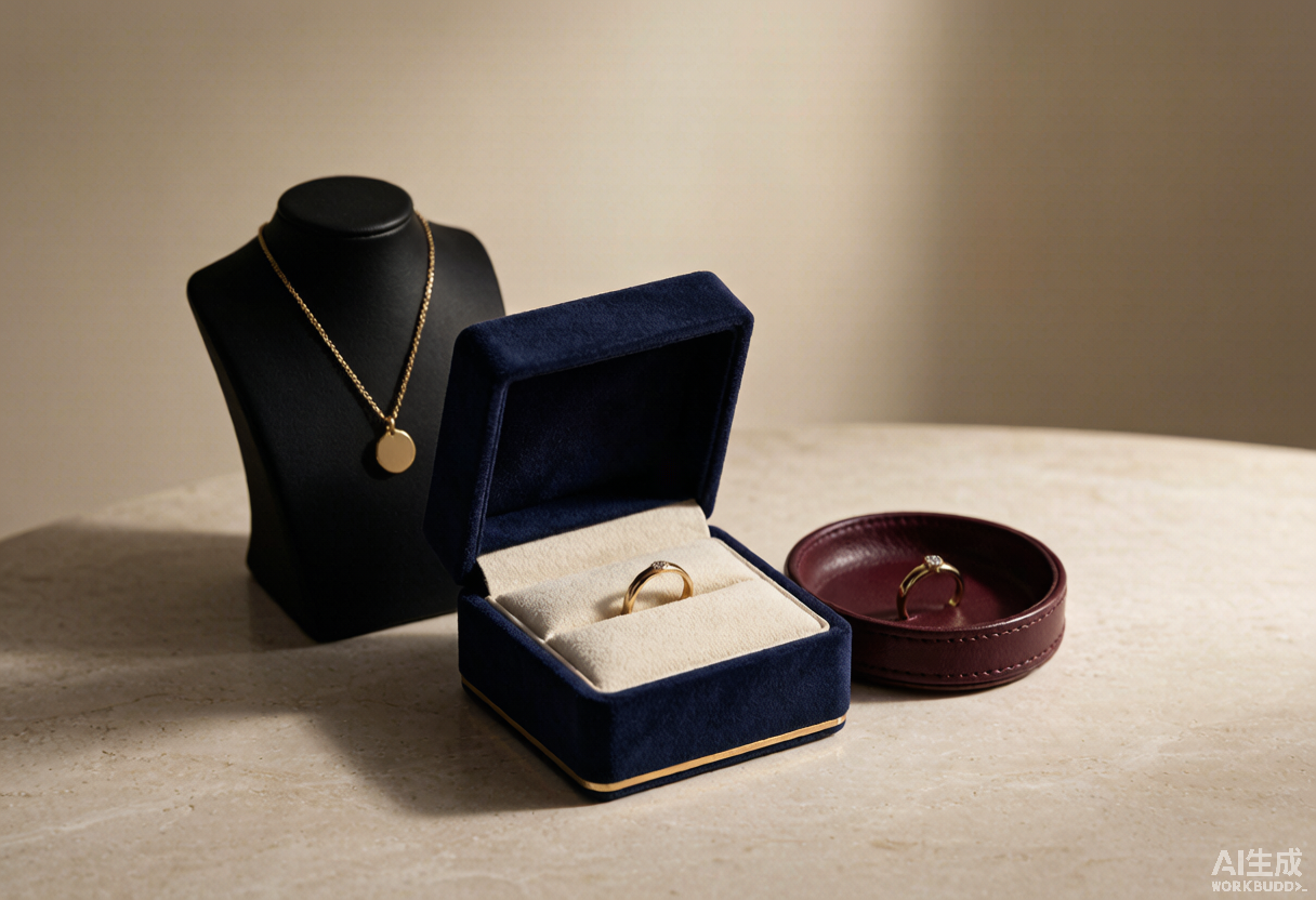
色彩决定珠宝身价 How Color and Texture Shape Jewelry's Perceived Value
同一枚戒指,放进哑光墨黑的礼盒,和放进亮面大红的礼盒,顾客愿意付的价格并不一样。这不是玄学,而是被反复验证的消费心理。国际店头广告协会(POPAI)调研显示,约七成购买决策在店内当场做出;而这几秒里最先起作用的不是价签,是颜色和手感。下面用六个最常被问到的问题,把珠宝包装、珠宝摆台这两位"沉默的销售员"讲透。
问一:顾客决定"要不要拿起来看",到底用了多久?
比多数人想象的短得多。行业普遍引用的数据是:消费者形成第一印象只需不到一秒,其中约九成判断依据来自色彩;在更完整的评估阶段(约 90 秒内),色彩仍是权重最高的单一变量。Pantone 的相关研究进一步指出,85% 的购买者承认"颜色"是他们选择某款奢侈品的首要原因。
这对珠宝零售的意义很直接:戒指的工艺细节要顾客凑近、要灯光和导购讲解才能被感知,但饰品包装盒与展台的颜色是零门槛传达出去的。色彩不是包装的装饰项,而是它的第一句台词;台词说错了,后面的工艺、证书、故事都要花更大力气去挽回。
问二:为什么高端珠宝包装总在黑、深蓝、正红这几种颜色里打转?
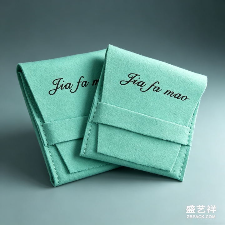
因为它们各自对应一种被验证过的心理暗示。哑光黑传递克制、权威与专业感,是极简高端路线最稳妥的底色;深蓝与藏青关联信任与永恒感,Tiffany 用一抹知更鸟蓝把品牌符号刻进了几代人的记忆;正红则代表热烈、珍贵与仪式感,卡地亚红盒就是注脚。深紫长期与皇室、稀有绑定;暖金与古铜强调价值与工艺,是黄金品类的天然搭档。
关键不在于"用哪个颜色",而在色彩、材质与品牌定位是否同频。行业观察显示,成体系的色彩策略可把感知价值抬升最高约三成——而且靠的不是多印几个色:奢侈品的通行做法是把主色控制在一到两个,用金属烫印、UV 局部上光做点缀,配比可参考 60-30-10(盒体六成、丝带内衬三成、logo 标签一成)。
问三:陈列道具的底色该怎么定?和包装用同一个色吗?
不建议简单复制,而应形成"呼应但有层次"的关系:包装的颜色承载品牌识别,陈列道具的颜色衬托宝石本身。深色绒面托盘能压住环境杂光,让钻石的火彩和白金的冷光跳出来;浅米、浅灰的展台更适合黄金与古法金,避免暖金被深色吃掉;翡翠与彩色宝石则可借助有明确色相的背景板强化体色对比。
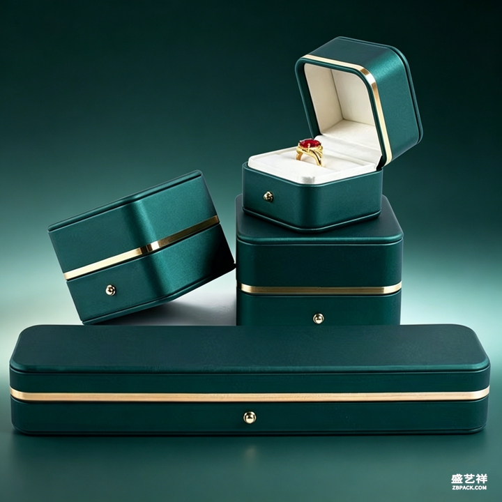
密度同样是颜色策略的一部分。一柜之内建议控制在 8 至 15 个 SKU、相邻单品间距不低于 5 厘米,每三到五件通过高度、材质或色块做一次视觉换气,避免目光被"色彩噪音"淹没。留白常被低估:把主推款单独放进一片负空间,感知价值可提升约 28%。NRF 的零售研究还给出了道具选型参考——胸像式展架在高客单价区域带来约 30% 的互动提升,分层托盘让中价带单量增加约 22%,壁挂式陈列在入口冲动区把连带率抬高约 18%;主题化成组陈列在旺季可带来最高约 34% 的转化提升。
问四:为什么"摸起来贵"比"看起来贵"更难被抄袭?
因为触觉记忆更深,也更难被照片复制。近年包装心理学研究给出不少可量化例证:某坚果品牌把光滑塑料袋换成压纹纸盒后,消费者对产品新鲜度的评分提升 22%;某高端茶饮采用"哑光黑+凹凸浮雕"组合,溢价接受度提高 25%;某美妆品牌提供绒面、磨砂、镜面三选一的可换触感外壳,Z 世代复购率提升 30%。
放到珠宝上,逻辑完全一致。绒布内衬的绒毛倒向、皮革的粒面纹理、纸盒的压纹深度、磁吸闭合那一声"咔哒"的静音程度——这些都不是能靠图片传达的信息,却决定了顾客把盒子拿在手里的那三秒钟感受。做首饰盒批发或定制采购时,值得把这几项写进验收标准:内衬厚度稳定在 1.2 至 1.8 毫米、绒面做过抗静电固化、烫金边缘无颗粒感、盒盖开合顺滑不卡顿。视觉决定顾客愿不愿意走近,触感决定他愿不愿意相信这个价格。
问五:灯光会不会毁掉一套精心搭配的配色?
会,而且这是门店里最常见也最易被忽略的失误。色温错配会让配色失真:2700K 左右的暖光能强化黄金与铜色的温润质感,3000K 至 4000K 的中性偏冷光更适合白金、银饰与钻石的火彩;显色指数(CRI)低于 90 时,彩色宝石的体色会明显发灰;光束角建议控制在 15° 至 30°,既能聚焦亮点,又不产生刺眼眩光。
展柜本身也在参与这场光学博弈。行业报告指出,2026 年中国珠宝展示柜高透玻璃细分市场有望突破 35 亿元、年复合增长率保持在 12% 以上,技术焦点正是把可见光透射比从常规超白玻璃的 91.5% 提到 95% 以上、把表面反射率从 4% 压到 1% 以下。数据还显示:通透度每提升 10%,顾客在柜前的停留时间平均延长约 15 秒——对高客单价品类而言,这十五秒往往就是"路过"与"开单"的分水岭。
问六:一套配色能全球通用吗?出海要注意什么?
不能,色彩是少数必须做本地化的设计要素。红色在中国意味着吉庆与尊贵,在西方更多指向热情与紧迫;白色在欧洲代表纯洁,在部分东亚语境里却与丧仪相关;性别偏好同样有别,男性受众更接受蓝、灰、黑等冷静色系,女性受众对粉、紫、橙接受度更高。有国际美妆品牌进入中国时把经典黑盒改为中国红配金色纹样,销量增长三倍;也有快消品牌把节日礼盒主色由绿改红后,顾客停留时间增加 40%、转化率提升 25%。
踩坑的方式往往也很相似:一是颜色堆得太多,奢侈感恰恰来自克制;二是忽略文化语义,把本土直觉直接搬到海外;三是打样与量产的 Pantone 色差失控,同一个深蓝在纸张、绒布、皮料上气质完全不同,最终让整套包装显得廉价。稳妥做法是:量产前做跨市场的小范围 A/B 视觉测试,并把主色色号、印刷工艺、材质批次一并锁进供应商标准。
说到底,色彩与质感回答的不是"好不好看",而是"值不值这个价"。当珠宝包装、珠宝摆台与灯光说同一套语言,顾客无需被说服,他自己就得出了结论。盛艺祥深耕高端珠宝包装设计与定制多年,帮品牌把这份无声的说服力做扎实。
本文为原创内容,版权归盛艺祥所有。如需转载请注明出处。
盛艺祥(Shengyixiang)——高端珠宝包装设计与定制专家,为品牌护航。
The same ring, placed in a matte black gift box versus a glossy red one, will not command the same price in a customer's mind. That is not superstition — it is well-documented consumer psychology. Research from POPAI indicates that roughly 70% of purchase decisions are made in-store. In those few decisive seconds, the first thing that works on a shopper is not the price tag or the sales pitch. It is colour and touch. Below are six questions retailers and buyers ask most often about jewelry packaging and display props.
Q1: How long does a customer take to decide whether a piece is worth picking up?
Far less time than most people assume. The widely cited figure is that a first impression forms in under a second, and roughly 90% of that snap judgement is based on colour alone. Even across the fuller evaluation window of about 90 seconds, colour remains the single heaviest variable. A Pantone-linked study goes further: 85% of shoppers say colour is the primary reason they chose a particular luxury product.
For jewelry retail the implication is blunt. Craftsmanship needs proximity, lighting and a sales associate to be appreciated. The colour of a gift box or a display bust communicates instantly, at zero cost and with zero friction. Colour is not decoration on packaging — it is the first line of dialogue. Get that line wrong, and the certificate, the finish and the brand story all have to work much harder to recover.
Q2: Why does premium jewelry packaging keep circling back to black, deep blue and red?
Because each carries a validated psychological signal. Black — matte black especially — reads as restraint, authority and professionalism, making it the safest base for a minimalist premium position. Deep blue and navy signal trust, nobility and permanence; Tiffany turned a single robin's-egg blue into a multigenerational brand asset. Red conveys warmth, preciousness and ceremony, with Cartier's red box as the definitive example. Deep purple has long been tied to royalty and rarity, used repeatedly by houses such as Piaget and Van Cleef & Arpels, while warm gold and copper underline value and craft for gold categories.
The real question is not which colour, but whether colour, material and brand position are in sync. Industry analysis suggests a coherent colour strategy can lift perceived product value by up to 30% — and notably, this is achieved by using fewer colours, not more. Luxury convention keeps the palette to one or two dominant tones, adding foil stamping or spot UV for accent. A useful rule of thumb is 60-30-10: 60% dominant colour on the box body, 30% supporting colour in ribbon and lining, 10% accent on logo and labelling.
Q3: What colour should display props be? The same as the packaging?
Not a straight copy. Aim for an echo with hierarchy. Packaging colour carries brand identity; display prop colour exists to flatter the stone. Dark velvet trays absorb ambient noise light so diamond fire and platinum coolness can jump forward. Pale ivory or light grey platforms suit gold and heritage gold, which get swallowed by dark backgrounds. Jade and coloured gemstones can borrow a background board with a defined hue to strengthen body-colour contrast.
Density is part of the colour equation too. Keep a single case to roughly 8–15 SKUs with at least 5cm between pieces, and break the rhythm every three to five items through a change in height, material or colour block, so the eye is not drowned in visual noise. Negative space is chronically undervalued: isolating a hero piece in deliberate emptiness has been shown to raise perceived value by around 28%. NRF retail research offers further guidance on fixture selection — bust stands lift engagement about 30% in high-consideration zones, tiered trays raise unit sales roughly 22% in mid-price bands, and wall-mounted systems increase attachment rates around 18% in impulse zones near the entrance. Thematic grouping delivers up to 34% higher conversion in peak season, and coordinated sets make multi-piece purchases about 27% more likely.
Q4: Why is "feeling expensive" harder to copy than "looking expensive"?
Because tactile memory runs deeper and does not photograph. Recent packaging psychology offers quantifiable proof: one snack brand switching from smooth plastic to embossed paperboard saw freshness ratings rise 22%; a premium tea brand using matte black with raised relief lifted willingness to accept a price premium by 25%; a beauty brand offering interchangeable texture panels — velvet, frosted or mirrored — reported a 30% repeat-purchase increase among Gen Z.
The logic transfers directly to jewelry. Nap direction on flocked lining, the grain of leather, the depth of an emboss, how quietly a magnetic closure clicks — none of this survives a product photo, yet all of it defines the three seconds a customer holds the box. For custom or wholesale sourcing, write these into acceptance criteria: lining thickness held at 1.2–1.8mm, anti-static curing on flocked surfaces, no grain along foil-stamped edges, and a lid that opens smoothly without catching. Sight decides whether a customer approaches. Touch decides whether they believe the price.
Q5: Can lighting ruin a carefully built colour scheme?
It can, and it is the most common yet most overlooked failure in store. Mismatched colour temperature distorts everything: around 2700K enhances the warmth of gold and copper, while 3000K–4000K neutral-to-cool light better serves platinum, silver and diamond fire. When the Colour Rendering Index falls below 90, coloured gemstones visibly grey out. Beam angles are best held between 15° and 30° — tight enough to create a sparkle hotspot, wide enough to avoid harsh glare.
The showcase itself is part of this optical contest. Industry reporting projects China's high-transparency showcase glass segment to exceed RMB 3.5 billion in 2026 with compound annual growth above 12%, with technical focus on lifting visible light transmittance from the 91.5% typical of standard low-iron glass to above 95%, and cutting surface reflectance from 4% to below 1%. The same research notes that every 10% gain in case transparency extends average dwell time in front of the case by about 15 seconds. Fifteen seconds sounds trivial, but in a high-ticket category it is frequently the dividing line between walking past and writing an order.
Q6: Does one palette travel globally? What should exporters watch for?
No — colour is one of the few design elements that genuinely must be localised. Red signals fortune and status in China but passion and urgency in the West. White reads as purity in Europe yet carries mourning associations in parts of East Asia. Gender preference diverges too, with male audiences skewing toward blue, grey and black while female audiences respond more strongly to pink, purple and orange. One international beauty brand entering China replaced its signature black box with Chinese red and gold motifs and saw sales triple; an FMCG brand switching a festive box from green to red recorded a 40% increase in dwell time and a 25% lift in conversion.
The failure modes are equally predictable. First, piling on too many colours — luxury reads as restraint. Second, ignoring cultural coding and exporting local instinct wholesale. Third, losing Pantone control between sampling and mass production: the same navy behaves completely differently on paper, flocking and leather, and inconsistency is what makes a set look cheap. The safer path is small-scale cross-market A/B visual testing before production, with colour references, printing process and material batch all locked into supplier specifications.
Ultimately, colour and texture never answer the question "is this attractive?" They answer "is this worth the price?" When packaging, display staging and lighting speak one language, the customer does not need to be persuaded — they reach the conclusion themselves. Shengyixiang has spent years in high-end jewelry packaging design and customization, from colour proofing and material specification to coordinated display props, helping brands make that silent persuasion solid.
This is original content. Copyright belongs to Shengyixiang.
Shengyixiang — your expert in high-end jewelry packaging design & customization.