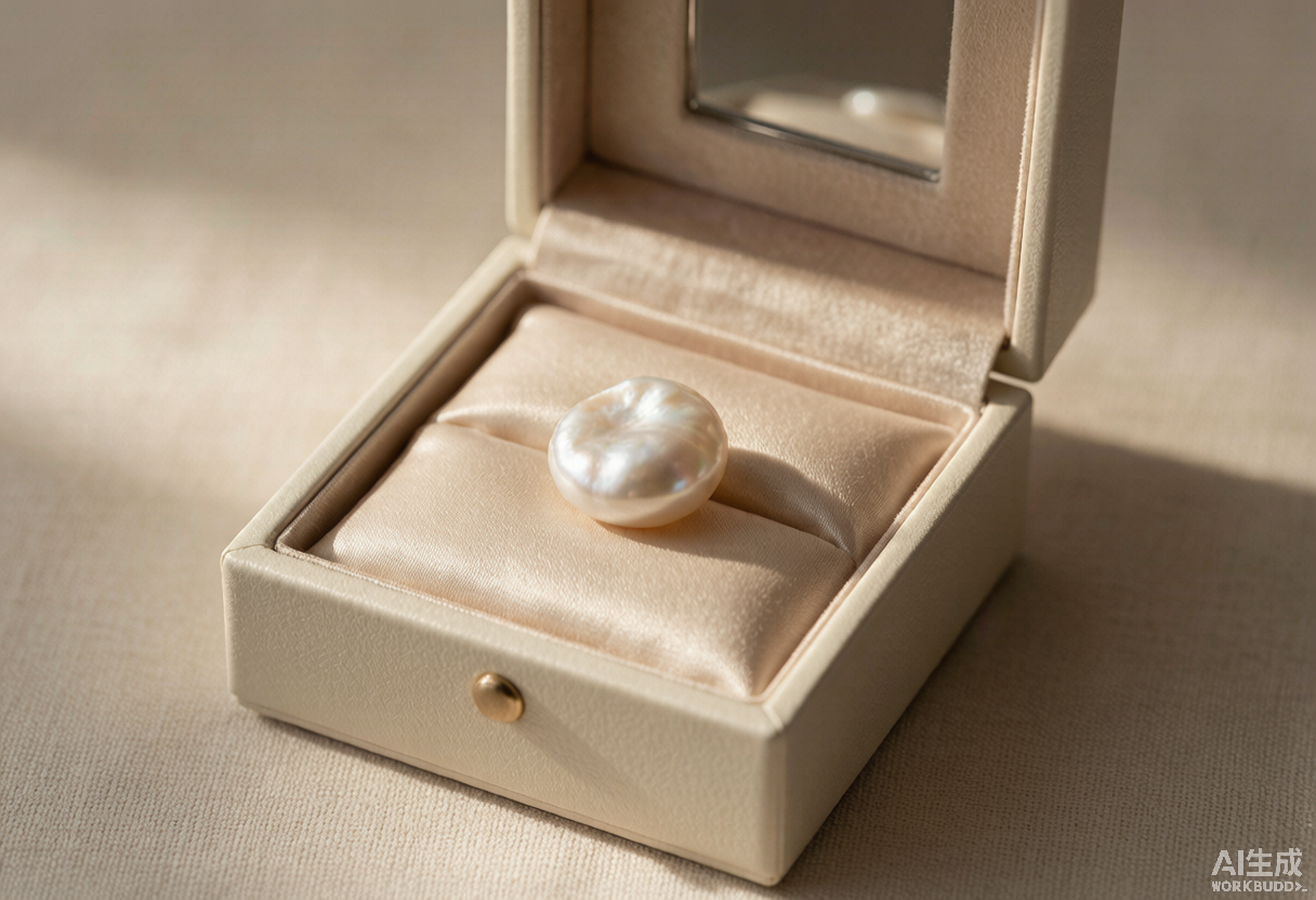
巴洛克珍珠正当红 Why Baroque Pearls Became 2026's Everyday Luxury Staple
曾几何时,珍珠是「妈妈那一代」的珠宝:一串正圆无瑕的米珠,端放在丝绒礼盒里,只在婚礼、寿宴这类讲究的场合才肯露面。2026 年,这枚古老的有机宝石正以另一种姿态回到日常——不规则、带肌理、甚至有点「歪」的巴洛克珍珠,成了秀场与街拍里最被反复佩戴的那一件。
把时间拨回 2026 春夏的伦敦与巴黎。Simone Rocha 把巴洛克珍珠缀在薄纱与缎带之间,被媒体形容为「浪漫又带方向感」;Schiaparelli 的高定秀上,异形珍珠与雕塑感金属框架并置,传递出一种「不完美才是高级」的笃定。这不是某个小众品牌的孤芳自赏。Branvas 的 2026 趋势矩阵把巴洛克珍珠排在「社媒声量、秀场背书、商业续航、供应可及性」四个维度全高的一档,与雕塑感银饰并列,视为全年最值得押注的主线。
数据比秀场更有说服力。全球天然及养殖珍珠市场 2025 年规模约 159.7 亿美元,2026 年已升至约 190.6 亿美元,并将以 15.0% 的复合年增速在 2032 年冲到 424.5 亿美元;其中淡水珍珠这一细分,2025 年 38.5 亿美元、2026 年约 41.8 亿,2032 年预计 66.8 亿美元(CAGR 8.21%)。中国是全球淡水珍珠绝对的生产中心,产量体积占比超过 90%,核心就在浙江诸暨山下湖——2024 年当地珍珠年销售额已突破 500 亿元人民币。回到国内,珍珠饰品整体市场规模站上 350 亿元,淡水珍珠吃掉约 65% 的份额。
 为什么是「巴洛克」?答案藏在它的不规则里。巴洛克珍珠是蚌体在育珠过程中被异物扰动、层层包裹形成的有机异形珠,每一颗的凹凸、拉长、扭曲都不可复制。过去这被视为「不够标准」,如今却成了年轻人眼里「不被定义」的注脚——在人人都戴同款正圆的年代,一颗歪得恰好的珍珠反而是最高级的自我介绍。更现实的是成本:相比培育一颗正圆珠,巴洛克珠的产出门槛低得多,批发端常能便宜近四成,让独立设计师也能做出「看起来像高珠、却没有高珠溢价」的系列。淡水养殖的 Edison(爱迪生)单核技术更进一步,把珠径与光泽做到可比肩高端海水珠,模糊了传统奢侈层级之间的界线。
价值坐标的迁移,才是这一轮珍珠热真正的底层逻辑。珍珠不再只为「传世」与「端庄」存在,它迁向了「悦己」与「日常」:白 T 配巴洛克耳钉、牛仔外套叠珍珠 choker、通勤衬衫别一枚异形珍珠胸针。Gen Z 把「有机的不完美」当作一种态度,而不是瑕疵。诸暨直播基地把源头蚌塘直连消费者,新中式审美与国货自信又推了一把,珍珠从礼品柜里被请出来,成了每天都能戴的轻奢。
这条线还在往外延展。peach、lavender、champagne 调的彩色巴洛克珠今年到处都是,给项链和戒指添一抹柔和的彩;男士珍珠也借无性别穿搭正常化,打开传统礼品之外的场合。而淡水珍珠天生比许多宝石更「可持续」——生长期两到七年、蚌塘可循环,恰好接住消费者对 responsible sourcing 的期待。当「负责任」本身成为一种高级感,珍珠的叙事就更完整了。
为什么是「巴洛克」?答案藏在它的不规则里。巴洛克珍珠是蚌体在育珠过程中被异物扰动、层层包裹形成的有机异形珠,每一颗的凹凸、拉长、扭曲都不可复制。过去这被视为「不够标准」,如今却成了年轻人眼里「不被定义」的注脚——在人人都戴同款正圆的年代,一颗歪得恰好的珍珠反而是最高级的自我介绍。更现实的是成本:相比培育一颗正圆珠,巴洛克珠的产出门槛低得多,批发端常能便宜近四成,让独立设计师也能做出「看起来像高珠、却没有高珠溢价」的系列。淡水养殖的 Edison(爱迪生)单核技术更进一步,把珠径与光泽做到可比肩高端海水珠,模糊了传统奢侈层级之间的界线。
价值坐标的迁移,才是这一轮珍珠热真正的底层逻辑。珍珠不再只为「传世」与「端庄」存在,它迁向了「悦己」与「日常」:白 T 配巴洛克耳钉、牛仔外套叠珍珠 choker、通勤衬衫别一枚异形珍珠胸针。Gen Z 把「有机的不完美」当作一种态度,而不是瑕疵。诸暨直播基地把源头蚌塘直连消费者,新中式审美与国货自信又推了一把,珍珠从礼品柜里被请出来,成了每天都能戴的轻奢。
这条线还在往外延展。peach、lavender、champagne 调的彩色巴洛克珠今年到处都是,给项链和戒指添一抹柔和的彩;男士珍珠也借无性别穿搭正常化,打开传统礼品之外的场合。而淡水珍珠天生比许多宝石更「可持续」——生长期两到七年、蚌塘可循环,恰好接住消费者对 responsible sourcing 的期待。当「负责任」本身成为一种高级感,珍珠的叙事就更完整了。
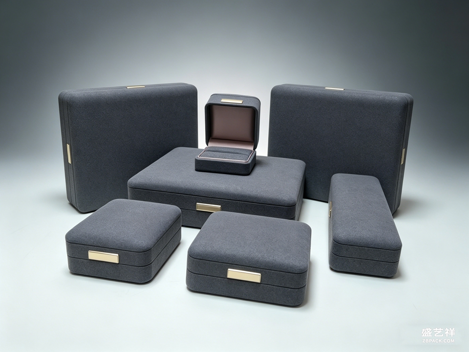
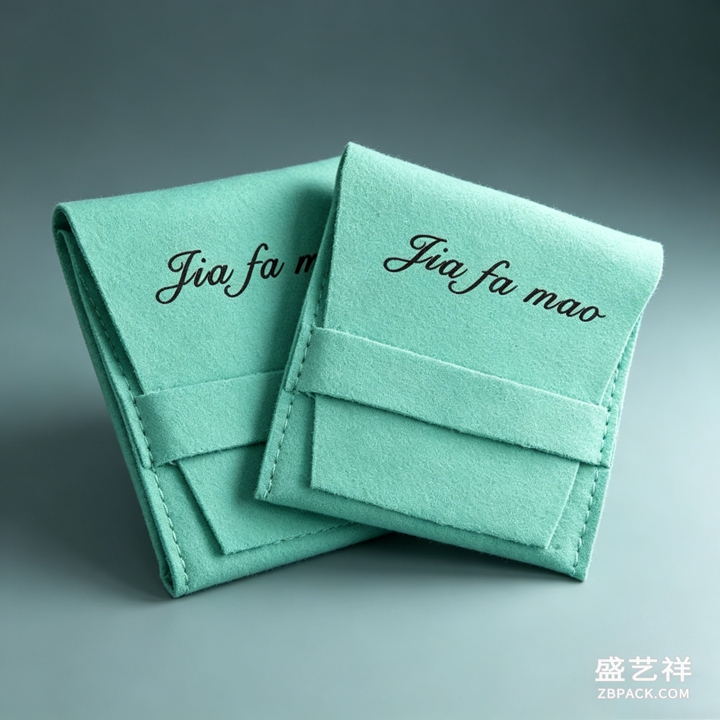 当一颗形状不规则、表面带肌理的珍珠成为日常主角,它的「呈现」也随之改变。圆形的标准珠可以安稳躺在戒枕凹槽里,巴洛克珠却会滚动、会相互剐蹭,盒内需要独立软卡位与低摩擦内衬,而不是一个通用托座;珠光是依赖光角度的「晕彩」,在冷白光下容易发灰发闷,珠宝陈列道具更适合用 2700–3000K 的暖光去托出它的层次。这正是珠宝盒定制与珠宝包装设计要接住的变化——不是把盒子做得更花,而是让结构去顺应每一颗珍珠的独一无二。盛艺祥在高端珠宝包装这条线上,习惯把「克制」当作高级感的底色:盒体挺度、内衬平整、开合阻尼,才是消费者指尖真正会记住的东西。
珍珠这一轮回潮,卖的从来不是克拉,也不是圆度,而是一种「我就这样,也很好看」的松弛。当珠宝的价值坐标从「显贵」迁到「显己」,首饰盒与陈列要做的,是把这份独特稳稳接住。
本文为原创内容,版权归盛艺祥所有。如需转载请注明出处。
当一颗形状不规则、表面带肌理的珍珠成为日常主角,它的「呈现」也随之改变。圆形的标准珠可以安稳躺在戒枕凹槽里,巴洛克珠却会滚动、会相互剐蹭,盒内需要独立软卡位与低摩擦内衬,而不是一个通用托座;珠光是依赖光角度的「晕彩」,在冷白光下容易发灰发闷,珠宝陈列道具更适合用 2700–3000K 的暖光去托出它的层次。这正是珠宝盒定制与珠宝包装设计要接住的变化——不是把盒子做得更花,而是让结构去顺应每一颗珍珠的独一无二。盛艺祥在高端珠宝包装这条线上,习惯把「克制」当作高级感的底色:盒体挺度、内衬平整、开合阻尼,才是消费者指尖真正会记住的东西。
珍珠这一轮回潮,卖的从来不是克拉,也不是圆度,而是一种「我就这样,也很好看」的松弛。当珠宝的价值坐标从「显贵」迁到「显己」,首饰盒与陈列要做的,是把这份独特稳稳接住。
本文为原创内容,版权归盛艺祥所有。如需转载请注明出处。
盛艺祥(Shengyixiang)——高端珠宝包装设计与定制专家,为品牌护航。 For decades, the pearl sat in a very specific box — literally and figuratively. It was the jewelry of a certain generation: a strand of perfectly round, flawless beads, kept in a velvet case, brought out only for weddings, anniversaries and the occasional formal dinner. In 2026, this ancient organic gem is back, but it is wearing something altogether different. The irregular, textured, occasionally lopsided baroque pearl has become the single most-repeated piece on the runways and in the street-style feeds. Trace it back to the Spring/Summer 2026 shows in London and Paris. Simone Rocha threaded baroque pearls through tulle and ribbon in a way one critic called "romantic and directional at once." At Schiaparelli's couture, misshapen pearls met sculptural metal frameworks, broadcasting a quiet confidence that imperfection is the point. This was not a niche house indulging itself. Branvas's 2026 Trend Confidence Matrix scores baroque pearls at the top across all four axes — social signal, runway endorsement, commercial longevity and sourcing accessibility — ranking it alongside sculptural silver as the year's safest bet. The numbers make the case better than any runway. The global natural and cultured pearl market was worth about USD 15.97 billion in 2025 and had already climbed to roughly USD 19.06 billion in 2026, on track for a 15.0% CAGR that reaches USD 42.47 billion by 2032. The freshwater segment alone moves from USD 3.85 billion in 2025 to about USD 4.18 billion in 2026 and an estimated USD 6.68 billion by 2032 (CAGR 8.21%). China is the undisputed production center, responsible for over 90% of global freshwater pearl volume, concentrated in Zhuji's Shanxiahu cluster — where annual pearl sales crossed RMB 50 billion in 2024. Domestically, the pearl jewelry market has passed RMB 35 billion, with freshwater pearls taking roughly 65% of it.
Why baroque, specifically? The answer lives in the irregularity. A baroque pearl forms when a foreign particle disturbs the mollusk's layering, and the nacre wraps around it in ways no two pearls share — pitted, elongated, curved, never repeated. Where that used to read as "not up to standard," younger buyers now read it as "not like anyone else's." In an era of identical round studs, a pearl that leans exactly wrong becomes the most expensive-looking introduction you can make. There is a commercial logic too: baroque pearls are far cheaper to produce than perfectly round ones, often landing near 40% below at wholesale, letting independent designers build collections that look like fine jewelry without the fine-jewelry overhead. Freshwater Edison (single-nucleus) cultivation has pushed size and luster close to high-end South Sea territory, blurring the old luxury tiers entirely.
The real engine underneath this pearl moment is a shift in the value coordinate. Pearls are no longer only for "heirloom" and "propriety"; they have migrated toward "self" and "everyday." A white tee with a baroque stud, a denim jacket layered over a pearl choker, a single misshapen pearl pinned to a work shirt. Gen Z treats organic imperfection as a stance, not a flaw. Zhuji's livestream bases connect the mussel farm straight to the buyer, and a new-Chinese-aesthetic wave plus growing pride in domestic brands pushed pearls out of the gift cabinet and into daily wear as an accessible luxury.
The line keeps extending outward. Peach, lavender and champagne-toned colored baroque pearls are everywhere this year, adding a soft wash of color to necklaces and rings; men's pearls normalize through genderless styling, opening occasions beyond the traditional gift. And freshwater pearls are naturally kinder than many gems — a two-to-seven-year growth cycle in recyclable mussel ponds — which lands neatly on consumers' rising expectation of responsible sourcing. When "responsible" itself becomes a kind of luxury, the pearl's story gets more complete.
Retailers have leaned into the repositioning hard. Baroque studs in sterling silver start around USD 55, a statement necklace sits near USD 152, an amber baroque piece around USD 288 — a spread that lets the trend live at every price tier at once. The democratization is structural, not just aesthetic: wholesale platforms now sell baroque freshwater pearls directly to indie brands, so a founder can source in bulk at up to 40% below round-pearl equivalents and build something that reads as luxury without the luxury overhead. That is precisely why baroque pearls are likely to outlast a single season — the supply chain changed, not merely the styling. What looks like a mood on the runway is, underneath, a reordering of who gets to sell pearls and at what price.
When an irregular, textured pearl becomes a daily protagonist, how it is presented has to change as well. A standard round bead rests quietly in a ring slot; a baroque pearl rolls and scratches against its neighbors, so the box needs independent soft compartments and low-friction lining rather than a generic cradle. Pearl luster is an angle-dependent iridescence that goes flat and grey under cold white light, which is why jewelry display props read better under warm 2700–3000K lighting that pulls out the depth. This is exactly where jewelry box customization and jewelry packaging design have to meet the trend — not by decorating the box harder, but by letting the structure yield to each pearl's uniqueness. Shengyixiang's approach on the high-end packaging line has long treated restraint as the bedrock of luxury: case rigidity, lining smoothness, the damping of the closure — those are the things a customer actually remembers under their fingertips.
What pearl's revival sells is never carat, never roundness. It is a certain ease that says "I'm like this, and that's fine." As the value coordinate moves from "looking expensive" to "looking like me," the box and the display exist to hold that uniqueness steady.
This is original content. Copyright belongs to Shengyixiang.
Shengyixiang — your expert in high-end jewelry packaging design & customization.
返回资讯列表
Back To News List
为什么是「巴洛克」?答案藏在它的不规则里。巴洛克珍珠是蚌体在育珠过程中被异物扰动、层层包裹形成的有机异形珠,每一颗的凹凸、拉长、扭曲都不可复制。过去这被视为「不够标准」,如今却成了年轻人眼里「不被定义」的注脚——在人人都戴同款正圆的年代,一颗歪得恰好的珍珠反而是最高级的自我介绍。更现实的是成本:相比培育一颗正圆珠,巴洛克珠的产出门槛低得多,批发端常能便宜近四成,让独立设计师也能做出「看起来像高珠、却没有高珠溢价」的系列。淡水养殖的 Edison(爱迪生)单核技术更进一步,把珠径与光泽做到可比肩高端海水珠,模糊了传统奢侈层级之间的界线。
价值坐标的迁移,才是这一轮珍珠热真正的底层逻辑。珍珠不再只为「传世」与「端庄」存在,它迁向了「悦己」与「日常」:白 T 配巴洛克耳钉、牛仔外套叠珍珠 choker、通勤衬衫别一枚异形珍珠胸针。Gen Z 把「有机的不完美」当作一种态度,而不是瑕疵。诸暨直播基地把源头蚌塘直连消费者,新中式审美与国货自信又推了一把,珍珠从礼品柜里被请出来,成了每天都能戴的轻奢。
这条线还在往外延展。peach、lavender、champagne 调的彩色巴洛克珠今年到处都是,给项链和戒指添一抹柔和的彩;男士珍珠也借无性别穿搭正常化,打开传统礼品之外的场合。而淡水珍珠天生比许多宝石更「可持续」——生长期两到七年、蚌塘可循环,恰好接住消费者对 responsible sourcing 的期待。当「负责任」本身成为一种高级感,珍珠的叙事就更完整了。
当一颗形状不规则、表面带肌理的珍珠成为日常主角,它的「呈现」也随之改变。圆形的标准珠可以安稳躺在戒枕凹槽里,巴洛克珠却会滚动、会相互剐蹭,盒内需要独立软卡位与低摩擦内衬,而不是一个通用托座;珠光是依赖光角度的「晕彩」,在冷白光下容易发灰发闷,珠宝陈列道具更适合用 2700–3000K 的暖光去托出它的层次。这正是珠宝盒定制与珠宝包装设计要接住的变化——不是把盒子做得更花,而是让结构去顺应每一颗珍珠的独一无二。盛艺祥在高端珠宝包装这条线上,习惯把「克制」当作高级感的底色:盒体挺度、内衬平整、开合阻尼,才是消费者指尖真正会记住的东西。
珍珠这一轮回潮,卖的从来不是克拉,也不是圆度,而是一种「我就这样,也很好看」的松弛。当珠宝的价值坐标从「显贵」迁到「显己」,首饰盒与陈列要做的,是把这份独特稳稳接住。
本文为原创内容,版权归盛艺祥所有。如需转载请注明出处。盛艺祥(Shengyixiang)——高端珠宝包装设计与定制专家,为品牌护航。 For decades, the pearl sat in a very specific box — literally and figuratively. It was the jewelry of a certain generation: a strand of perfectly round, flawless beads, kept in a velvet case, brought out only for weddings, anniversaries and the occasional formal dinner. In 2026, this ancient organic gem is back, but it is wearing something altogether different. The irregular, textured, occasionally lopsided baroque pearl has become the single most-repeated piece on the runways and in the street-style feeds. Trace it back to the Spring/Summer 2026 shows in London and Paris. Simone Rocha threaded baroque pearls through tulle and ribbon in a way one critic called "romantic and directional at once." At Schiaparelli's couture, misshapen pearls met sculptural metal frameworks, broadcasting a quiet confidence that imperfection is the point. This was not a niche house indulging itself. Branvas's 2026 Trend Confidence Matrix scores baroque pearls at the top across all four axes — social signal, runway endorsement, commercial longevity and sourcing accessibility — ranking it alongside sculptural silver as the year's safest bet. The numbers make the case better than any runway. The global natural and cultured pearl market was worth about USD 15.97 billion in 2025 and had already climbed to roughly USD 19.06 billion in 2026, on track for a 15.0% CAGR that reaches USD 42.47 billion by 2032. The freshwater segment alone moves from USD 3.85 billion in 2025 to about USD 4.18 billion in 2026 and an estimated USD 6.68 billion by 2032 (CAGR 8.21%). China is the undisputed production center, responsible for over 90% of global freshwater pearl volume, concentrated in Zhuji's Shanxiahu cluster — where annual pearl sales crossed RMB 50 billion in 2024. Domestically, the pearl jewelry market has passed RMB 35 billion, with freshwater pearls taking roughly 65% of it.
Why baroque, specifically? The answer lives in the irregularity. A baroque pearl forms when a foreign particle disturbs the mollusk's layering, and the nacre wraps around it in ways no two pearls share — pitted, elongated, curved, never repeated. Where that used to read as "not up to standard," younger buyers now read it as "not like anyone else's." In an era of identical round studs, a pearl that leans exactly wrong becomes the most expensive-looking introduction you can make. There is a commercial logic too: baroque pearls are far cheaper to produce than perfectly round ones, often landing near 40% below at wholesale, letting independent designers build collections that look like fine jewelry without the fine-jewelry overhead. Freshwater Edison (single-nucleus) cultivation has pushed size and luster close to high-end South Sea territory, blurring the old luxury tiers entirely.
The real engine underneath this pearl moment is a shift in the value coordinate. Pearls are no longer only for "heirloom" and "propriety"; they have migrated toward "self" and "everyday." A white tee with a baroque stud, a denim jacket layered over a pearl choker, a single misshapen pearl pinned to a work shirt. Gen Z treats organic imperfection as a stance, not a flaw. Zhuji's livestream bases connect the mussel farm straight to the buyer, and a new-Chinese-aesthetic wave plus growing pride in domestic brands pushed pearls out of the gift cabinet and into daily wear as an accessible luxury.
The line keeps extending outward. Peach, lavender and champagne-toned colored baroque pearls are everywhere this year, adding a soft wash of color to necklaces and rings; men's pearls normalize through genderless styling, opening occasions beyond the traditional gift. And freshwater pearls are naturally kinder than many gems — a two-to-seven-year growth cycle in recyclable mussel ponds — which lands neatly on consumers' rising expectation of responsible sourcing. When "responsible" itself becomes a kind of luxury, the pearl's story gets more complete.
Retailers have leaned into the repositioning hard. Baroque studs in sterling silver start around USD 55, a statement necklace sits near USD 152, an amber baroque piece around USD 288 — a spread that lets the trend live at every price tier at once. The democratization is structural, not just aesthetic: wholesale platforms now sell baroque freshwater pearls directly to indie brands, so a founder can source in bulk at up to 40% below round-pearl equivalents and build something that reads as luxury without the luxury overhead. That is precisely why baroque pearls are likely to outlast a single season — the supply chain changed, not merely the styling. What looks like a mood on the runway is, underneath, a reordering of who gets to sell pearls and at what price.
When an irregular, textured pearl becomes a daily protagonist, how it is presented has to change as well. A standard round bead rests quietly in a ring slot; a baroque pearl rolls and scratches against its neighbors, so the box needs independent soft compartments and low-friction lining rather than a generic cradle. Pearl luster is an angle-dependent iridescence that goes flat and grey under cold white light, which is why jewelry display props read better under warm 2700–3000K lighting that pulls out the depth. This is exactly where jewelry box customization and jewelry packaging design have to meet the trend — not by decorating the box harder, but by letting the structure yield to each pearl's uniqueness. Shengyixiang's approach on the high-end packaging line has long treated restraint as the bedrock of luxury: case rigidity, lining smoothness, the damping of the closure — those are the things a customer actually remembers under their fingertips.
What pearl's revival sells is never carat, never roundness. It is a certain ease that says "I'm like this, and that's fine." As the value coordinate moves from "looking expensive" to "looking like me," the box and the display exist to hold that uniqueness steady.
This is original content. Copyright belongs to Shengyixiang.Shengyixiang — your expert in high-end jewelry packaging design & customization.