复古珠宝包装的纹理回潮 Retro Jewelry Packaging: Textures and Colors Return
时尚是个轮回,珠宝包装也不例外。近几年,复古风潮从服装蔓延到珠宝陈列与包装领域:做旧金属、浮雕纹理、深咖与勃艮第红、丝绒与蕾丝质感,这些元素正重新回到首饰盒与陈列道具的设计中。复古不等于老气,而是用时间感为产品增加叙事。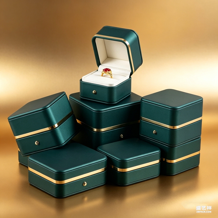
复古珠宝包装的第一张牌是材质。植绒布、烫金、哑光烤漆与做旧五金,组合起来就很有年代感。比如一只深绿色植绒首饰盒,配上古铜色合页与锁扣,立刻有了传家宝的气质。亚克力等现代材质并不排斥复古,关键在于颜色与工艺的搭配:用深色系与金色点缀,现代材质也能呈现古典氛围。
纹理是复古的第二张牌。压纹皮革纹、浮雕花纹、蕾丝镂空,这些纹理让平面包装变得立体而丰富。烫金在复古风格中尤为重要,但用法与轻奢风不同:复古更偏爱哑金、做旧金的色泽,以及不对称、手写体的线条,避免过于工整而失去年代感。
色彩搭配上,复古风偏爱低饱和、高对比的组合:墨绿配金、勃艮第红配米白、深棕配古铜。这些颜色自带时间沉淀的气质,与珠宝的光泽相得益彰。切忌使用高饱和的亮色,那会让复古变成土味。选择色彩时,可以先定一个主色,再用金、铜等金属色做10%的点缀,比例控制是关键。
陈列道具同样可以拥抱复古。黄铜材质的中岛架、做旧处理的木质托盘、丝绒覆盖的展示柜,都是营造复古氛围的好帮手。与极简陈列不同,复古陈列允许更丰富的层次与装饰,但依然要守住焦点唯一的底线:道具是衬托,珠宝才是主角。
对珠宝品牌而言,复古包装的价值在于差异化与情感共鸣。年轻消费者对复古的喜爱,本质是对独特叙事与品质感的向往。一只有故事的首饰盒,比十只平庸的盒子更容易被记住、被分享。定制复古风首饰盒时,建议从材质与五金入手,先打样确认做旧效果,再决定批量方案。
复古回潮提醒我们:包装设计不必永远追逐新潮,有时向后看,反而能走出新路。用纹理、色彩与工艺讲一个关于时间的故事,珠宝的贵重感会因此更立体。无论是陈列道具还是首饰盒,复古都是值得尝试的差异化方向。
本文为原创内容,版权归骏依美所有。如需转载请注明出处。
深圳骏依美首饰包装,21年专注首饰盒定制与珠宝袋加工,源头工厂一站供货,欢迎垂询。
Fashion is a cycle, and jewelry packaging is no exception. In recent years, the retro wave has moved from clothing into jewelry display and packaging: aged metal, embossed textures, deep brown and burgundy, velvet and lace textures, all returning to jewelry box and prop design. Retro does not mean old-fashioned; it uses a sense of time to add narrative to products.
The first card of retro packaging is material. Flocking, foil stamping, matte paint, and aged hardware combine into an era feel. A dark green flocked jewelry box with bronze hinges and clasps instantly gains heirloom character. Modern materials like acrylic are not excluded; the key is color and craft pairing: dark tones with gold accents make modern materials classical.
Texture is the second card. Embossed leather grain, relief patterns, lace cutouts, these make flat packaging dimensional and rich. Foil matters greatly in retro, but differently from light luxury: retro prefers matte gold and aged gold, with asymmetric, handwritten lines, avoiding too-perfect geometry that loses the period feel.
In color, retro favors low saturation with high contrast: forest green with gold, burgundy with cream, deep brown with bronze. These colors carry sedimented time and match jewelry glow well. Avoid bright saturated colors, which turn retro into kitsch. Set one main color, then use 10 percent gold or copper accents; proportion control is key.
Display props can embrace retro too. Brass island stands, aged wood trays, velvet-covered showcases all build the mood. Unlike minimalist displays, retro allows richer layers and decoration, yet still holds the single-focus rule: props support, jewelry leads.
For jewelry brands, retro packaging offers differentiation and emotional resonance. Young consumers love retro for its unique narrative and quality feel. A jewelry box with a story is remembered and shared more than ten plain ones. When customizing retro boxes, start with material and hardware, confirm the aging effect with samples, then decide bulk production.
The retro return reminds us that packaging need not chase novelty forever; sometimes looking back opens new paths. Tell a story about time through texture, color, and craft, and jewelry preciousness becomes more dimensional. Whether props or boxes, retro is a differentiation direction worth trying.
This article is original content, copyrighted by JUNYIMEI. Please credit the source when reposting.
JUNYIMEI Jewelry Packaging: 21 years of custom jewelry boxes and pouches, OEM/ODM from the source factory. Welcome to inquire.