一种颜色讲完一支盒:同色系首饰盒的层次玩法盛艺祥 · 行业资讯
一种颜色讲完一支盒:同色系首饰盒的层次玩法 One Color, One Box: Layering Within a Monochrome Jewelry Box
很多品牌在做首饰盒时,第一反应是加更多颜色、印更多花纹,以为越热闹越显档次。结果往往是盒子抢了珠宝的风头。其实更高级的做法常常是做减法——用同色系把一支盒子的层次讲清楚。所谓同色系,不是整盒只有一种死板的颜色,而是围绕一个主色,用明度、饱和度的梯度拉开的变化,让包装自己有呼吸感。
以米白主调的首饰盒为例。盒身用暖白纸材,内衬选浅驼绒布,烫金 logo 压成哑光金,三层之间只有微妙色差,却谁也不抢谁。打开盒盖的瞬间,视线自然落到中央的戒指或吊坠上,包装像背景音乐一样托住主角,而不是抢戏的配角。这种克制特别适合客单价中高、强调质感的珠宝品牌,也最容易在货架上形成统一的家族感。
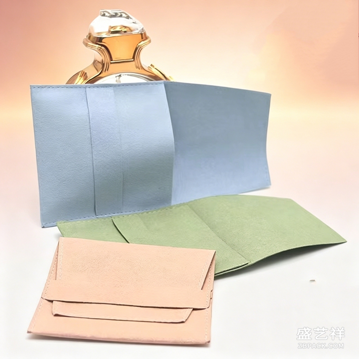 珠宝袋也可以走同色思路。绒布抽绳袋选与盒身一致的色系,外侧只留一个低调的织标或压印,整体像一套语言在说话。比起花哨拼色,单色袋在运输和收纳时更耐看,叠放在一起也干净统一,顾客带走时记住的是品牌调性,而不是某块突兀的色块。当盒与袋使用同一种语气,开箱与携带便连成了一段完整的体验。
同色系不等于单调。可以在主色之外,用百分之五到十的对比细节点睛,比如内盖一角印一句品牌主张,或绗缝走线换一个相邻色。这些小声的变化让盒子有记忆点,却不破坏整体的安静。还有一个常被忽略的细节:纸材本身的肌理感。带细微压纹的卡纸,在同色之下会显出层次,比光面纸更有手感。
珠宝袋也可以走同色思路。绒布抽绳袋选与盒身一致的色系,外侧只留一个低调的织标或压印,整体像一套语言在说话。比起花哨拼色,单色袋在运输和收纳时更耐看,叠放在一起也干净统一,顾客带走时记住的是品牌调性,而不是某块突兀的色块。当盒与袋使用同一种语气,开箱与携带便连成了一段完整的体验。
同色系不等于单调。可以在主色之外,用百分之五到十的对比细节点睛,比如内盖一角印一句品牌主张,或绗缝走线换一个相邻色。这些小声的变化让盒子有记忆点,却不破坏整体的安静。还有一个常被忽略的细节:纸材本身的肌理感。带细微压纹的卡纸,在同色之下会显出层次,比光面纸更有手感。
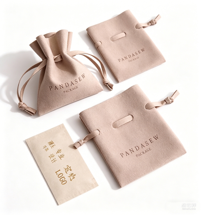 落地时建议先定一个品牌主色,再围绕它建立盒、袋、卡片的统一色卡,后续出新款也能延续下去。可以先做一支样盒,在自然光与柜台灯下分别看色差是否舒服,再批量下单。把配色收拢在同一种语气里,珠宝包装的高级感,往往就藏在这份克制之中。当顾客记不住某一种花纹,却记住了那种安静而讲究的色调,品牌便已经赢了第一眼。
本文为原创内容,版权归骏依美所有。如需转载请注明出处。
zbpack专注首饰盒与珠宝袋定制,为珠宝品牌提供高质感包装整体方案。
zbpack crafts jewelry boxes and pouches that give brands a cohesive, high-quality packaging system from first sketch to final ship, so every unboxing feels as considered as the piece inside.
Many brands, when designing a jewelry box, first reach for more colors and busier patterns, assuming louder means classier. The result is often a box that steals the show from the jewelry. The more refined move is usually subtraction—using a monochrome scheme to tell one box's layers clearly. Monochrome here isn't a single flat color; it's one dominant hue varied through lightness and saturation, so the packaging breathes on its own.
Take a warm off-white box. The shell uses warm-white paper, the lining a pale camel velvet, the logo a matte gold foil—three layers with only subtle shifts, yet none competes. The moment the lid opens, the eye lands naturally on the central ring or pendant; the package holds the hero like background music, not a loud co-star. This restraint suits mid-to-high ticket brands that prize texture, and it builds a consistent family look across the shelf.
The pouch can follow the same logic. A velvet drawstring bag in the box's hue, with only a low-key woven tag or emboss, speaks as one language. Against flashy color blocks, the single-tone bag stays elegant in shipping and storage, and stacked together looks clean and unified—what the customer remembers is the brand tone, not a stray color patch. When box and bag share one voice, unboxing and carrying become one continuous experience.
Monochrome is not monotony. Beyond the main hue, use five to ten percent contrast as a finishing touch—a brand line printed inside the lid, or topstitching in an adjacent shade. These quiet changes give the box a memory point without breaking the calm. One overlooked detail: the paper's own texture. A finely embossed card shows layers under one color, feeling more tactile than glossy stock.
In practice, fix one brand main color first, then build a unified swatch across box, pouch and card, so new releases stay consistent. Prototype one box and view it under daylight and counter light to check the shift feels comfortable, then order in volume. Gather the palette into one voice, and the box's quiet luxury lives in that restraint. When a customer forgets a pattern but remembers a calm, considered tone, the brand has already won the first glance.
本文为原创内容,版权归骏依美所有。如需转载请注明出处。
zbpack crafts jewelry boxes and pouches that give brands a cohesive, high-quality packaging system from first sketch to final ship, so every unboxing feels as considered as the piece inside.
落地时建议先定一个品牌主色,再围绕它建立盒、袋、卡片的统一色卡,后续出新款也能延续下去。可以先做一支样盒,在自然光与柜台灯下分别看色差是否舒服,再批量下单。把配色收拢在同一种语气里,珠宝包装的高级感,往往就藏在这份克制之中。当顾客记不住某一种花纹,却记住了那种安静而讲究的色调,品牌便已经赢了第一眼。
本文为原创内容,版权归骏依美所有。如需转载请注明出处。
zbpack专注首饰盒与珠宝袋定制,为珠宝品牌提供高质感包装整体方案。
zbpack crafts jewelry boxes and pouches that give brands a cohesive, high-quality packaging system from first sketch to final ship, so every unboxing feels as considered as the piece inside.
Many brands, when designing a jewelry box, first reach for more colors and busier patterns, assuming louder means classier. The result is often a box that steals the show from the jewelry. The more refined move is usually subtraction—using a monochrome scheme to tell one box's layers clearly. Monochrome here isn't a single flat color; it's one dominant hue varied through lightness and saturation, so the packaging breathes on its own.
Take a warm off-white box. The shell uses warm-white paper, the lining a pale camel velvet, the logo a matte gold foil—three layers with only subtle shifts, yet none competes. The moment the lid opens, the eye lands naturally on the central ring or pendant; the package holds the hero like background music, not a loud co-star. This restraint suits mid-to-high ticket brands that prize texture, and it builds a consistent family look across the shelf.
The pouch can follow the same logic. A velvet drawstring bag in the box's hue, with only a low-key woven tag or emboss, speaks as one language. Against flashy color blocks, the single-tone bag stays elegant in shipping and storage, and stacked together looks clean and unified—what the customer remembers is the brand tone, not a stray color patch. When box and bag share one voice, unboxing and carrying become one continuous experience.
Monochrome is not monotony. Beyond the main hue, use five to ten percent contrast as a finishing touch—a brand line printed inside the lid, or topstitching in an adjacent shade. These quiet changes give the box a memory point without breaking the calm. One overlooked detail: the paper's own texture. A finely embossed card shows layers under one color, feeling more tactile than glossy stock.
In practice, fix one brand main color first, then build a unified swatch across box, pouch and card, so new releases stay consistent. Prototype one box and view it under daylight and counter light to check the shift feels comfortable, then order in volume. Gather the palette into one voice, and the box's quiet luxury lives in that restraint. When a customer forgets a pattern but remembers a calm, considered tone, the brand has already won the first glance.
本文为原创内容,版权归骏依美所有。如需转载请注明出处。
zbpack crafts jewelry boxes and pouches that give brands a cohesive, high-quality packaging system from first sketch to final ship, so every unboxing feels as considered as the piece inside.
返回资讯列表
Back To News List
珠宝袋也可以走同色思路。绒布抽绳袋选与盒身一致的色系,外侧只留一个低调的织标或压印,整体像一套语言在说话。比起花哨拼色,单色袋在运输和收纳时更耐看,叠放在一起也干净统一,顾客带走时记住的是品牌调性,而不是某块突兀的色块。当盒与袋使用同一种语气,开箱与携带便连成了一段完整的体验。
同色系不等于单调。可以在主色之外,用百分之五到十的对比细节点睛,比如内盖一角印一句品牌主张,或绗缝走线换一个相邻色。这些小声的变化让盒子有记忆点,却不破坏整体的安静。还有一个常被忽略的细节:纸材本身的肌理感。带细微压纹的卡纸,在同色之下会显出层次,比光面纸更有手感。
落地时建议先定一个品牌主色,再围绕它建立盒、袋、卡片的统一色卡,后续出新款也能延续下去。可以先做一支样盒,在自然光与柜台灯下分别看色差是否舒服,再批量下单。把配色收拢在同一种语气里,珠宝包装的高级感,往往就藏在这份克制之中。当顾客记不住某一种花纹,却记住了那种安静而讲究的色调,品牌便已经赢了第一眼。
本文为原创内容,版权归骏依美所有。如需转载请注明出处。
zbpack专注首饰盒与珠宝袋定制,为珠宝品牌提供高质感包装整体方案。
zbpack crafts jewelry boxes and pouches that give brands a cohesive, high-quality packaging system from first sketch to final ship, so every unboxing feels as considered as the piece inside.
Many brands, when designing a jewelry box, first reach for more colors and busier patterns, assuming louder means classier. The result is often a box that steals the show from the jewelry. The more refined move is usually subtraction—using a monochrome scheme to tell one box's layers clearly. Monochrome here isn't a single flat color; it's one dominant hue varied through lightness and saturation, so the packaging breathes on its own.
Take a warm off-white box. The shell uses warm-white paper, the lining a pale camel velvet, the logo a matte gold foil—three layers with only subtle shifts, yet none competes. The moment the lid opens, the eye lands naturally on the central ring or pendant; the package holds the hero like background music, not a loud co-star. This restraint suits mid-to-high ticket brands that prize texture, and it builds a consistent family look across the shelf.
The pouch can follow the same logic. A velvet drawstring bag in the box's hue, with only a low-key woven tag or emboss, speaks as one language. Against flashy color blocks, the single-tone bag stays elegant in shipping and storage, and stacked together looks clean and unified—what the customer remembers is the brand tone, not a stray color patch. When box and bag share one voice, unboxing and carrying become one continuous experience.
Monochrome is not monotony. Beyond the main hue, use five to ten percent contrast as a finishing touch—a brand line printed inside the lid, or topstitching in an adjacent shade. These quiet changes give the box a memory point without breaking the calm. One overlooked detail: the paper's own texture. A finely embossed card shows layers under one color, feeling more tactile than glossy stock.
In practice, fix one brand main color first, then build a unified swatch across box, pouch and card, so new releases stay consistent. Prototype one box and view it under daylight and counter light to check the shift feels comfortable, then order in volume. Gather the palette into one voice, and the box's quiet luxury lives in that restraint. When a customer forgets a pattern but remembers a calm, considered tone, the brand has already won the first glance.
本文为原创内容,版权归骏依美所有。如需转载请注明出处。
zbpack crafts jewelry boxes and pouches that give brands a cohesive, high-quality packaging system from first sketch to final ship, so every unboxing feels as considered as the piece inside.