珠宝包装设计方案:礼盒手提袋的一体化定制方案盛艺祥 · 行业资讯
珠宝包装设计方案:礼盒手提袋的一体化定制方案 Jewelry Packaging Design: Integrated Customization of Gift Boxes and Bags
礼盒与手提袋,是珠宝从柜台走进顾客生活之前的最后一道包装。盒子的手感传递品质,袋子的质感延续期待,两者如果风格割裂,哪怕各自做得都不错,整体印象也会打折扣。一体化定制,就是把礼盒与手提袋当作一个整体来设计:同一个主视觉、同一种材质语言、同一套开合逻辑,让顾客从接过袋子到打开盒子,感受到的是同一种品牌气质。
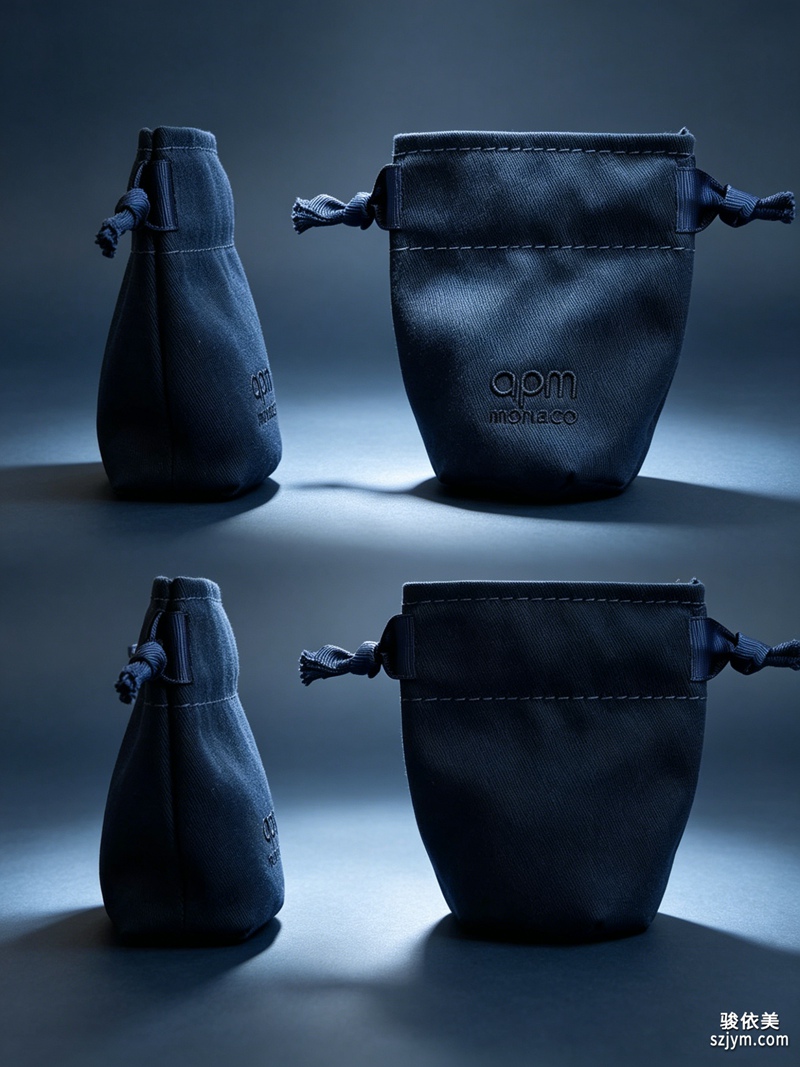 一体化设计的起点是主视觉的复用。品牌标识、辅助图形、色彩体系,这三样在盒与袋上必须保持一致,但表现方式可以分层:盒体上是完整的标志组合与工艺细节,袋面上则是缩小版的标志与大面积留白,形成"盒子精致、袋子克制"的节奏。色彩方面,盒袋同用一主色,但允许色阶差异,比如盒面用深一号的专色营造质感,袋面用浅一号的同色系保持轻盈,视觉上仍然是一套。主视觉的复用不靠简单复制,而是通过比例、材质与工艺的变化,让两件产品各有侧重又彼此呼应。
材质语言要统一,更要适配。礼盒常用纸板加绒布内衬的结构,手提袋则要考虑承重与提握,两者的材料选择应服从各自的功能,但表面处理可以共用同一套逻辑。常见的做法是:盒面包覆与袋身使用同类处理的面料或纸张,比如都做触感膜或都做哑光压纹,摸上去的"手感语言"一致;盒内绒布与袋内衬纸选择同一色系,打开盒子与打开袋口的瞬间色觉连续。材质不必完全一样,但质感层级要匹配,纸袋配纸盒、布袋配绒盒,这样的组合才能形成统一的品质想象。
开合逻辑是容易被忽略的一体化细节。盒子的开盒方式与袋子的取物方式如果设计得呼应,会形成一种微妙的仪式感:比如盒子用磁扣翻盖,袋子就可以设计成不用打结的抽绳封口,一开一抽的动作节奏相近;盒子如果做抽屉式,袋子则适合做敞口加内衬束口,抽拉感前后承接。这些细节顾客未必说得出来,但动作的连贯会强化"这套包装设计过"的整体感受。
结构设计上,礼盒与手提袋要围绕产品保护联动。珠宝盒在袋内不能晃动,袋子的内部尺寸建议比盒子大出一到两厘米,刚好容下再加一层薄海绵垫的余量。袋手提绳的承重按盒装产品重量的十倍设计,留足安全系数,避免顾客提着重物时提绳断裂的尴尬。袋底加装硬板衬底,防止盒子放入后袋底被拉坠变形。冬季与节庆场景下,还可以在盒袋之间预留一枚贺卡位,卡片与盒袋使用同一主视觉,完成从包装到情感的最后一环。
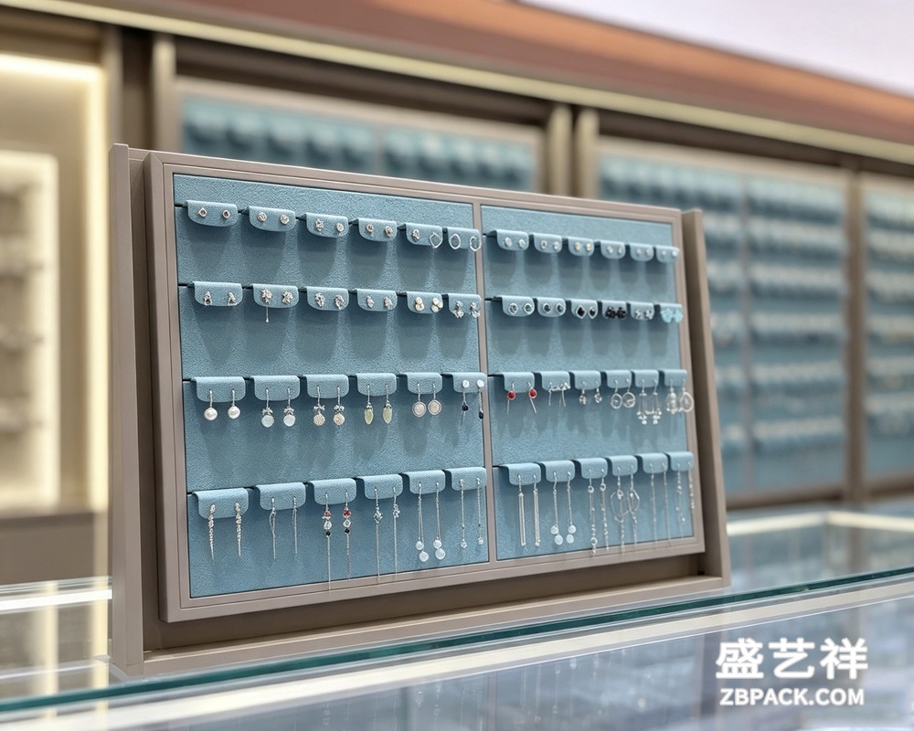 另外在批量场景中,盒与袋建议按同一主视觉分组编号,配套下单、入库与出库,避免出现不同批、色差明显的尴尬。节庆前提前两个月锁排期,常规款按季度滚动补货,保持安全库存。一体化不仅是设计的一致,更是从采购到交付的全程协同。
定制管理的核心是打样与色彩管理。一体化定制涉及两个供应商时(盒厂与袋厂),最大的风险是色差。建议把色卡与主视觉源文件同时发给两厂,并要求大货前各出一件确认样,两件样品放在一起比对后再锁定色值。如果条件允许,尽量选择同时具备盒与袋生产能力的一站式工厂,同一工厂内色彩管理与材质库存共用,色差风险会小很多。确认样留存后,大货到货时抽检对比,色差超过允许范围的一律退回。
成本上,一体化定制比分开采购未必更贵。主视觉与设计稿只付一次设计费,两厂共用;色彩与材质管理省掉了来回调色的沟通成本;采购量合并后,纸材与印料可以统一备库,单价有所下降。真正要控制的是工艺堆叠,盒袋各自的表面工艺应当控制在两到三种以内,工艺越多,交期越长、报废率越高,一体化设计追求的是整体质感,而不是工艺数量。
把礼盒与手提袋当作一个整体来设计,本质上是把品牌体验的链条打通:顾客先提袋、再开盒、最后取出产品,每一个动作之间都有包装在衔接。主视觉统一、材质同频、开合呼应、结构联动,四步走完,一体化定制就从一句口号变成了一套可交付、可验收、可复购的包装方案。
Gift boxes and carrier bags are the last packaging before jewelry leaves the counter and enters the customer's life. The box conveys quality by touch, the bag extends expectation by texture. If the two styles are split, even well-made pieces leave a weaker overall impression. Integrated customization treats the box and bag as one whole design: the same key visual, the same material language, the same opening logic, so the customer feels one brand character from taking the bag to opening the box.
The starting point is reuse of the key visual. Brand logo, auxiliary graphics and color system must stay consistent on both box and bag, but expression can be layered: the box carries the full logo group with craft details, the bag carries a reduced logo with generous white space - a rhythm of refined box and restrained bag. Colors use one main tone with allowed shade differences: a deeper spot color on the box surface for texture, a lighter same-family tone on the bag for lightness, still one visual set. Reuse does not mean simple copying; proportion, material and craft variations let the two pieces emphasize differently while echoing each other.
Material language should be unified yet adapted. Boxes use cardboard with velvet lining; bags must bear weight and be easy to hold. Material choices follow function, but surface treatments can share one logic: box cover and bag body use the same treated fabric or paper, such as soft-touch film or matte embossing, giving the same hand-feel language; box lining and bag inner paper share one color family for continuous color experience when opening. Materials need not be identical, but quality levels must match: paper bag with paper box, fabric bag with velvet box.
Opening logic is an easily missed detail. If the way the box opens echoes the way the bag opens, a subtle ritual feeling forms. For example, a magnetic flip-lid box pairs with a no-knot drawstring closure; a drawer box pairs with an open mouth with inner gathered opening. Customers may not articulate these details, but the continuity of motions strengthens the impression that this packaging was designed.
Structurally, box and bag must work together for protection. The jewelry box should not shake inside the bag; inner bag size should be one or two centimeters larger than the box, with room for a thin foam pad. Rope strength should be ten times the packed weight as a safety factor. Add a hardboard bottom to prevent sagging. For winter and festivals, reserve a card slot between box and bag, using the same key visual for the card, completing the chain from packaging to emotion.
The core of customization management is sampling and color control. When two suppliers are involved, the biggest risk is color difference. Send the color card and key visual sources to both factories and require confirmation samples before production, comparing the two samples side by side before locking values. If possible, choose a one-stop factory making both boxes and bags, where color management and material stock are shared. Keep confirmation samples and spot-check bulk goods on arrival; reject any beyond tolerance.
On cost, integrated customization is not necessarily more expensive than separate purchasing. Design fees are paid once for both; communication cost of color adjustment is saved; merged purchase volume lowers material unit prices. What needs control is craft stacking: limit surface crafts to two or three types each, as more crafts mean longer lead times and higher scrap rates. Integrated design pursues overall texture, not craft quantity.
Treating box and bag as one whole is essentially connecting the chain of brand experience: the customer lifts the bag, opens the box, takes out the product, with packaging bridging every motion. Unified key visual, same-frequency materials, echoing openings, linked structure - four steps turn integrated customization from a slogan into a deliverable, verifiable and repeatable packaging plan.
返回资讯列表
Back To News List
一体化设计的起点是主视觉的复用。品牌标识、辅助图形、色彩体系,这三样在盒与袋上必须保持一致,但表现方式可以分层:盒体上是完整的标志组合与工艺细节,袋面上则是缩小版的标志与大面积留白,形成"盒子精致、袋子克制"的节奏。色彩方面,盒袋同用一主色,但允许色阶差异,比如盒面用深一号的专色营造质感,袋面用浅一号的同色系保持轻盈,视觉上仍然是一套。主视觉的复用不靠简单复制,而是通过比例、材质与工艺的变化,让两件产品各有侧重又彼此呼应。
材质语言要统一,更要适配。礼盒常用纸板加绒布内衬的结构,手提袋则要考虑承重与提握,两者的材料选择应服从各自的功能,但表面处理可以共用同一套逻辑。常见的做法是:盒面包覆与袋身使用同类处理的面料或纸张,比如都做触感膜或都做哑光压纹,摸上去的"手感语言"一致;盒内绒布与袋内衬纸选择同一色系,打开盒子与打开袋口的瞬间色觉连续。材质不必完全一样,但质感层级要匹配,纸袋配纸盒、布袋配绒盒,这样的组合才能形成统一的品质想象。
开合逻辑是容易被忽略的一体化细节。盒子的开盒方式与袋子的取物方式如果设计得呼应,会形成一种微妙的仪式感:比如盒子用磁扣翻盖,袋子就可以设计成不用打结的抽绳封口,一开一抽的动作节奏相近;盒子如果做抽屉式,袋子则适合做敞口加内衬束口,抽拉感前后承接。这些细节顾客未必说得出来,但动作的连贯会强化"这套包装设计过"的整体感受。
结构设计上,礼盒与手提袋要围绕产品保护联动。珠宝盒在袋内不能晃动,袋子的内部尺寸建议比盒子大出一到两厘米,刚好容下再加一层薄海绵垫的余量。袋手提绳的承重按盒装产品重量的十倍设计,留足安全系数,避免顾客提着重物时提绳断裂的尴尬。袋底加装硬板衬底,防止盒子放入后袋底被拉坠变形。冬季与节庆场景下,还可以在盒袋之间预留一枚贺卡位,卡片与盒袋使用同一主视觉,完成从包装到情感的最后一环。
另外在批量场景中,盒与袋建议按同一主视觉分组编号,配套下单、入库与出库,避免出现不同批、色差明显的尴尬。节庆前提前两个月锁排期,常规款按季度滚动补货,保持安全库存。一体化不仅是设计的一致,更是从采购到交付的全程协同。
定制管理的核心是打样与色彩管理。一体化定制涉及两个供应商时(盒厂与袋厂),最大的风险是色差。建议把色卡与主视觉源文件同时发给两厂,并要求大货前各出一件确认样,两件样品放在一起比对后再锁定色值。如果条件允许,尽量选择同时具备盒与袋生产能力的一站式工厂,同一工厂内色彩管理与材质库存共用,色差风险会小很多。确认样留存后,大货到货时抽检对比,色差超过允许范围的一律退回。
成本上,一体化定制比分开采购未必更贵。主视觉与设计稿只付一次设计费,两厂共用;色彩与材质管理省掉了来回调色的沟通成本;采购量合并后,纸材与印料可以统一备库,单价有所下降。真正要控制的是工艺堆叠,盒袋各自的表面工艺应当控制在两到三种以内,工艺越多,交期越长、报废率越高,一体化设计追求的是整体质感,而不是工艺数量。
把礼盒与手提袋当作一个整体来设计,本质上是把品牌体验的链条打通:顾客先提袋、再开盒、最后取出产品,每一个动作之间都有包装在衔接。主视觉统一、材质同频、开合呼应、结构联动,四步走完,一体化定制就从一句口号变成了一套可交付、可验收、可复购的包装方案。
Gift boxes and carrier bags are the last packaging before jewelry leaves the counter and enters the customer's life. The box conveys quality by touch, the bag extends expectation by texture. If the two styles are split, even well-made pieces leave a weaker overall impression. Integrated customization treats the box and bag as one whole design: the same key visual, the same material language, the same opening logic, so the customer feels one brand character from taking the bag to opening the box.
The starting point is reuse of the key visual. Brand logo, auxiliary graphics and color system must stay consistent on both box and bag, but expression can be layered: the box carries the full logo group with craft details, the bag carries a reduced logo with generous white space - a rhythm of refined box and restrained bag. Colors use one main tone with allowed shade differences: a deeper spot color on the box surface for texture, a lighter same-family tone on the bag for lightness, still one visual set. Reuse does not mean simple copying; proportion, material and craft variations let the two pieces emphasize differently while echoing each other.
Material language should be unified yet adapted. Boxes use cardboard with velvet lining; bags must bear weight and be easy to hold. Material choices follow function, but surface treatments can share one logic: box cover and bag body use the same treated fabric or paper, such as soft-touch film or matte embossing, giving the same hand-feel language; box lining and bag inner paper share one color family for continuous color experience when opening. Materials need not be identical, but quality levels must match: paper bag with paper box, fabric bag with velvet box.
Opening logic is an easily missed detail. If the way the box opens echoes the way the bag opens, a subtle ritual feeling forms. For example, a magnetic flip-lid box pairs with a no-knot drawstring closure; a drawer box pairs with an open mouth with inner gathered opening. Customers may not articulate these details, but the continuity of motions strengthens the impression that this packaging was designed.
Structurally, box and bag must work together for protection. The jewelry box should not shake inside the bag; inner bag size should be one or two centimeters larger than the box, with room for a thin foam pad. Rope strength should be ten times the packed weight as a safety factor. Add a hardboard bottom to prevent sagging. For winter and festivals, reserve a card slot between box and bag, using the same key visual for the card, completing the chain from packaging to emotion.
The core of customization management is sampling and color control. When two suppliers are involved, the biggest risk is color difference. Send the color card and key visual sources to both factories and require confirmation samples before production, comparing the two samples side by side before locking values. If possible, choose a one-stop factory making both boxes and bags, where color management and material stock are shared. Keep confirmation samples and spot-check bulk goods on arrival; reject any beyond tolerance.
On cost, integrated customization is not necessarily more expensive than separate purchasing. Design fees are paid once for both; communication cost of color adjustment is saved; merged purchase volume lowers material unit prices. What needs control is craft stacking: limit surface crafts to two or three types each, as more crafts mean longer lead times and higher scrap rates. Integrated design pursues overall texture, not craft quantity.
Treating box and bag as one whole is essentially connecting the chain of brand experience: the customer lifts the bag, opens the box, takes out the product, with packaging bridging every motion. Unified key visual, same-frequency materials, echoing openings, linked structure - four steps turn integrated customization from a slogan into a deliverable, verifiable and repeatable packaging plan.