首饰盒上的布标:品牌、材质与护理信息怎么排 Fabric Tags on Jewellery Boxes: Brand, Material and Care Information Done Right
首饰盒拿到手里,顾客的目光先落在盒面,再打开盒盖,最后翻到内衬——而内衬里那条不起眼的布标,往往是品牌留给顾客的最后一次正式见面。布标虽小,承载的信息却不少:品牌名、材质成分、护理说明,甚至产地信息。做得好的布标,缝得平整、字迹清晰、位置讲究,摸上去有质感;做得随意的布标,缝线歪斜、字样模糊,再好的盒子也显得不严谨。对包装厂家来说,布标不是附属品,而是首饰盒工艺的一部分:织标、印标、烫印标,各有各的取舍。
先选材质:织标与印标,质感差在哪
布标按工艺分两大类:织标和印标。织标是经纬线直接织出文字图案,手感厚实、边缘平整、经久耐磨,字迹有立体感,中高端首饰盒首选,但起订量高、改版成本大;印标是在布料上直接印刷,色彩丰富、可以印渐变和复杂图案、起订灵活,但印刷层磨损后容易发花,适合批量大、信息经常变动的产品。两者之间还有过渡选择:植绒布标手感柔软细腻,适合轻奢丝绒盒;涤纶织标强度高,适合出口走量的产品。材质跟着货品档次走:盒子定位越高,越值得在织标上花钱。
再定位置:缝在哪,顾客才看得见
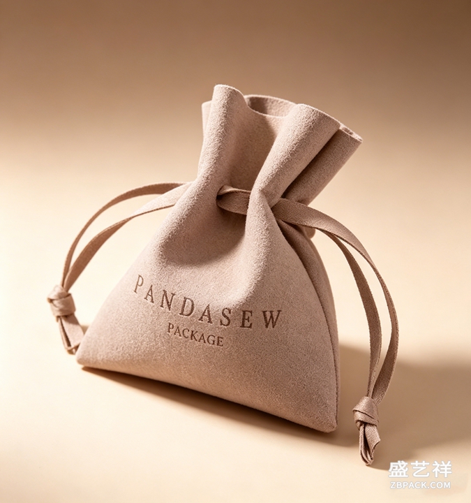
布标的位置直接影响看见率。最经典的位置是盒盖内侧正中偏下,开盒的第一眼就能看到品牌名,仪式感最强;另一个常见位置是内衬侧缝或翻盖处,不抢占视线,但需要时随手可得;还有一部分品牌把布标缝在盒外底角,低调地展示品牌身份。方向也要讲究:文字与盒内主视方向一致,顾客开盒无需扭转即可阅读。特殊品类另有讲究:抽屉式首饰盒的布标缝在抽屉内侧面,翻盖盒缝在盖内顶部,悬挂式陈列的盒子则要避免布标外露影响美观。
内容排布:一行都不能少,也不能多
布标上的内容分三类:必要的、建议的、多余的。必要信息包括品牌名与商标、材质成分(如面料成分、内衬材质)、产地,涉及出口的还要加符合目的地要求的标识;建议信息包括护理说明(避免暴晒、请勿水洗)、货品或型号编号,方便售后和补货对账;多余的信息是促销语、口号、价格——这些会稀释品牌感,而且印上价格,调价只能报废滞销标。文字排布要克制:字号清晰可读、行距适中、中英文对齐,布标字小空间小,最考验排版,排得清爽、信息齐整,就是好标。
工艺与耐久:布标也要过三关
布标不是缝上去就一劳永逸,三类测试在打样阶段就要做实:耐磨关——日常开合、拿放、擦拭时,织标会不会起球、印标会不会掉色发花;耐洗关——顾客偶尔会水洗内衬,布标会不会缩水变形、缝线会不会脱开,送检重点关注洗标行业标准;耐老化关——长期存放和光照下,布标颜色会不会发黄、文字会不会褪色。测试结果要在打样确认时书面确认;出口产品更要核对目的地对洗标的规定。布标通过三关,才敢大规模投产,否则省下的打样费,会在售后里加倍还回来。
布标与整体包装的呼应
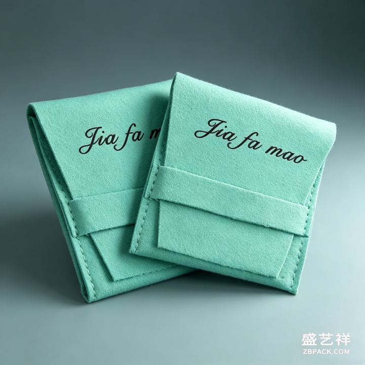
布标做得再好,孤零零地好看也不够,要与整体包装形成呼应。色系上和盒内衬、盒面主色靠拢,深色盒子配深色底织标,浅色盒子配米白或浅灰标;字体上和盒面LOGO一致,至少保持风格相近;工艺上和盒子同频,盒子是烫金工艺、布标可用烫金织边呼应,盒子走极简风、布标就保持素净。呼应不是复制,而是让顾客从外到内感受到同一套设计语言。盒面是门面,布标是落款,开盒的仪式感正是这些细节叠出来的。
一条布标的分量
布标虽小,却是首饰盒完整性的最后一块拼图。材质定质感、位置定看见率、内容定专业度、耐久定品质、呼应定整体感,五件事串起来,一条布标就从附属品变成了加分项。中宝包装专注首饰盒与珠宝包装十余年,支持织标、印标、植绒标及各类布标定制,欢迎来图来样交流具体方案。
原创声明:本文由深圳中宝包装(zbpack.com)原创,欢迎转载,请注明出处。专业首饰盒定制,欢迎咨询:https://www.zbpack.com
When a jewellery box reaches a customer, the eyes first fall on the lid, then open the cover and finally turn to the lining - and the modest fabric tag sewn there is often the last formal meeting the brand has with the customer. Small as it is, the tag carries plenty: the brand name, material composition, care instructions and even origin and quality marks. A well-made tag sits flat, prints clearly and sits in a deliberate position with texture under the fingers; a careless tag with crooked stitching, blurred lettering or incomplete information makes even a good box feel unfinished. For a packaging manufacturer, the tag is not an accessory but part of the craft: woven labels, printed labels and foil-stamped labels each bring their own trade-offs.
Pick the Material: Woven vs Printed
Tags divide broadly into two crafts: woven and printed. A woven label produces letters and patterns directly from warp and weft threads, giving a firm hand, neat edges and lasting wear, with dimensional lettering - the first choice for mid-to-high-end jewellery boxes, though minimum orders are higher and revisions cost more. Printed labels print directly onto fabric, offering rich colours, gradients and complex artwork with flexible order quantities, yet the print layer can bloom with wear, suiting high-volume products whose information changes often. In between, flocked tags feel soft and fine for light-luxury velvet boxes, while polyester woven tags offer strength for exported volume lines. Let the material follow the product grade: the higher the box positioning, the more a woven tag deserves the budget.
Choose the Position: Where Customers Will See It
Position decides the visibility rate. The classic spot is centre-low on the inside of the lid, where the brand name greets the eye at the moment of opening with the strongest ritual feel; another common position is the inner side seam or flap, out of the line of sight but available when needed; some brands sew the tag at the outer bottom corner for a low-key statement of identity. Beyond position comes orientation: text on the tag should follow the box's main viewing direction so customers read it without turning the box. Special types have their own conventions: drawer boxes put the tag on the inner drawer side, flip-lid boxes on the inner lid top, and hanging-display boxes avoid tags that would mar the exterior. With the position settled, the tag stops being sewn for sewing's sake.
Layout the Content: Not One Line Missing, Not One Line Extra
Tag content falls into three classes: necessary, recommended and superfluous. Necessary items include the brand name and trademark, material composition such as fabric content and lining material, and origin, plus destination-required marks for exports; recommended items include care instructions like avoiding sunlight or machine washing, and item or model numbers for after-sales and restocking; superfluous items are promotional lines, slogans and prices - they dilute the brand feel, and a price printed on the tag forces scrapping lagging stock whenever prices change. Keep the layout restrained: legible type size, moderate leading and aligned Chinese and English, ordered from brand to detail, left to right. Tags are small with little room, which makes layout the hardest craft; when one glance takes in clean, complete information, it is a good tag.
Craft and Durability: Tags Must Pass Three Tests
A tag is not sewn once and forgotten; three tests should be run during sampling. The wear test: during daily opening, handling and wiping, does a woven tag pill and does a printed tag lose colour or bloom? The wash test: when customers occasionally wash the lining, does the tag shrink or distort and do the stitches pull out - check relevant washing-label industry standards during third-party testing. The ageing test: under long-term storage and light, does the tag yellow and do letters fade? Confirm test results in writing when approving the sample, and for exports verify destination rules on washing-label material and content. Only after passing all three should the tag go into mass production; otherwise the sample fee saved returns doubly in after-sales costs.
Echo the Overall Packaging
A tag that looks good in isolation still needs to echo the whole package. Keep the colour family close to the inner lining and lid: dark boxes take dark woven tags on dark grounds, light boxes take cream or light grey. Keep the typeface consistent with the lid logo, or at least in the same style. Keep the craft in tune: a box with foil stamping can take a foil-edged woven tag, while a minimalist box keeps the tag plain. Echoing is not copying; it lets customers feel one design language from outside in. The ritual of opening is built up layer by layer - the lid is the facade, the tag is the signature.
The Weight of One Small Tag
Small as it is, the tag is the final piece of a jewellery box's completeness. Material sets the feel, position sets the visibility, content sets the professionalism, durability sets the quality and echo sets the whole impression; link the five and the tag turns from an attachment into an asset. Next time you customise a box, put the tag and the box body in the same sampling list so this last-encountered detail matches the front facade. Zhongbao Packaging has focused on jewellery boxes and packaging for over a decade, supporting woven, printed and flocked tag customisation. Welcome to send artwork and samples to discuss specific solutions.
Original article by Shenzhen Zhongbao Packaging (zbpack.com). Reprints welcome; please credit the source. Custom jewellery boxes: https://www.zbpack.com