珠宝零售终端的陈列动线设计:让每一件首饰都被看见 Display Flow Design in Jewelry Retail: Making Every Piece Seen
在体验式零售成为主流的今天,珠宝门店早已不只是售卖场所,更是一处讲述品牌美学的空间。顾客进店后目光最先落到的,往往不是价签,而是陈列本身。如何让珠宝在方寸柜台中脱颖而出,成为品牌与顾客沟通的第一语言,正是珠宝陈列设计的核心命题。好的陈列不是把产品摆满,而是用节奏、层次与留白引导目光流动,延长停留、激发购买意愿。
动线规划是第一步。入口的黄金视线区适合主推当季形象款,中段以系列化铺开,让顾客在比较中建立对产品线的整体认知,洽谈区则保持克制、少量点缀即可。在这条看不见的动线上,珠宝陈列道具扮演着引导者的角色——从高低错落的展示台到便于拿取的首饰摆盘,每处细节都在无声地说:请靠近、请端详、请试戴。

道具讲究藏技于无形。一款好的首饰摆盘既要托举珠宝的璀璨光泽,又不能喧宾夺主;绒面、皮革与哑光金属的质感差异,会直接改变顾客对价值的判断。深色系常作主基调,用细腻肌理衬托钻石与贵金属的火彩,再以少量浅色珠宝托盘形成视觉呼吸点,让陈列既有秩序,又不失温度。
灯光是陈列美学的另一半灵魂。珠宝陈列架上的点光源讲究角度与色温的精密配合:钻石偏好冷白光凸显火彩,黄金与玫瑰金则需暖调唤醒色泽。灯光与道具相互成就,才能让首饰在顾客抬眼瞬间绽放最佳状态。陈列也需定期更新,调整组合与主题,给老顾客常逛常新的新鲜感,也为新品制造话题。
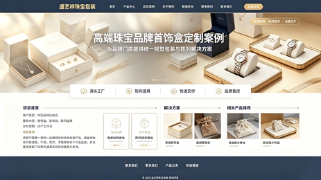
从更长周期看,陈列已从卖货技巧升级为品牌资产。一套稳定而富有辨识度的陈列语言,能让顾客在任何门店感受到一致的品牌气质。对连锁品牌而言,陈列规范需标准化、模块化,并保留按城市客群调整的空间。珠宝包装与陈列本是一体两面:包装负责开箱前的第一印象,陈列负责到店后的沉浸体验,共同构成完整的品牌叙事。
说到底,陈列是一门关于克制的艺术。懂得留白才能突出重点,懂得取舍才能形成记忆点。当珠宝、道具、灯光与动线彼此呼应,门店便不再是冰冷的交易空间,而成为顾客愿意驻足、分享、再次归来的美学现场。这或许正是当下珠宝零售最值得投入的长期主义。
本文为盛艺祥原创内容,版权归盛艺祥所有,如需转载请注明出处。盛艺祥珠宝包装定制,懂设计更懂省料,让每一分预算花在刀刃上,体面实用真省心。
As experiential retail becomes the norm, a jewelry store is no longer a mere selling floor but a space that tells a brand's aesthetic story. What catches a customer's eye on entering is rarely the price tag; it is the display itself. Making each piece stand out within a few square feet of counter space, and turning display into the first dialogue between brand and customer, is the central task of jewelry display design. Great display does not mean filling every inch. It uses rhythm, layering and negative space to guide the eye, lengthen dwell time and gently stir the desire to buy.
Traffic planning comes first. The prime sightline near the entrance suits seasonal signature pieces, the middle section unfolds by collection so customers can grasp the full range through comparison, and the consultation area stays restrained with just a few highlights. Along this invisible path, jewelry display props act as guides: from staggered risers to easy-to-reach jewelry trays, every detail quietly says come closer, take a look, try it on.
Props should hide their craft. A good jewelry tray supports a piece's brilliance without stealing the show; the difference between velvet, leather and matte metal directly shapes how value is perceived. Deep tones often set the base, fine textures flatter the fire of diamonds and precious metals, and a few light trays create visual breathing points, giving the display both order and warm layering.
Lighting is the other half of display aesthetics. Spotlights on a jewelry display rack demand precise angles and color temperature: diamonds favor cool white to reveal fire, while gold and rose gold need warmer tones to awaken their hue. Light and props complete each other, letting a piece bloom at the instant a customer looks up. Refresh frequency also belongs in daily operations; rotating compositions and themes keeps regulars curious and gives new launches a talking point.
Over the longer arc, display has evolved from a selling trick into a brand asset. A stable, recognizable visual language lets customers feel the same brand character in any store. For chains, this means display standards must be modular and consistent, yet flexible enough for local tastes. Packaging and display are two sides of one coin: packaging owns the first impression before unboxing, display owns the immersion in store, and together they form a complete brand narrative.
Ultimately, display is an art of restraint. Knowing where to leave blank space highlights the essentials; knowing what to omit creates memory points. When jewelry, props, light and flow answer one another, a store stops being a cold transaction space and becomes an aesthetic scene customers want to linger in, share and return to. That may be the long-term investment most worth making in jewelry retail today.